 In this tutorial I’m going to explain how to create the Covered Bridge pyrography artwork. My primary goal with this artwork is to demonstrate the importance of contrast in creating visually striking images. The secondary goal is to show you how to create the different textures in the artwork; like the trees and the wooden bridge.
Be aware that nib and pen tip are the same thing. For some reason I tend to use different terms as I write.
 Click on the thumbnail to the left to watch a YouTube video tutorial version of this artwork. Or click on this link: https://youtu.be/N9vgFqBEHEs
Now, let’s started.
MATERIALS NEEDED:
- Writing tip
- Shading tip
- 4 x 6 inch (10.2 x 15.2 cm) piece of wood
- Pattern (shrink or enlarge as needed). Covered Bridge pattern (Stampin Up)
ABOUT THE IMAGE
 For this artwork, I used a stamp. This photo shows the image of the stamp.
 This is the line drawing I traced onto the wood from the stamped image.
You can choose to use the line drawing I did or the pdf of the stamp.
LOW CONTRAST
 This image is the low contrast version of the bridge.
I will only use this version to occasionally compare it with the high contrast version. The process that I used to create this version is exactly the same as the high contrast; the only different is the range of tonal values I used. For the low contrast I tried to keep everything in the tan range, but I did use some light brown tones.
HIGH CONTRAST
Here is the high contrast version. With this version I used the full tonal range available in pyrography, so everything from light tan all the way to dark brown. This really improves the artworks visual appeal. The eye tends to linger longer on this version of the artwork than the low contrast version.
STEP 1 – PREP THE WOOD
 Wood burning is much easier if you take the time to prepare the wood surface. Always smooth the wood surface by sanding it with at least 220 grit sandpaper.
 Then thoroughly wet the board by misting it with water or running it quickly under the sink faucet.
 The board should be damp to the touch, but not soaking wet.
Let the board dry. Once the board is dry, you will notice that the rough appears and feels rough. That’s because the grain swelled and is now sticking up from the rest of the board. To remove this, just sand again with 220 grit sandpaper.
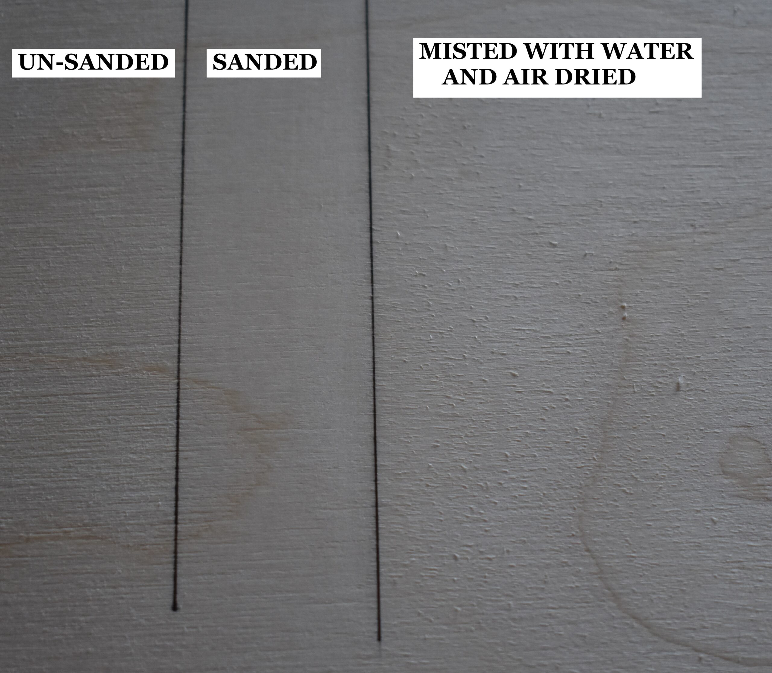 This piece of plywood board is broken up into three sections. The far-left section is how the board looks without any prep work. The board has a rough texture. The middle section of the board shows how it looks after it was sanded, and the surface is a lot smoother. The right section of the board shows it after it was lightly misted with water and allowed to dry. Notice how rough the board looks, but a quick sanding will remove that and leave an ultra-smooth board.
Doing the 4-step process (sand, mist, dry, sand) produces a super smooth surface, and the smoother the surface is the better the burn results will be. There are other benefits to the 4-step process.
- Humidity changes won’t impact the board. This means that the grain (or nap) won’t swell.
- You can safely add liquids without worrying about the nap raising (grain swelling). Liquids include things like watercolors and water-based wood finishes that are brushed on.
STEP 2 – TRANSFER PATTERN TO WOOD
 I use the tracing method to transfer all my patterns to my projects. It’s cheap, easy, and gives me control on what I want to include. Print off your pattern on lightweight paper (standard copier paper is perfect), coat the back of the pattern with a graphite pencil, position on the wood, and trace over the pattern. Make sure to check the trace results for accuracy before removing the pattern.
STEP 3 – BURN THE OUTLINE
 With the writing pen tip on medium low, lightly burn in the trace lines.
After you have burned in the trace lines, rub over the surface with a pencil eraser to remove any residual graphite.
STEP 4 – BRIDGE SHADOWS
 We’ll begin with the shadows on the bridge and the tree branches. For this you will need a shader and a writer nib.
Depending on the size of your artwork, you might be able to just use a writer nib.
 Use a shader of your choice to darkly burn in the visible walls inside the bridge. Be careful when burning around the flower petals. In fact, it would be much easier to use a writer nib around the flowers.
If you are using a shader, make sure you keep your pen tip in optimal position when burning around the edges. This means that the front edge or toe of the shader is on the edge of the wall. The body of the shader is angled over the dark shadowed interior. This will ensure that your lines stay crisp and clean.
I like to burn around the edges of an area first and then fill in the center.
 Switch to a writer pen tip to burn in the support beams visible in the opening along the left wall on the bridge.
Also, darkly burn in the tree branches that are visible on the background trees.

Next use a shader to burn in the cast shadows from the roof onto the bridge walls. Burn the shadows to a lighter brown color.
Start each burn stroke on the seam or line where the roof touches the wall. Then pull the nib down towards yourself. End the burn stroke a short distance from the roof. Make sure the burn strokes end at the same place. It is easier to rotate the board and burn a line where the shadows end.
STEP 5 – TREES
 Now we’ll burn in all of the trees in the background.
 Let’s begin with the largest tree to near the front opening of the bridge. Use a shader of your choice and move your hand in a very small circular motion. Burn small sections of the tree at a time.
Start at the back or shady side of the leaves. I visualized the sun being on the left in my artwork, so the shady side is on the right closest to the bridge.
As I said, I’m using circular motion for this process, so I’m literally moving my hand in very small circles. To get a range of tonal values or color, I vary how many times I repeatedly burn the same small circles.
 Continue to work your way around the tree burning in small sections at a time. Because to incorporate tonal variety and make the right a bit darker than the left.
Also, make sure to use a light pressure while working. Light pressure will help keep the pen from sticking or catching on the wood and ensures the heat of the pen remains constant.
 Using a heavy hand pressure when burning creates a number of problems. I have a video that demonstrates how your hand pressure impacts the burn results. The video also has a test you can do to check your hand pressure. To watch, click on the video thumbnail or this link: https://youtu.be/q8OGqS5kyHg
 It might help to think of the tree as composed of several small shrubs and you are working on one small shrub at a time.
After one section is done, then move to another section and begin by burning on the shadowed side first.
In this photo you can really see the large tonal variety my tree has. Notice how the shadows are all located along the inner portion of the tree where the sun doesn’t reach as easily.
It doesn’t matter if you work right to left, top to bottom, or start in the middle like I did. Take your time and work a small section at a time and before you know it the tree will be done.
 Now we’ll work on the evergreen tree to the left of the large tree we just finished. For this tree we will use a combination of single lines and ‘V’ shapes.
Start at the top of the tree and burn a few short lines to give the tree it’s pointed or peak top.
Work your way down the tree burning more single and short V’s. I overlapped the V’s slightly to break up the V shape.
 It is important to keep some pale lines visible so your tree has the impression of branches.
 For the small shrub next to the fence, burn a row of tan lines along the outer edge of the shrub. I burned the row using a zigzag motion, but you can also just burn individual lines.
The zigzag motion is nothing more than a continuous line burned in an up and down motion.
 Burn a second row of darker tan lines below and slightly overlapping the first row.
Notice how I’m burning the row of lines in a curve following the contour of the shrub. This is giving the shrub a rounded or mounded appearance. Continue to burn rows of lines that follow the contour of the shrub. Yes, each row will get smaller as you work your way down the shrub.
 Also make sure to burn between the fence posts. I will mention that it would probably be easier to use a writer nib for this.
 Now let’s burn in the two large trees behind the bridge. For these two trees we are going to use the same the process we used on the large tree to the left of the bridge.
Burn circular motion over the trees working small sections at a time.
While we’re working in the area, re-burn over the birds to darken them. While I used the razor edge of the shader, a writer pen tip would be easier.
 Like before, make sure there is tonal variety in the tree. Also, darken the inner edges to create a shadowed appearace.
Let me point out that I made sure that the top right edge of the middle tree is lighter than the tree behind it. This helps separate the two and give a sense of depth to the artwork.
 Now let’s burn in the evergreen tree on this side. I began by burning a row of dark lines along the outer edge of the tree. You can do the same or replicate the steps you used on the first evergreen tree.
Whichever method you choose, the tree will look good.
 Use care when burning around the flower petals. I’m working in a really small area, so I’m using the smallest shader I own.
If you decide to create this artwork, I would recommend enlarging the image a bit so it’s easier to work in the tight areas around the flower petals.
 Let’s do contrast comparison.
You can see that both images have a fair amount of detail. The assorted trees are easy to tell apart and the bridge opening is very noticeable, but which image do you prefer and why?
For me, image B just pops and is a lot more visually interesting.
Whereas image A looks washed out and drab to me. With image B I find my eye lingers longer and I look around the image more. Basically I’m noticing or looking at the different high contrast areas; tree branches, evergreen trees, and, of course, the dark insides of the bridge.
 There is one more step to do before we’re done with the trees. Use a shader to burn some tree or shrub foliage behind the opening on the left side of the bridge.
Go ahead and burn right over the dark beams as you’re not going to change their color in any noticeable way.
Looking at my artwork, I realized I should have burned some foliage next to the left wall on the bridge. This is the area behind the large tree on the left side of the bridge. I would leave the area adjacent to the roof bridge unburned, but I do recommend creating some sort of foliage texture next the to left wall of the bridge.
STEP 6 – BRIDGE WALLS
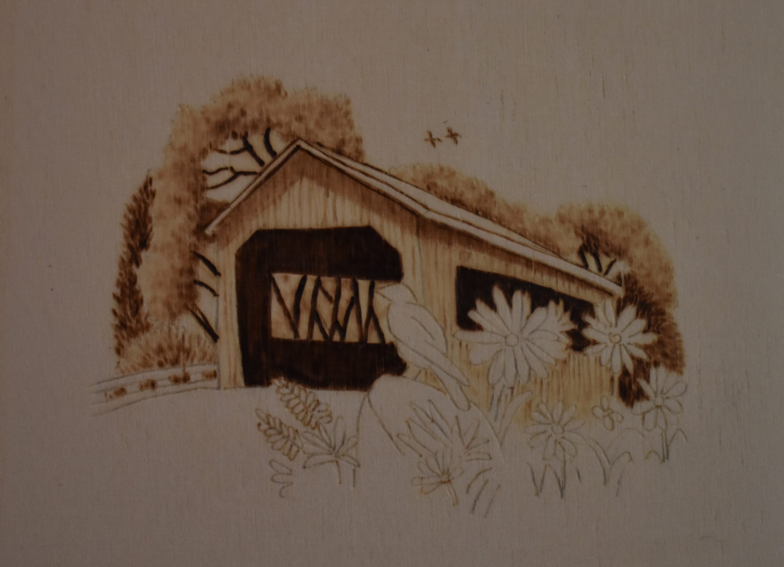 In this step we will be burning the walls or sides of the bridge. I will not be able to do a contrast comparison for this step as I deviated from the order in which I burned in image. In the low contrast I burned in the foreground (flowers, bird, etc.,) first and burned in the sides of the bridge last.
 Begin by using the razor edge of the shader or a writer pen tip to burn vertical lines down the length of the bridge. The lines represent the seam where two boards touch.
The lines do not need to be perfectly straight, uniform in color, or spaced evenly apart.
In fact, a little variety will add interest and help the bridge look a little weathered.
 Then burn over the right side of the bridge making it a medium tan color.
Make sure to burn in the area below the opening.
 Repeat the process along the front of the bridge, but make it a shade or two lighter than the right side. As you can see from the photo, I’m giving the front of the bridge color before burning in the seam lines.
 Use the razor edge of the shader to burn in the seam lines.
 If you own a skew nib, that would be a great choice for burning thin lines. Skews are pen tips that are angled and have a straight thin edges on them.
 Rotate the board, if needed, and burn a thin dark line along the outer edges of the roof.
Here’s how the artwork looks at this point.
 To finishing up the bridge, burn the top of the roof to a tan color.
Then use the razor edge of the shader to burn thin diagonal lines on the roof.
Burn the diagonal lines in two directions. Burn the first layer of lines semi-vertically. The lines should follow the angle of the roof.
Burn the second layer of lines at angle. Basically we are creating a single layer of cross-hatch on the roof.
Keep in the mind that the lines do not need to be parallel or perfectly straight. We’re just creating texture, and no one is going to pay that much attention to the roof. Also, a remind that if you have a skew tip, this would be perfect situation to use it. I’m not sure why I didn’t use one.
STEP 7 – FOREGROUND
 Let’s burn in the objects in the foreground like the flowers and bird to finished up the image.
Use a writer nib and start burning in the leaves and stems of the flowers.
A very simple thick dark tan line is sufficient to represent the leaves and stems.
I did NOT try to add any shading or shadows to the leaves and stems; instead I kept them as very basic lines. If the line was not uniform in color, I let it be. If nothing else, I figured the variety helped with the visual interest of the artwork.
 Next use the writer to burn a dark line under the lower edge of the bridge. Try to avoid the petals, stems, and leaves of the flowers while doing this.
Also burn the body of the small butterfly to a dark color.
Afterwards, burn in the ground around the flowers to a medium tan color. I chose to use a standard writer pen tip for this.

Burn in the road that leads into the bridge. For this I used a writer pen tip for this step and burned a series of lines.
I did burn a dark thin line along the left edge of the ground.
Afterwards, I reburned over the area using a horizontal zigzag, or back and forth motion, to give a slightly irregular color. This added a little ‘rough’ texture to the road. I kept the left side a bit darker than the center and right side. There reason was to create a big of a shadow from the fence and shrubbery.
 Lightly burn in the fence and add a few lines here and there to give it a slightly weathered look.
 Next, use the writer to burn the bird’s tail feathers to a medium brown color. I did not try to create individual feathers.
Then burn in the bird’s wing, but make it a shade or two lighter than the tail. Lightly burn along the lower edge of the wing and continue the line to the bird’s throat. I left the shoulder of the wing unburned or very light tan in color.
 Burn the bird’s back to the same color as the tail, but let the color lighten by a few shades when you near the bird’s head.
Burn along the edges of the bird’s head. To make it stand out it needs to be considerably lighter than the shadows inside the bridge. I left the belly completely un-burned, but feel free to add some color to your bird.
 Burn in the grass clump or whatever the foliage is next to the rock.
I burned the grass clump just like a did the flower stems & leaves, so the fronds are nothing more than thick lines. Just like the flower stems and leaves, I didn’t worry about making the lines uniform in color. Just make sure to avoid the flower petals in front of the fern.
 Then burn a line down the center of the fern fronds.
These could be some sort of flower, but I’m going to call them a fern frond instead.
 Then burn around each nodule or leaf on the frond.
Please keep in mind that I’m not a botanist, so I don’t have a clue what the technical terms are for the different parts of the plant.
 Make sure your shader, or writer pen tip, is on low heat. Then burn in the flower petals. Start the burn stroke on the flower center and pull it outward towards the end of the petal, but stop the stroke near or just past the halfway mark.
I am using my smallest shader for this, but a writer nib would be easier to use. Also, rotate the board as needed so that you are always pulling the nib down towards yourself. Burning in this direction makes it much easier to control the burn results.
 Let’s finish up by burning the rock. I began by burning a dark line along the edge of the rock.
Then I switched to a shader and burn in the side of the rock. Give it a base tan color and then burn an assortment of thin short vertical lines on the side.
Add a crack if you want like I did by burning a thicker vertical line.
 Lightly burn over the top of the rock.
Burn a thin dark line under the rock.
Add some blotches or small dots to the top of the rock for a little texture.
I have to mention that I’m not really thrilled with how the rock turned out, so if you want to try something else go for it! Hopefully you’re rock will look better than mine.
Lastly, if needed, darken up the side of the rock and add more vertical lines.
FINAL COMPARISON
 Now it’s time for the final comparison between the low and high contrast image.
Comparing the two, which image do you think is more visually striking?
Again for me I really prefer image B. There is a lot more contrast between the bridge and the white daisies, so the daisies are a lot easier to see. All of the dark brown areas on the artwork help guide the eye around the artwork and keep your interest longer.
Image A has a fair amount of detail in it, but it lacks pizzazz. Again, to me it just looks washed out and boring when compared to image B.
Quite truthfully, it doesn’t take a lot of work to incorporate contrast into your artwork. Generally all you need to do is make sure a few of the shadows are really nice and dark, and have a few really pale areas. For the covered bridge I have the dark shadowed opening adjacent to the white petals of the daisies creating an area of high contrast..
IN CONCLUSION
That’s it for this tutorial. I hope I was able to convey the importance of contrast in your artwork. Artwork looks so much better if you incorporate some extreme contrast in the image. One more image I want to share with you is the Christ of the Mines artwork I did as it is a perfect example of high contrast.
 This is my Christ of the Mines artwork I did and I’ve had numerous people tell me the statue looks like it could be picked up. The statue stands out so well because of the dark background. The darkness helps push the background further into the background. Plus, the dark background creates an area of high contrast that makes the statue stand out.
I hope that this blog will help you think about the importance of contrast and incorporate it into your own artwork.
Now to answer a couple of questions I get asked frequently. This covered bridge was burned on birch plywood that measures 5 x 7 inches (12.7 x 17.8 cm). Both versions of the bridge were burned onto the same piece of wood, so each image is pretty small measuring around 3 x 3 inches (7.6 x 7.6 cm). It took me a total of 2 1/2 hours to complete both bridges. That said, this is not a race or contest. I only put how long a project takes me as I get asked that question a lot.
Until the next blog,
Brenda
Apr 12, 2019
Want to subscribe?
- Click on the “Leave a Comment” field at the end of any post (blog) and a subscribe option will appear.
- Put something in the comment field (if you put “test” or “just subscribing” I won’t make your comment public)
- Fill in the sections for your email address and name, and then click on the “notify me of new posts via email.”
- You will get a confirmation email from WordPress confirming you want to subscribe.
- Click on the confirm button in that email and you’re done.
Please note that I do not send out emails. If you have a WordPress account there is a way to subscribe within the WordPress system, but I cannot provide specifics on how it works as I don’t know.
I am thrilled to see your tutorial each at a time it’s so helpful. I would like to subscribe
Thanks for the comment
Hi Brenda, great work so glad i found you . i”m a beginner learning my tips. You are a real help THANK YOU!!!! I HAVE BEEN DOING CARTOON CHARACTERS its been fun but i want to move on. i would love to see you do the landscape with the mountains ,trees and lake just slower. a lot slower lolol. i get lost when you go fast . but i have learned so much from you. thank you.
Hi Carol,
As long as you are staying creative and having fun, that is the only important thing. Creating tutorials is an ever evolving thing for me, and I will keep your comment in mind with future tutorials.
I would like to subscribe to your blog – thanks for all the great info!
Hi Shelley,
thanks for subscribing and glad to know the information is of value.
Brenda
Hi Brenda
Seeing the two results side by side really shows how important it is to pay attention to the contrast.
Thank you for all your postings. I know it takes a lot of time and I appreciate what you do for us.
Your tutorials are so detailed and easy to follow that I just have to try it myself and I ordered a Colwood Detailer.
Thank you again.
Billy
Hi Billy,
A lot of times we don’t think about contrast, but it really can make the difference between good and great artwork.
How exciting! I hope you will get a lot of use out of your burner when it comes in, and, more importantly, I hope that you will really enjoy pyrography. It has become almost an obsession with me and I seldom work in any other medium now.
Thank you for your wonderful comment and welcome to the pyrography community!
Brenda