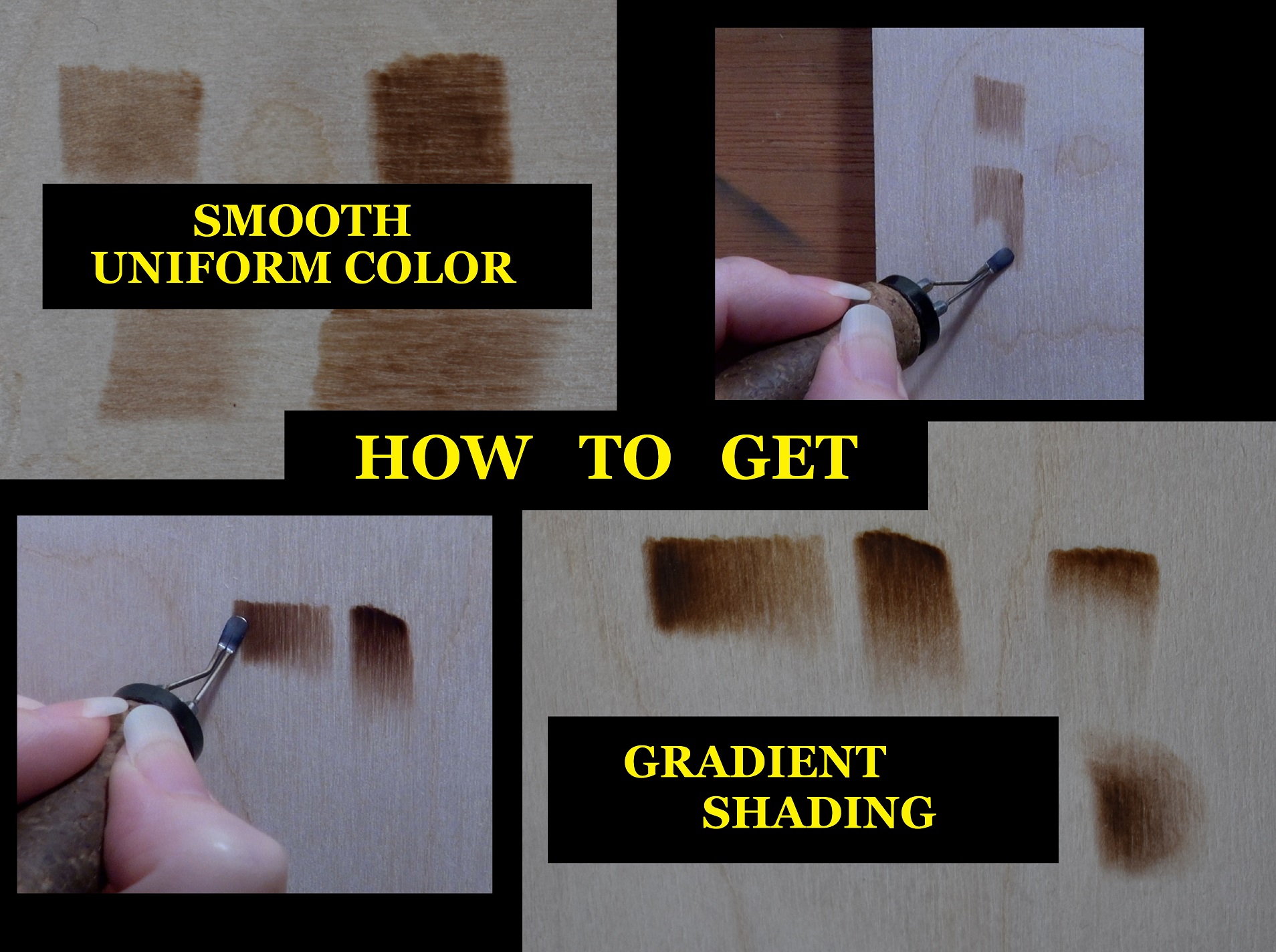
 In this tutorial I’m going to explain pyrography shading techniques to get smooth gradient color. First I will give you some tips that will help get better burn results and then I’ll explain how to create both uniform color and gradient color. Gradient shading is one of the more difficult skills to master in pyrography. Being able to burn in color that is smooth and uniform will make learning gradient shading easier. I generally start with uniform color and transform it into gradient color.
I have to tell you that I have worked harder on this tutorial than I have on any of my previous tutorials. I really tried to make sure to cover everything I could think that to help explain the steps needed to produce gradient shading. How to get smooth gradient shading is one of the most common questions I get asked from people trying to learn pyrography, but it is a hard question to answer as I can’t see what you are doing. I really hope that I was able to write this so it makes sense, answers a lot of questions I get, and helps improve your results. Please leave me a comment and let me know how I did. If something isn’t clear then put that in a comment and I’ll try to clarify.
May 2026. I originally wrote this blog in February of 2019. Since that time I’ve learned more about pyrography and gotten better at explaining things. At least I hope I’ve gotten better at explaining. I’ve re-written parts of this blog to add a few tips that I’ve learned over the years.
Nib, tip, pen tip all refer to the same thing.
 I do have a YouTube tutorial video available to help you learn this important skill. Be aware that the video was created in 2019, so doesn’t include some of the things I’ve learned over the years. To watch click on the thumbnail to the left, or click on this link: https://youtu.be/w-dkGiZrwLk
 This tutorial provides additional information on getting smooth results. To watch click on the thumbnail or click on this link: https://youtu.be/VpQshNJqquY
Let’s get started.
TIP 1 – SMOOTH SURFACE
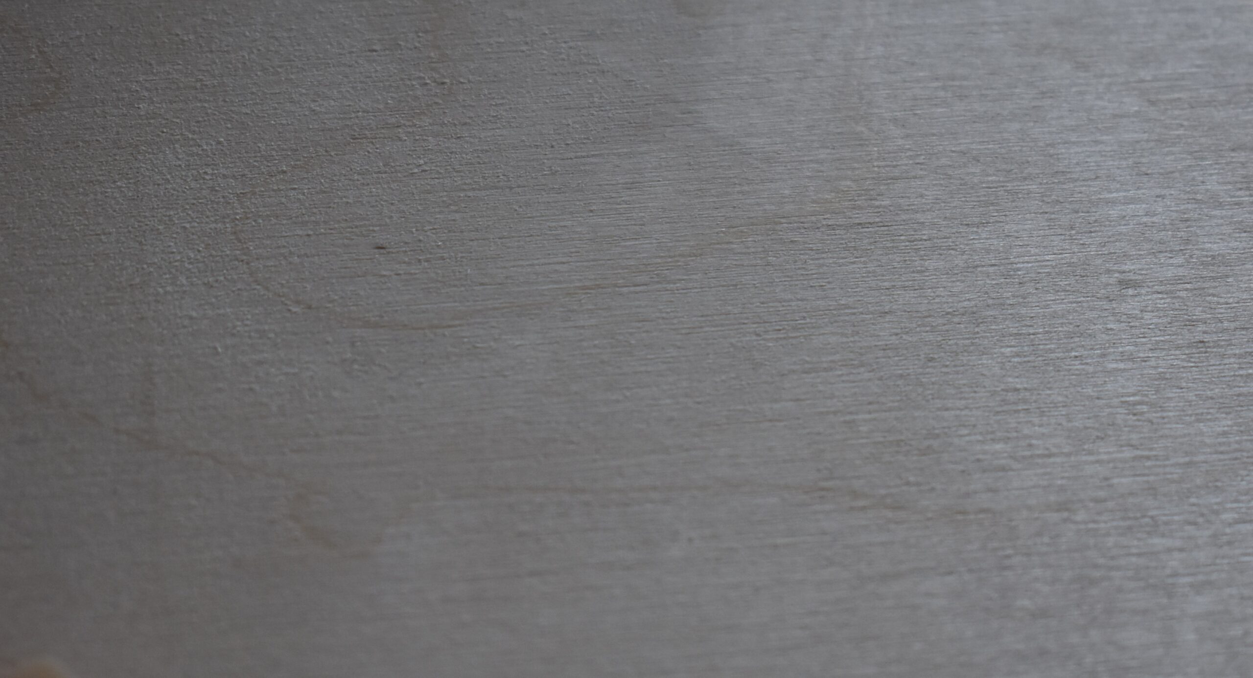 Make sure your burning surface is as smooth as possible. This photo shows a piece of un-sanded plywood. While the surface might feel fairly smooth, a visual inspection shows there is a lot of rough looking texture.
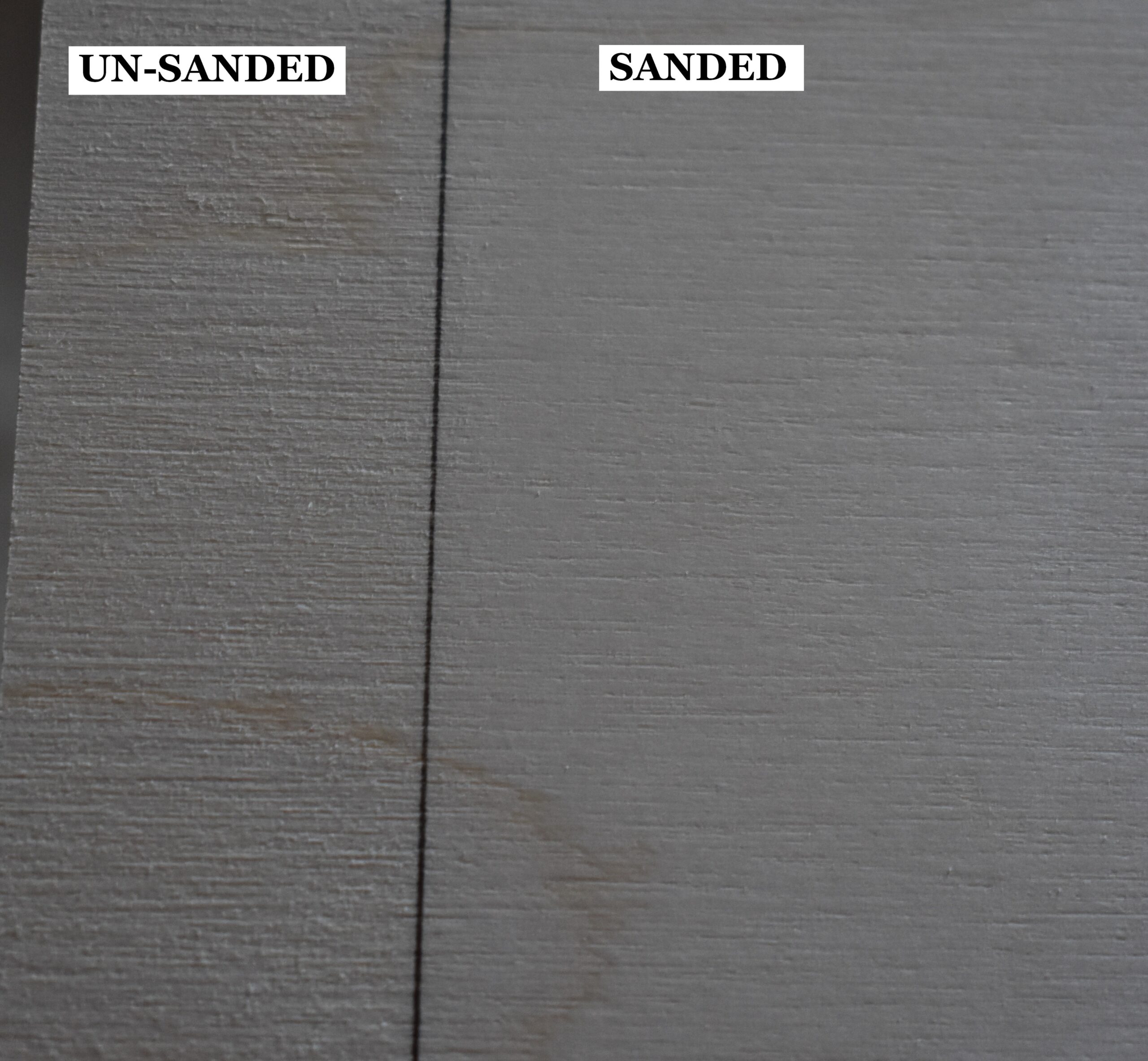 Here’s that same piece of plywood, but the right side of the board has been sanded with 220 grit sandpaper.
A line separates the un-sanded and sanded surfaces. To the left of the line is the un-sanded portion of the board.
You can clearly see a huge improvement of the wood surface after it was sanded.
 At the very least you should sand your board.
I personally do a 4-step process on all of my boards; including plywood.
My 4-step process is as follows:
1 – Sand the board with 220 grit sand paper.
2 – Mist the board with water. The board should be damp, but not soaking wet.
3 – Let the board dry completely. This will raise the nap or grain on the board making the board look and feel rough.
4 – Re-sand the board with 220 grit sand paper.
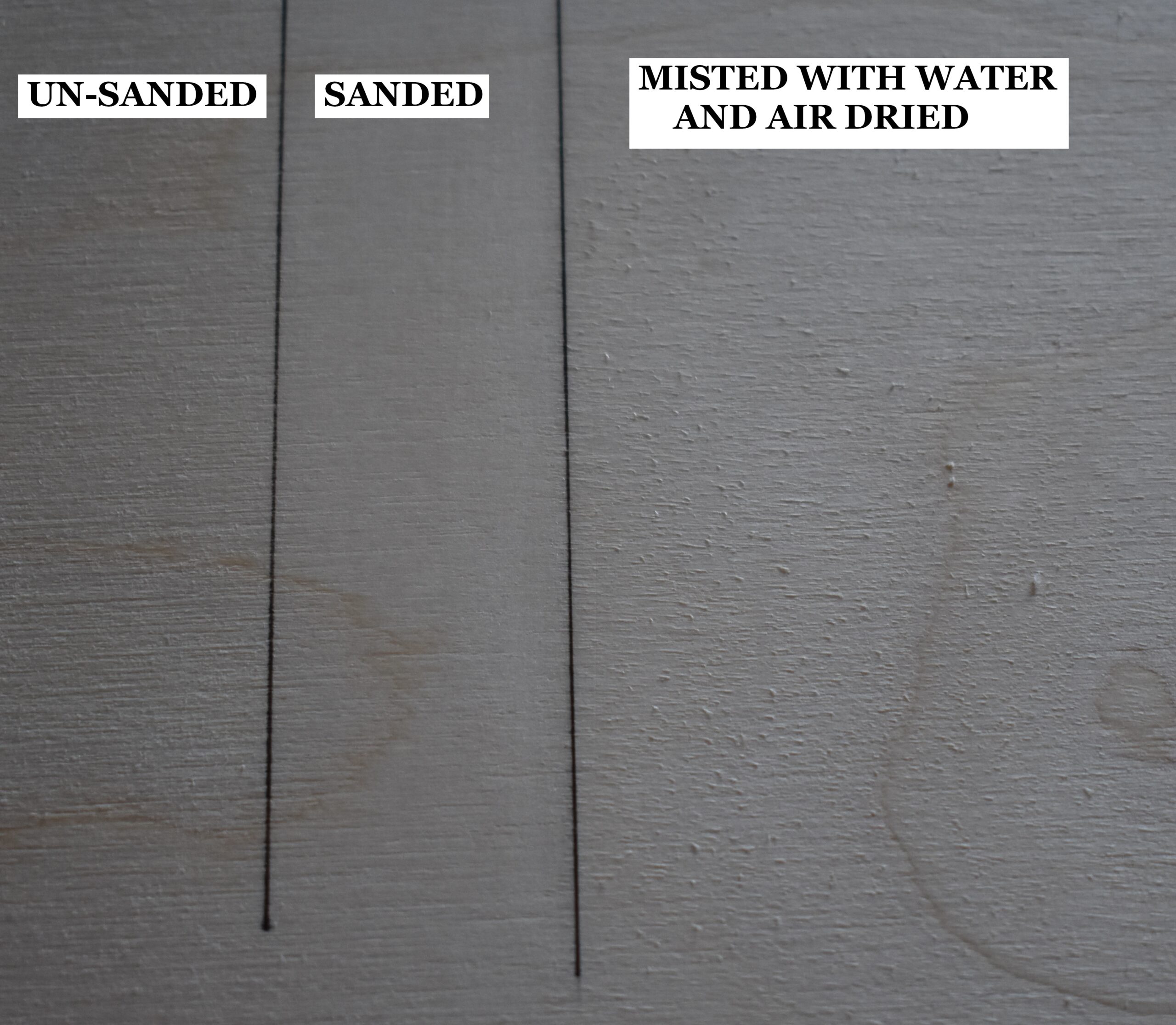 The example shows a board divided into 3 sections. The left section is un-sanded. The middle was sanded with 220 grit sand paper. The right section shows the board after it was misted with water and allowed to dry. Notice how rough the board is.
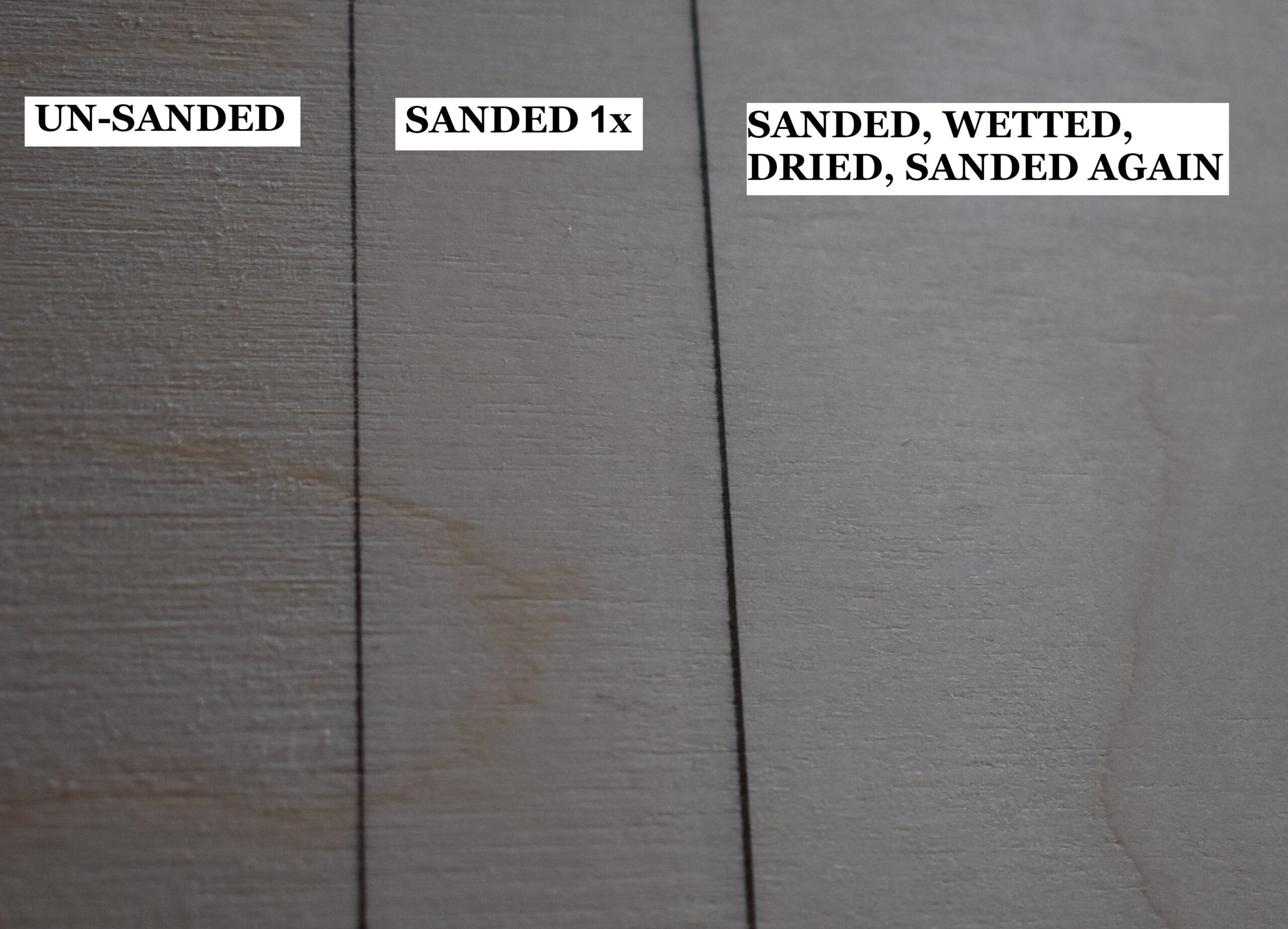 This image shows the same board, but the far right section has been sanded. Now that section is ultrasmooth.
Why wet the board? There are 3 reasons.
1) The smoother the board is, the easier it is to get smooth results.
2) If you are going to add a liquid to the board, it will prevent the nap from raising. Liquids can be things like watercolor paint or brush on wood finish.
3) Prevents the nap from raising during humidity changes. I have a number of projects that have taking me a year to finish. Mostly because I get frustrated, or bored, and quit working on them. I will put the artwork aside and work on other things. Sometimes I go back to the original artwork in a few days, but other times it can be months later.
 This koala project took me two years to finish. The reason for this was that I couldn’t figure out how to create a fur texture I liked. I’d put the artwork away for a few months, take it back out and try a different technique. Because the artwork sat on a shelf for many months, it was exposed to seasonal humidity changes. Since I had done the 4-step process on the board, the nap did not raise and the board continued to be ultrasmooth.
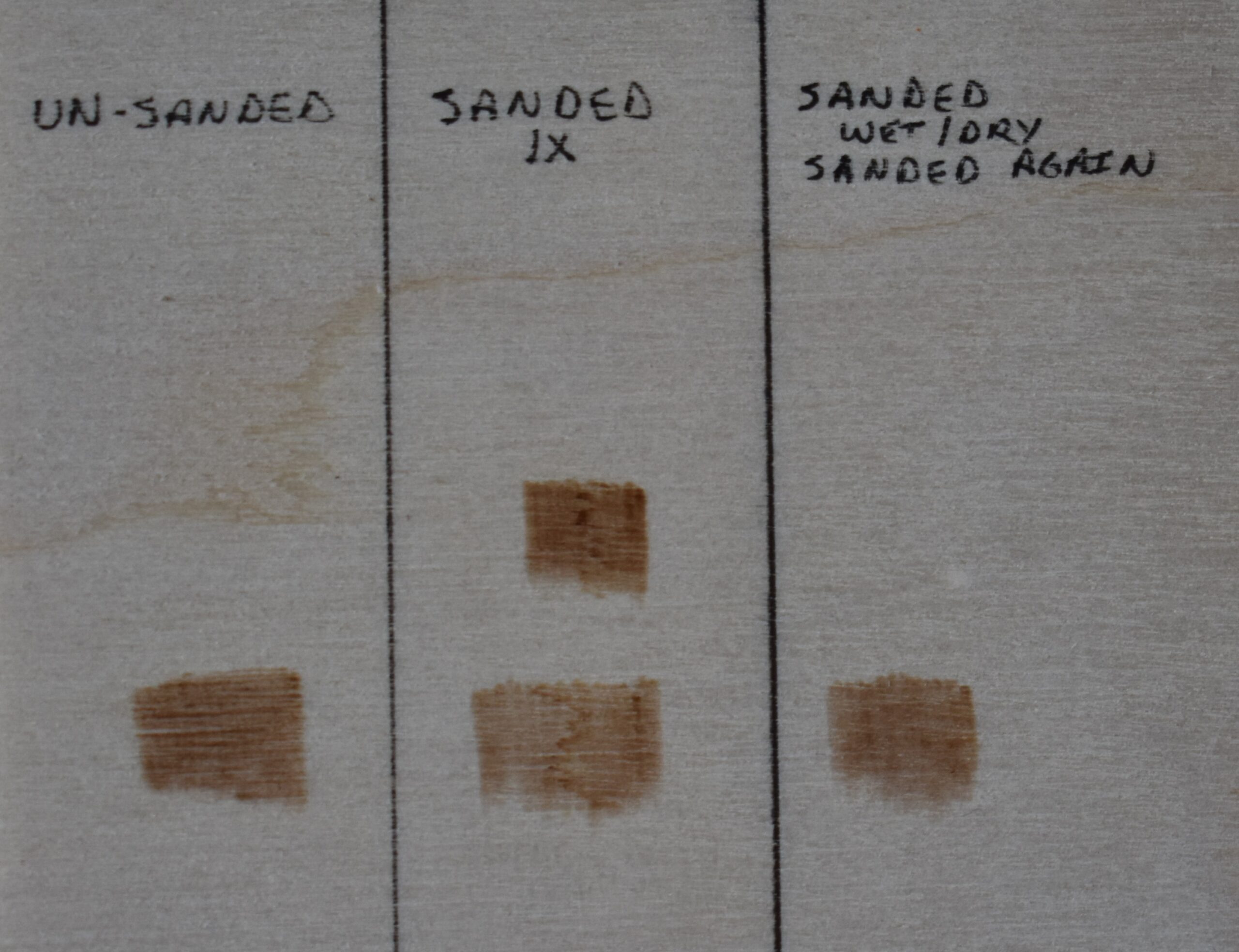 Here’s a test burn example.
There are two burn patches in the middle section because I burning right over a grain line with the first burn. I did a second test burn above it, but ironically it had a little grain line running through the middle of it too.
The results of the test burn between the segments might look similar, but what I can’t convey is how much different it felt.
Left Section. The left section was un-sanded. Obviously I was able to burn over this section, but it felt stiff and resistive to the pen tip.
When I was first learning pyrography, I doubt I would have been able to get results this smooth looking on a rough board.
Middle section. The middle section was sanded with 220 grit sandpaper. When I started burning on this section of the board, it was like skating on ice; the pen tip just glided along the surface so easily.
Right section. The right section had the 4-step process done to it. Now I will admit that I couldn’t feel a huge difference between this surface and the previous one, but it was easier to get consistently uniform burn strokes.
TIP 2 – KEEP PEN TIP CLEAN
 Dirty pens tips, especially if they have a lot black carbon buildup, can interfere with heat transfer. Plus, the carbon buildup can snag on the wood. This image shows a clean nib on the left (1) and a dirty one on the right (2).
Lots of gunk on the pen tip can make it feel scratchy when burning on wood. It reminds me of burning on wood that hasn’t been sanded.
I’ve also experienced times where the pen felt almost sticky when burning. This has happened on a piece of poplar wood that was still a bit green and it oozed a little sap. I’ve had several different pine boards ooze resin and it’s one of the reasons I don’t like burning on pine.
Generally, the darker you’re burning the more likely you are to get heavy carbon build up. Depending on the wood it can build up pretty quickly.
 At the end of each burn session I clean my tips. That way they are ready to use the next time I burn. I use Sharpal buffing compound.
Here’s an Amazon affiliate link to the compound: https://amzn.to/39Z57Pe
Here’s a link to my Amazon affiliate store: https://www.amazon.com/shop/pyrographymad
 I rub a little of the compound on some scrap leather, then rub the nib over it. Only do this with a cold nib!
 You can also use a piece of denim instead of leather. Again, only do this with a cold nib.
In fact, you can use any clean thick material that is made out of 100% cotton.
There are two ways you can clean your nib while it is hot.
 First is to rub the nib on a clean piece of denim. No buffing compound should be applied to it!
The second way is to use a piece of scrap paper. I don’t have a photo of this. The scrap paper can be notebook paper, watercolor paper, copier paper, etc.
It is doubtful that either the denim or paper will remove all of the carbon buildup, but it should remove the majority of it so you can continue to burn. This is helpful when you’re burning a really dark area and don’t want to wait for the nib to cool down to be able to clean it.
TIP 3 – PRESSURE
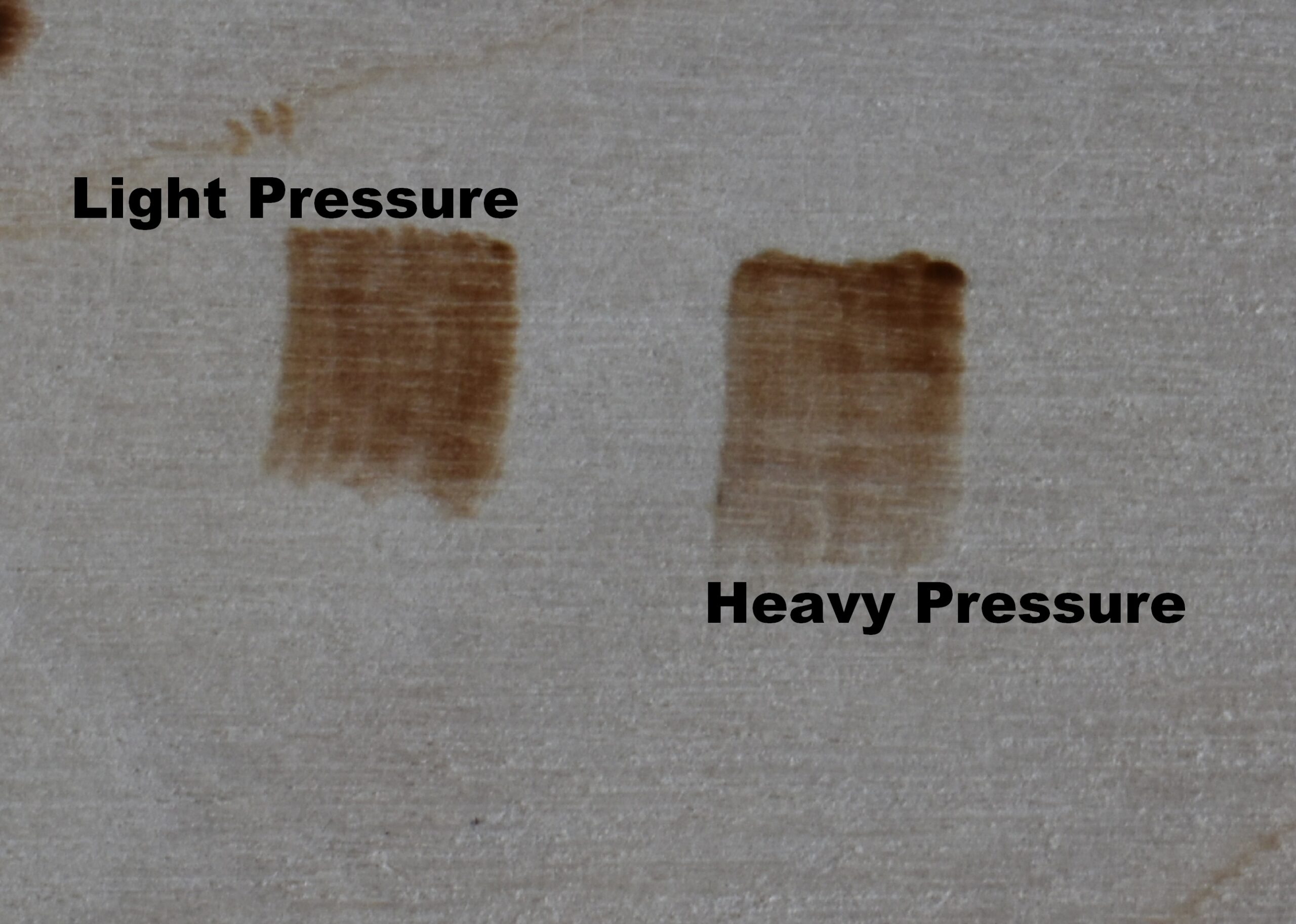 This photo compares two blocks of tan color burned at the same temperature and using the same pen tip. The only difference was the amount of pressure applied to the pen tip. The left burn was created using a light hand pressure. The right one was created using a heavy hand pressure.
The light hand pressure burn is darker, and the color is more consistent throughout the length of the burn.
The heavy hand pressure burn starts out dark, but quickly loses color. Near the end of the burn stroke there is little color to the burn.
 This is a close up of the left example that was created with a light pressure. A light hand pressure means the nib is lightly touching the wood surface, so it can easily glide over the board.
 This closeup shows the patch burned using a heavy hand pressure. I was really pressing the pen tip into the wood. The burn starts out dark, but quickly loses the color intensity. To me it looks like I was burning pull-away strokes instead of uniform strokes.
Use a light pressure when burning. You want the pen tip to glide over the surface of the wood. Remember, we’re burning the wood, not engraving it.
Excessive pressure and not sanding the board are probably the two most common reasons people are having problems getting smooth results.
 I have a blog that discusses my top 5 tips for beginners. I have some great examples of how hand pressure impacts your burn results.
Included is a test you can do to check your own hand pressure. Click on the thumbnail to open the blog or click on this link: https://wp.me/p8j0lZ-9hY
IDEAL COMBINATION
 There is an ideal combination of heat setting, hand speed, and burn stroke length that enables you to avoid irregular burning (example 1) and instead produce nice uniform burns (example 2).
I can’t tell you what that ideal combination is for you. You have to experiment to find the ideal combination that produces the best results for you. What I can do is discuss each item a little bit more to help you understand how they influence your burn results.
HEAT SETTING
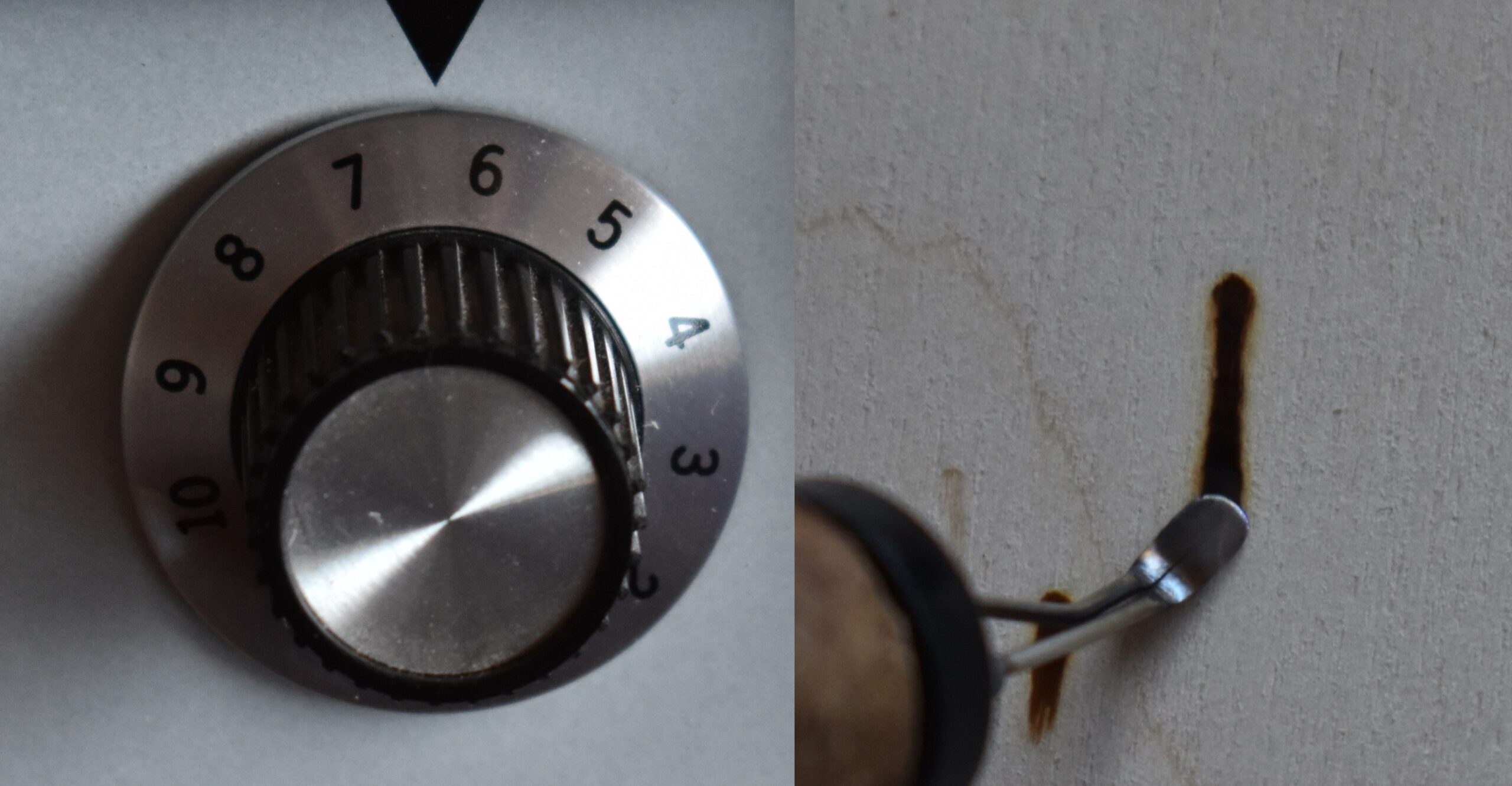 Higher heat produces a darker burn. This is great if you’re working on a really dark area, but most of the time that isn’t the case.
The down side of high heat is that it is a lot harder to get tan and light brown hues. To get lighter colored hues means you have to move your hand a lot faster, so the pen tip isn’t in contact with the board in one spot for very long. Since most of my work happens in the tan to medium brown hues a high heat setting doesn’t work well for me.
Another problem with using a high heat is that it is harder to control the results. Plus, overburn can become a problem. Overburn means that the wood adjacent to your nib darkens. Often the overburn is not something you want to happen.
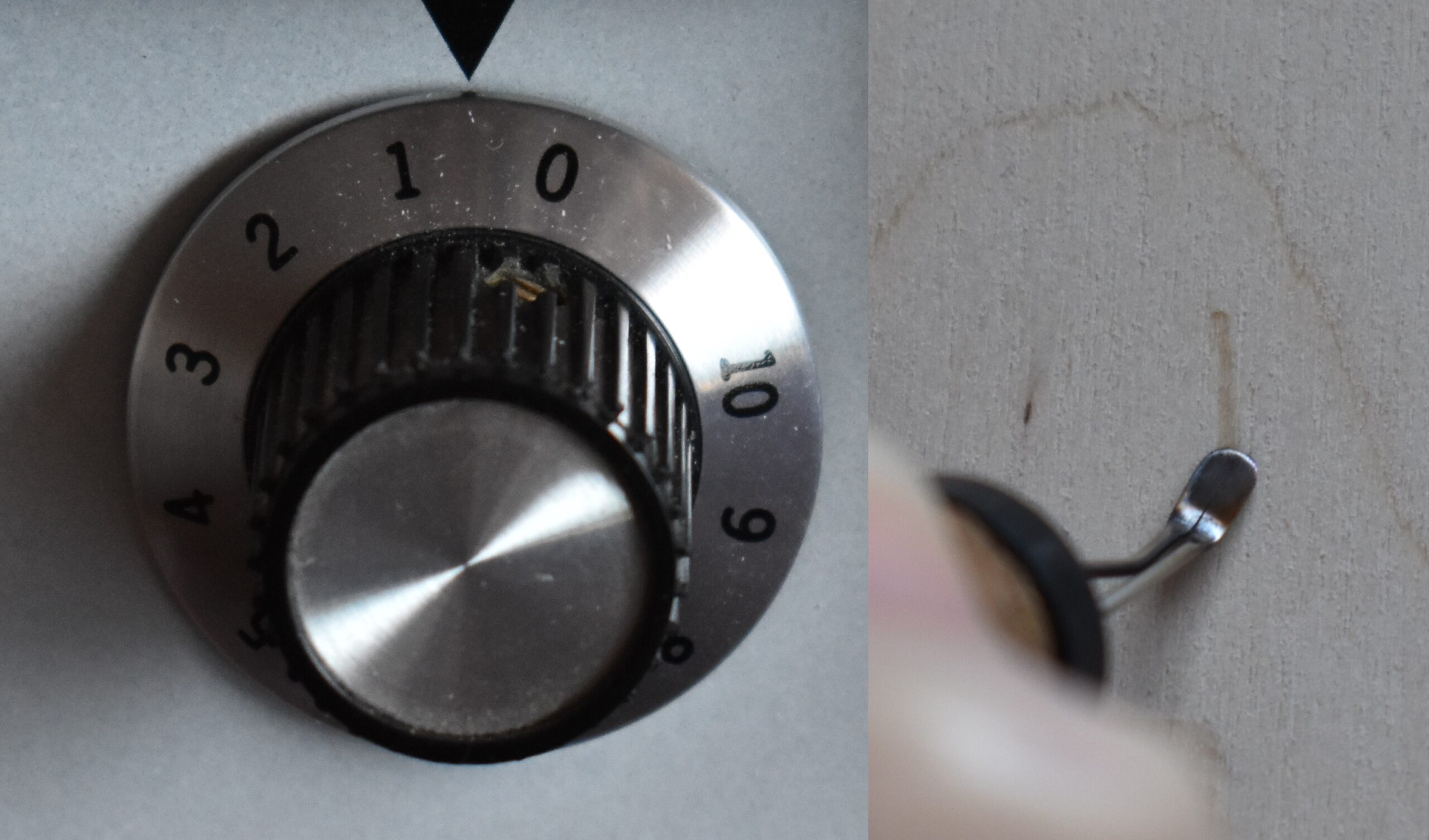 On the opposite spectrum of the heat dial is using a really low heat setting. This will produce a much lighter burn, but if the heat is too low you may not get any burn results.
That’s not totally true. Even on very low heats you can get a burn result, but you have to move your hand really slow. I know I don’t have the patience for that; unless it is for a very small area that won’t take long to burn.
My goal with the heat is to set it so that you get a medium tan color using a normal hand speed, so let’s talk about hand speed.
 I often get asked what temperature I burn at. That is a question I won’t answer because there are too many variables. For example, what type of wood is being burned on? Hard woods, like maple, require a higher heat than softer woods like basswood.
Because I get frequent questions about the temperature I burn at, I created a video talking about it. To watch click on the thumbnail or this link: https://youtu.be/vL8UhK5mBzc
HAND SPEED
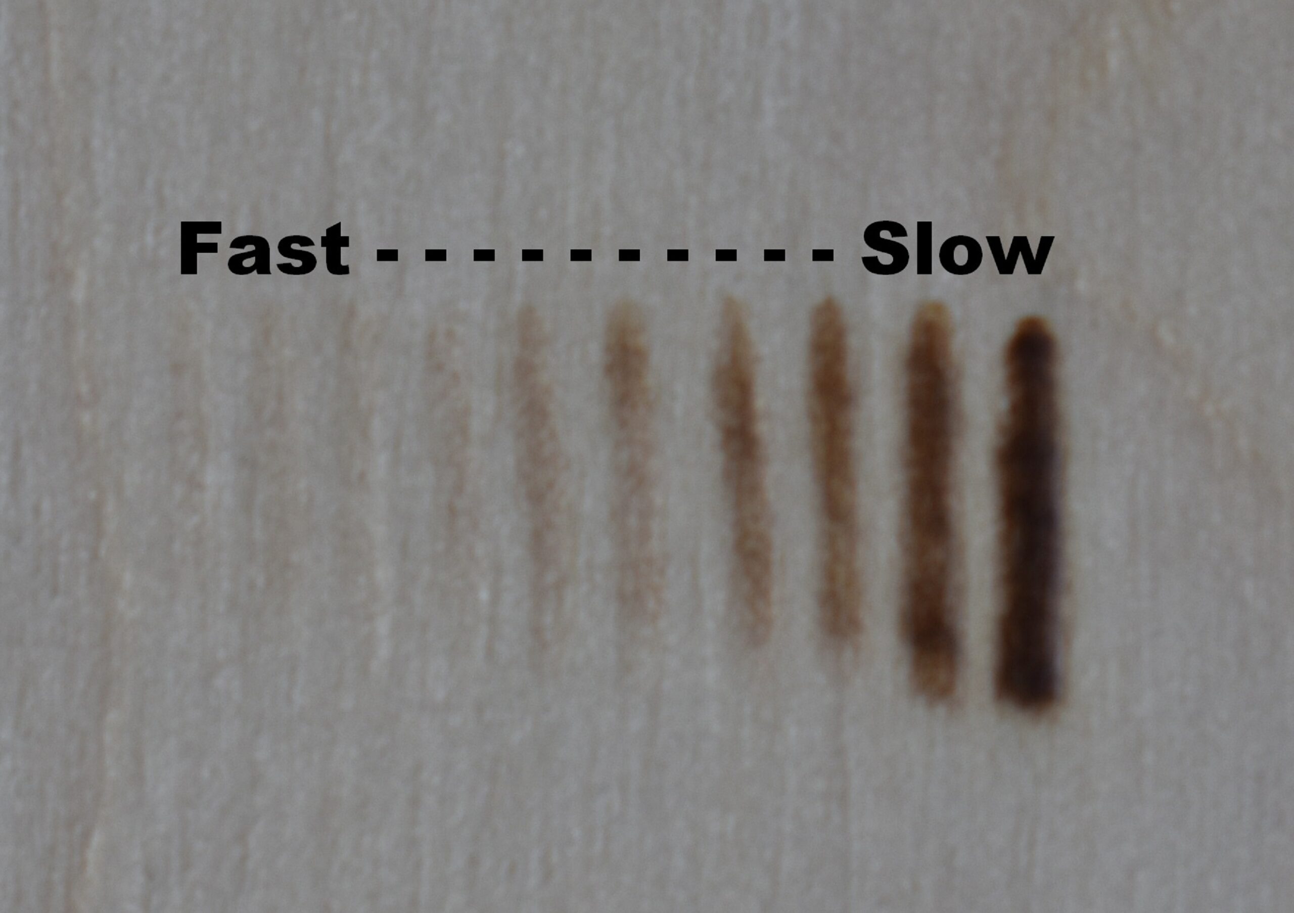 This photo shows a number of lines with a wide range of tonal hues. The heat setting remained the same on every single burn. What changed was how fast or slow I moved my hand.
I had my burner set at 3.0 and moved my hand pretty fast to get the super pale burns along the left.
The middle is where my hand speed is normal and I get a nice tan color. Moving to the right my hand speed slows down with each line.
The far right line is a very dark burn and was created by moving my hand very slowly down the board.
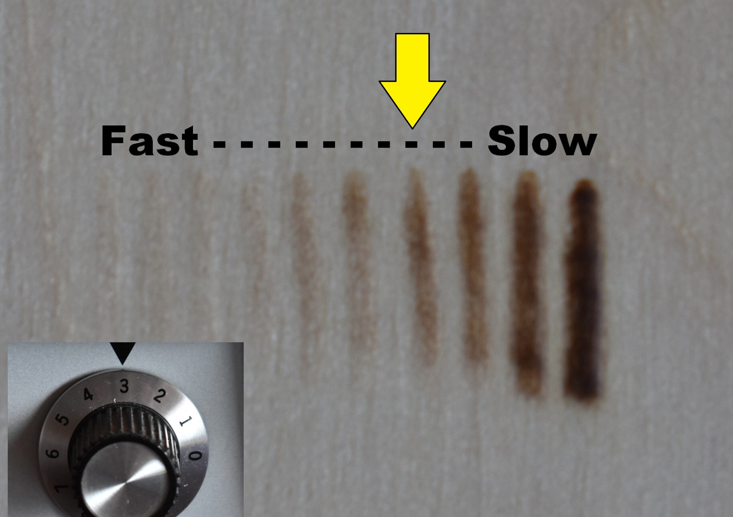 My goal is to set my burner to get a medium to dark tan burn result using my normal hand speed.
BURN STROKE LENGTH
 Burn stroke length is how long of a line you can comfortably and repeatedly burn without heat buildup becoming an issue.
Comfort
First of all, what is a comfortable burn length?
For me it is the length I can burn without having to move my hand a lot. For example, burning one continuous 8 inch (20.3 cm) line would not be comfortable to me. I have found that I tend to have a burn stroke length of 3/8″ or 0.9cm. This is comfortable for me. This may or may not be comfortable for you. With experience you will quickly discover what is comfortable for you.
Repeatable
What is repeatable burn? It is the ability to burn multiple burn strokes that are fairly consistent in color throughout the entire burn.
This patch of color that was created by burning lots of thick lines or wide bands of color. I was able to burn each line without getting a dark blotch at the beginning of any line, so I can repeatedly burn the lines without heat buildup becoming an issue.
 What is heat build up? The minute the pen tip is not in contact with the wood surface, the heat starts to build up on the pen. If the heat gets too hot you will get a dark blotch at the beginning of the burn. As the nib is in contact with the board, the excess heat will be removed. Once the excess heat is gone, the color of the burn gets lighter in value.
If you look at this photo, all of the burn strokes start much darker than they end. Plus, the width of the burn strokes changed. The top of the burns are wider than the lower portions. My hand speed is constant, so the problem is because of heat build up. This means the heat setting on my burner is too high.
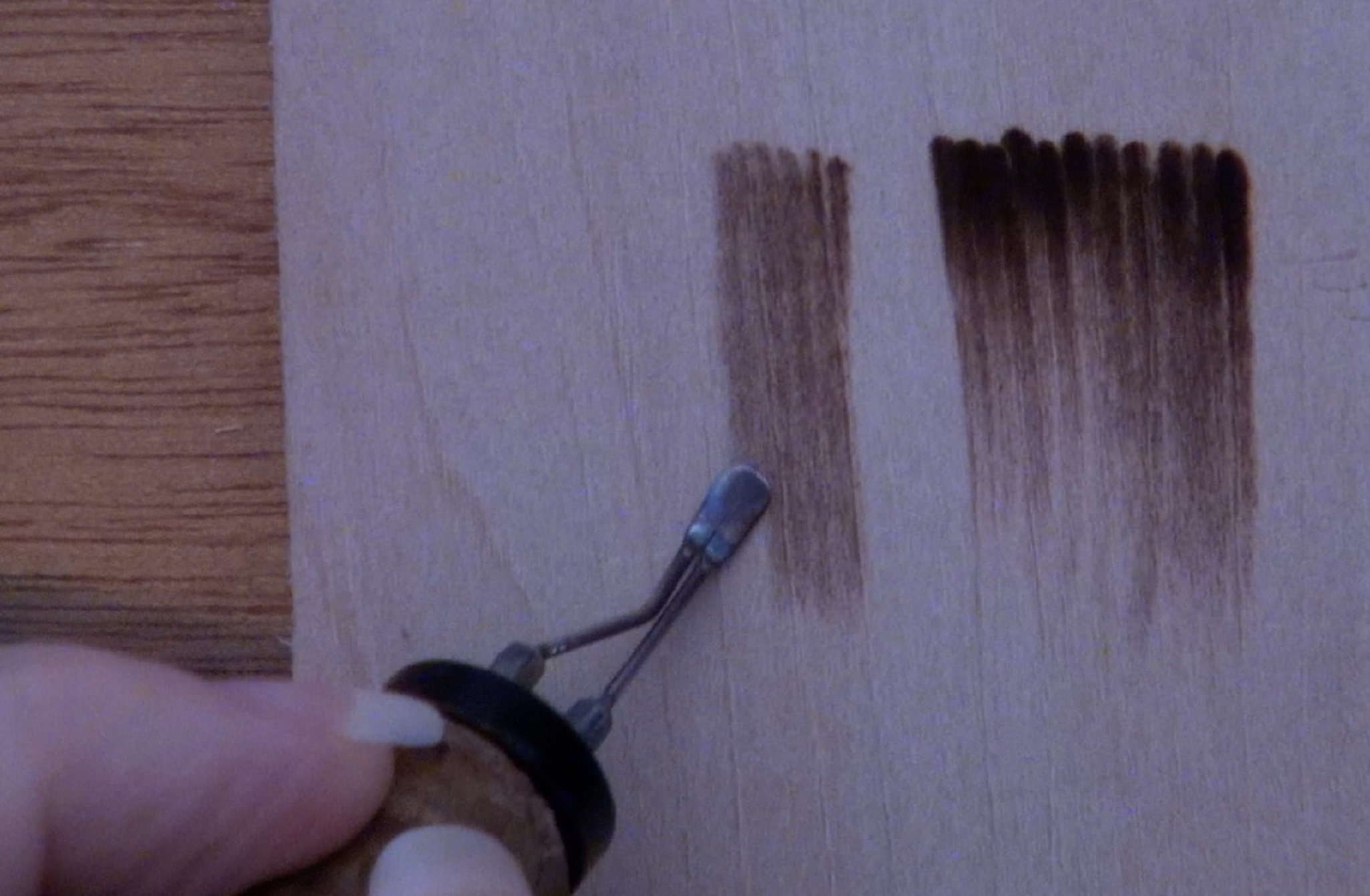 When the heat is set properly on your burner, you can get back to the top of the area you are working on and start a new line of color before the heat gets too hot.
I have found my ideal combination that allows me to burn comfortably and repeatedly burn without heat buildup being an issue.
Discovering the ideal combination of heat, speed, and length that works best for you takes time and practice. Obviously, the more you practice the quicker you’ll discover your ideal combination.
TIP 4 – BURN DIRECTION
I don’t have a photo for this. Always burn so you are pulling the nib down towards yourself. If that doesn’t make sense maybe this will. Burn so you are pulling the nib down towards the bottom of the board. Burning in this direction is makes it much easier to control your hand pressure and hand speed.
TIP 5 – WOOD GRAIN
Again, I don’t have a photo. For some reason, it is much easier to get smoother burn results when you burn with the grain. When possible, burn with the grain instead of against it. I know that this is not always possible, so be aware that you may experience a little more difficulty when burning against the grain.
TIP 6 – WOOD MATTERS
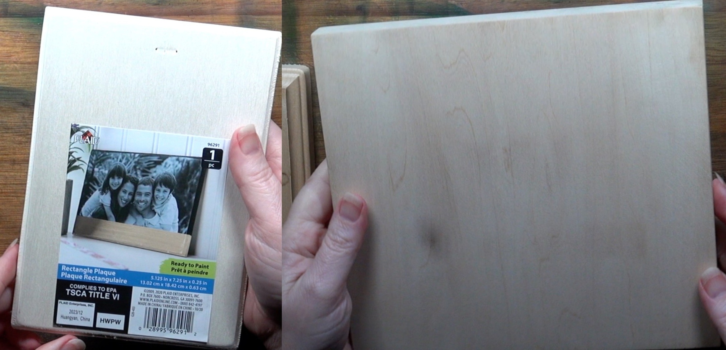 I highly recommend burn on quality solid wood boards. Learning pyrography is challenging, and there’s not reason to make it even harder by using low quality boards. I understand that when you’re first learning you don’t want to ruin a board, but solid wood boards can be recycled. This photo shows a cheap craft board I bought at Michaels on the left, and a piece of basswood on the right. Basswood is also called linden.
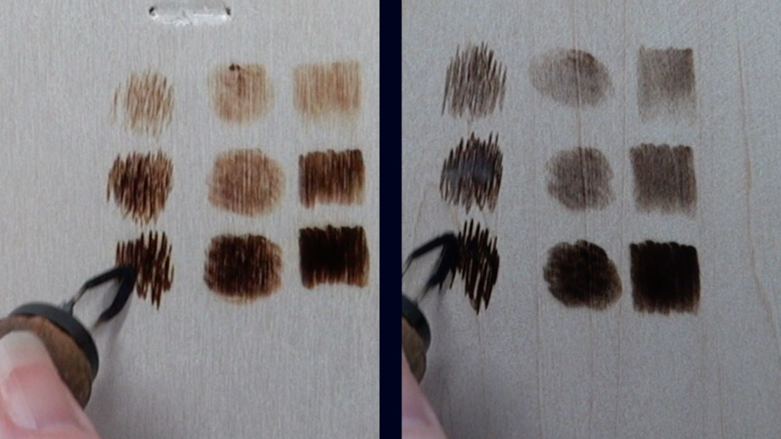 This photo shows several different burn strokes burned at different heat settings. The craft board (left) isn’t as smooth looking.
 Almost all of the examples in this blog were done on plywood.
Plywood is okay for practicing, but keep in mind that the plywood will NEVER have as smooth of a surface as a solid wood board has.
Every brand of plywood I have tried has a pitted texture that looks like there are slivers of wood missing from the surface. No amount of sanding removes this. Some brands are better than others, but all of them have it to some degree. At least, every piece of plywood I’ve tried has. The best brand I’ve found is Ampersand’s unprimed basswood artist panels. Ampersand has a ‘value’ brand series board, but it has a much lower quality than the artist panels.
 This photo shows a piece of plywood (top board – 1) next to a piece of solid basswood (top board – 2). You can always tell a piece of plywood by looking at the side view. Plywood is made by gluing thin layers of wood together. The top burnable layer is extremely thin. If you burn through the top burnable layer you will be in the glue layer. That can be very dangerous!
This is another subject that is covered in my top 5 tips for beginners. Here’s a link to the blog: https://wp.me/p8j0lZ-9hY
UNIFORM COLOR EXAMPLES
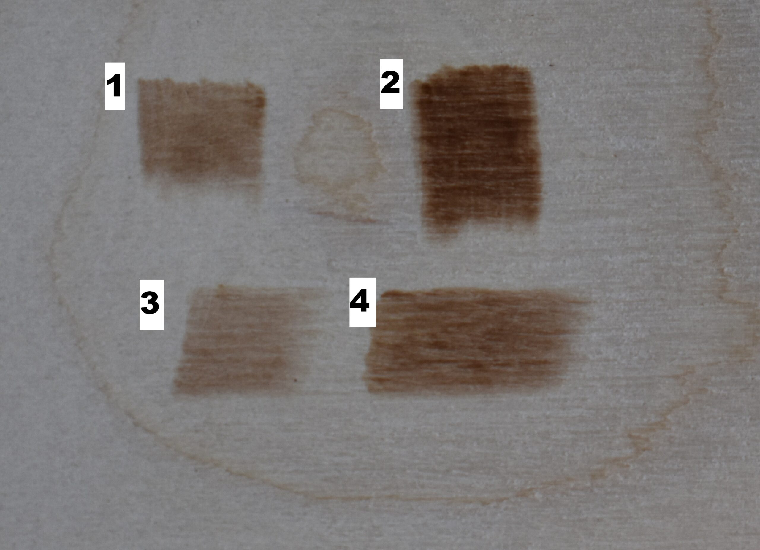 Here are 4 examples of uniform smooth color. Examples 1 & 2 were burned with the wood grain and examples 3 & 4 burned against or across the grain.
Being able to burn a uniform patch of color is important and will make it easier to master gradient color. Also, with examples 3 & 4 I will discuss how to fix a common problems that can happen when burning.
Example 1
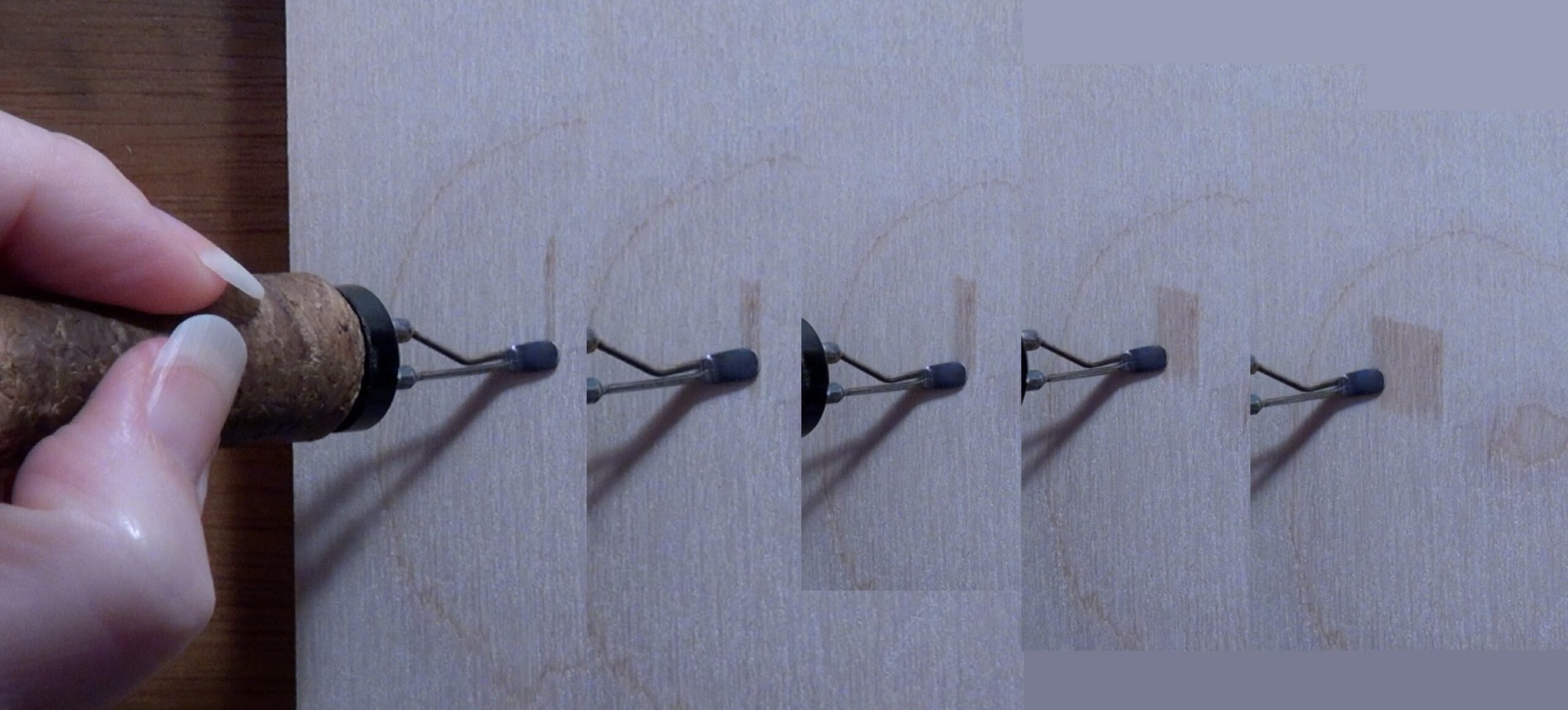 Begin by burning a thick band of color with a shader. Start the stroke along the upper edge of the area and pull it down or towards you.
Then burn another thick band of color so it is just barely touching the first band. Keep the color the same as the first band. The key is to maintain the same hand speed during the entire burn.
The minute the pen tip touches the wood, immediately start pulling it down. DO NOT PAUSE! Letting the pen tip just sit in one place can create dark blotches.
Continue to burn adjacent bands of color in the area you are trying to fill.
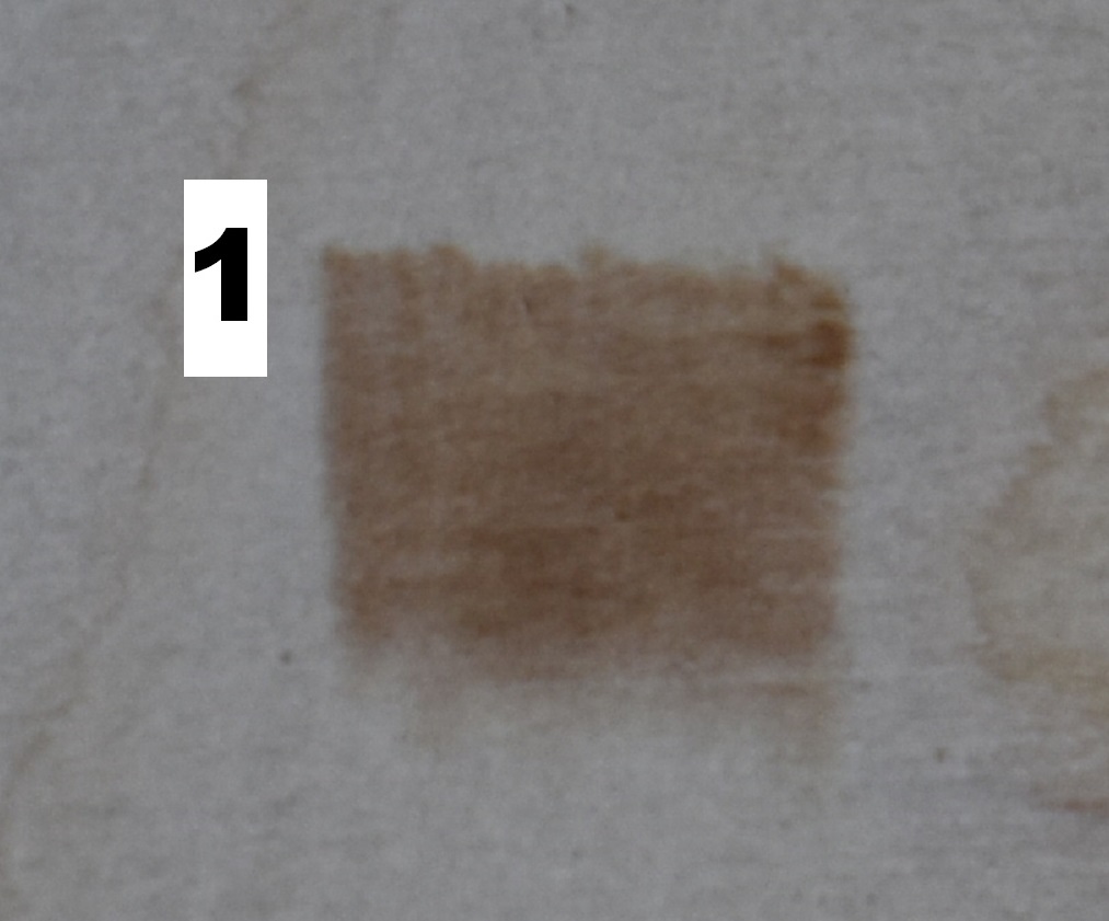 Here’s a close up of the first example. Notice how the length of the strokes are very similar, even if I didn’t burn them in a straight line. Also, notice how uniform the color is. This was accomplished by using the same hand speed for every single thick line or band that was burned.
Example 2
 In this second example we’re going to take a block of solid uniform color and extend the color.
I’m just finishing up the block of color that I’m going to extend. There is something I need to point out. Look at the bottom edge of the color patch and notice it is not a straight line. Instead, there is a variety of burn lengths. I do this on purpose when I know I am going to extend the color because it helps prevent a tell-tale seam line where old and new burn lines touch.
Obviously the first thing is to burn a patch of uniform color, but make sure to vary the length of the lines a little so the bottom edge isn’t even.
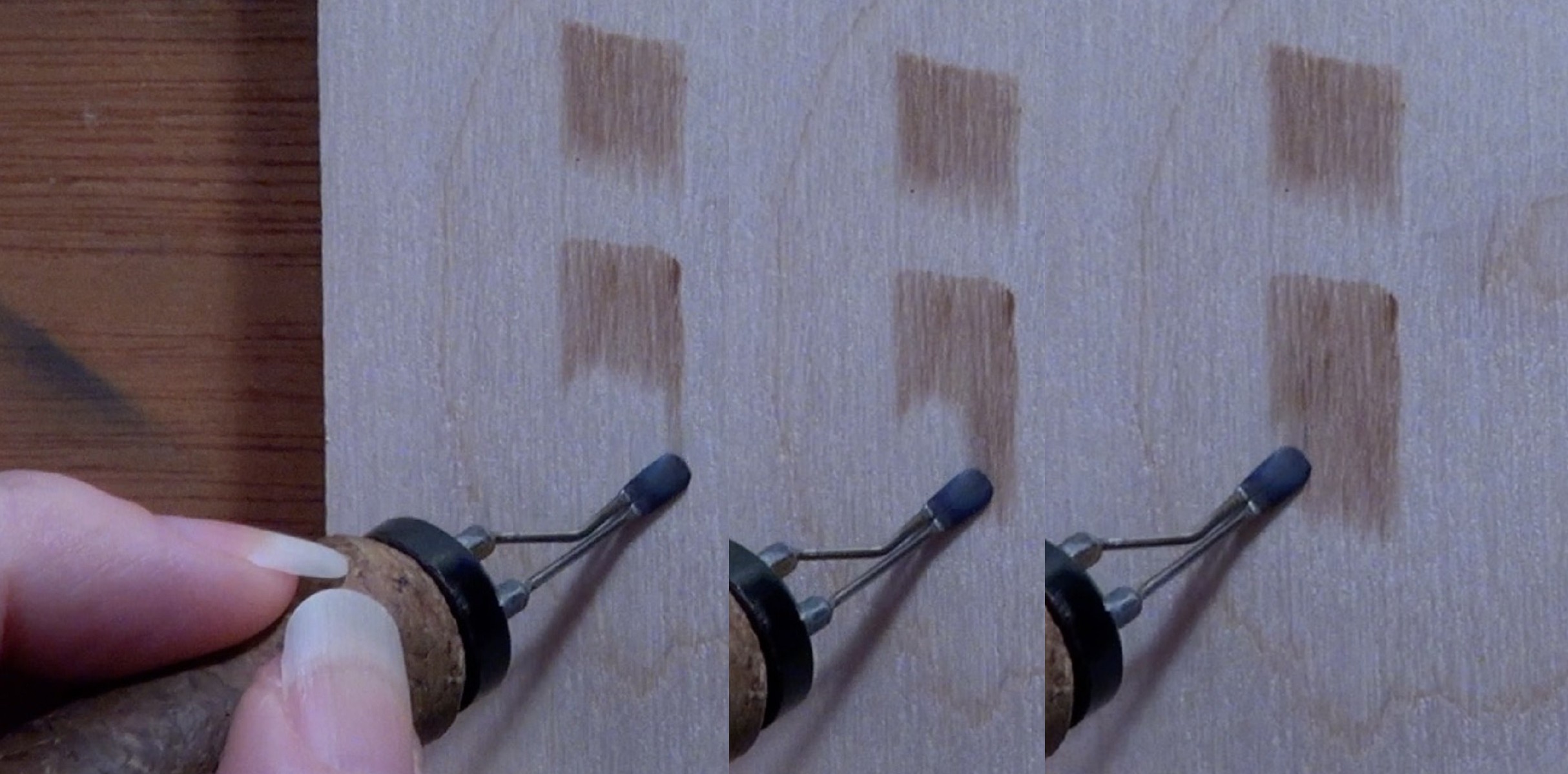 To extend the color, start a new stroke along the bottom of the color block. The new stroke should slightly overlap the bottom of a previous burn stroke on the color block.
The pull the pen tip straight down using the same hand speed you’ve been using all along. This should result in a new wide band of color that matches the color block.
Then it is a matter of burning new strokes that all start slightly on the bottom edge of the color block. Since each new stroke is starting on a slightly different spot you shouldn’t get a line forming between the old block of color and the new one. Other than that, the process is the same as the first example.
 Here’s a close up of the second example.
Example 3
 This example is almost identical to the first example. The difference is that this example was burned against the grain. Some people prefer the term across the grain.
I recommend burning a patch of color with the grain and one against just so you can feel the difference.
 As you can see in this photo, the right edge of the color block is darker than the rest of the block.
A red arrow is pointing to the spot I’m referring to.
Obviously my pen tip had built up a bit of excess heat before I started burning.
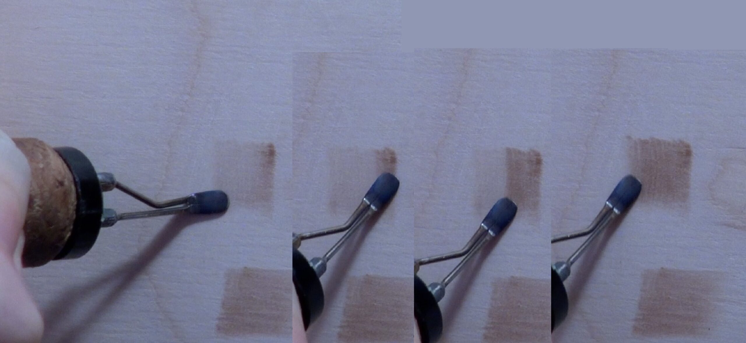 First I finish burning in the patch of color (far left). To fix the dark blotch, I just re-burn over the entire color block to darken it up until it matches the dark spot.
 Don’t re-burn over the dark spot, instead start the stroke just below the spot.
Continue to burn new wide bands of color over the top of the color block.
Here’s a close up of the burn. It’s not perfect, but the dark blotch isn’t as noticeable.
If you still aren’t happy with the results, you can re-burn again. Just keep in mind that each time you re-burn over the color block, you will darken up the color block.
Another option would be to gently scrape over the dark area with the edge of a sharp knife. I can’t emphasize enough the need to gently scrape until the excess color is gone.
Example 4
 With this last example I was extending a patch of color, and a line began to form where the burn strokes overlapped. A red arrow is pointing to the band.
The most common reason this happens is that all of the previous burn strokes were the same length. It is real easy to get into a rhythm while burning, and if you aren’t paying attention your strokes often end up the same length. Let me show you how to fix this if should happen.
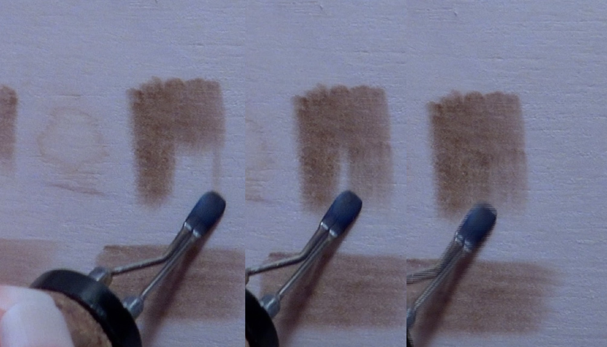 First, extend the color. This is the same thing we did with the second example we did. Now let’s fix the problem.
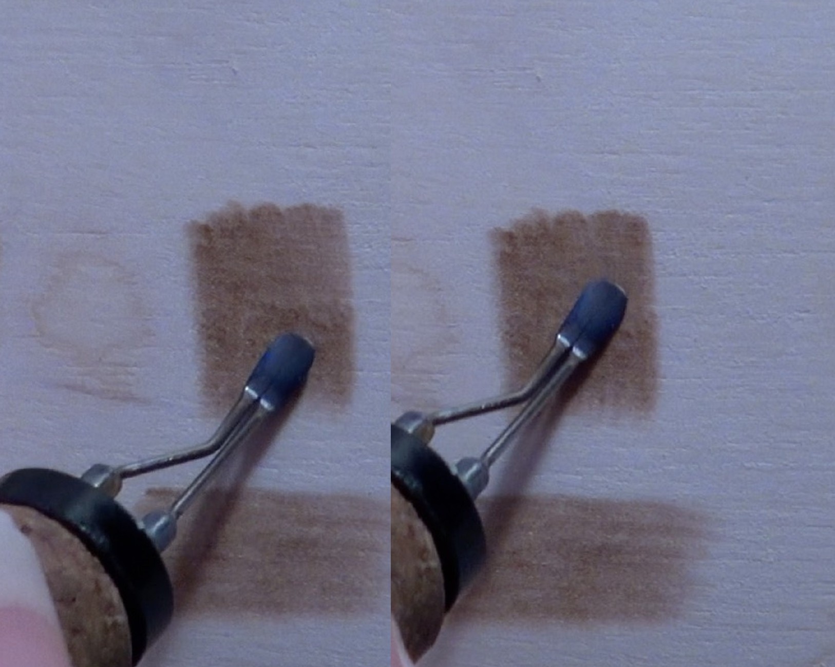
This is done by reburning over the patch, but avoid reburning over the horizontal dark band that formed.
Be careful as you burn. If you aren’t really careful, it will make even worse.
 Here’s a close up of example 4. The horizontal band is gone. The color isn’t perfectly uniform, but there are three main reasons for that.
One – I’m burning on plywood.
Two – I’m burning against the grain.
Three – I wasn’t trying that hard since this is just a demo. Hey, that’s excuse may be lame, but I’m sticking with it. 🙂
GRADIENT COLOR EXAMPLES
 Now that we understand how to create solid uniform color, let’s work on creating gradient color.
Again I have 4 examples, but this time each one was created differently. I can’t tell you that one method is better than another, so I recommend trying them and see what works best for you.
Example 1
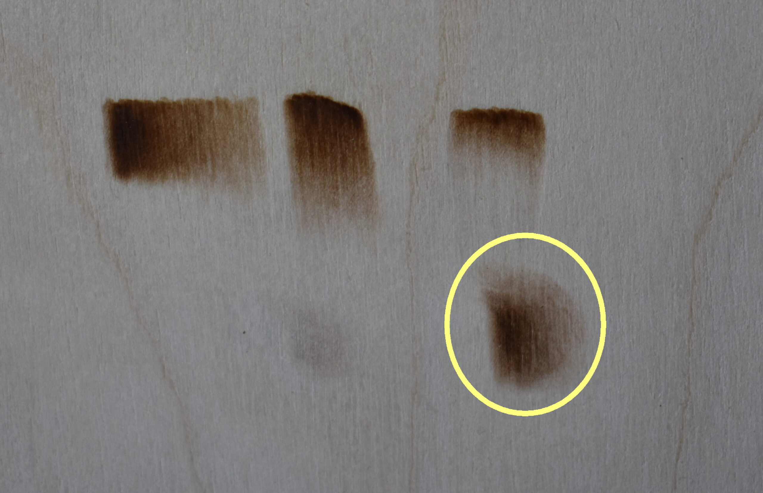
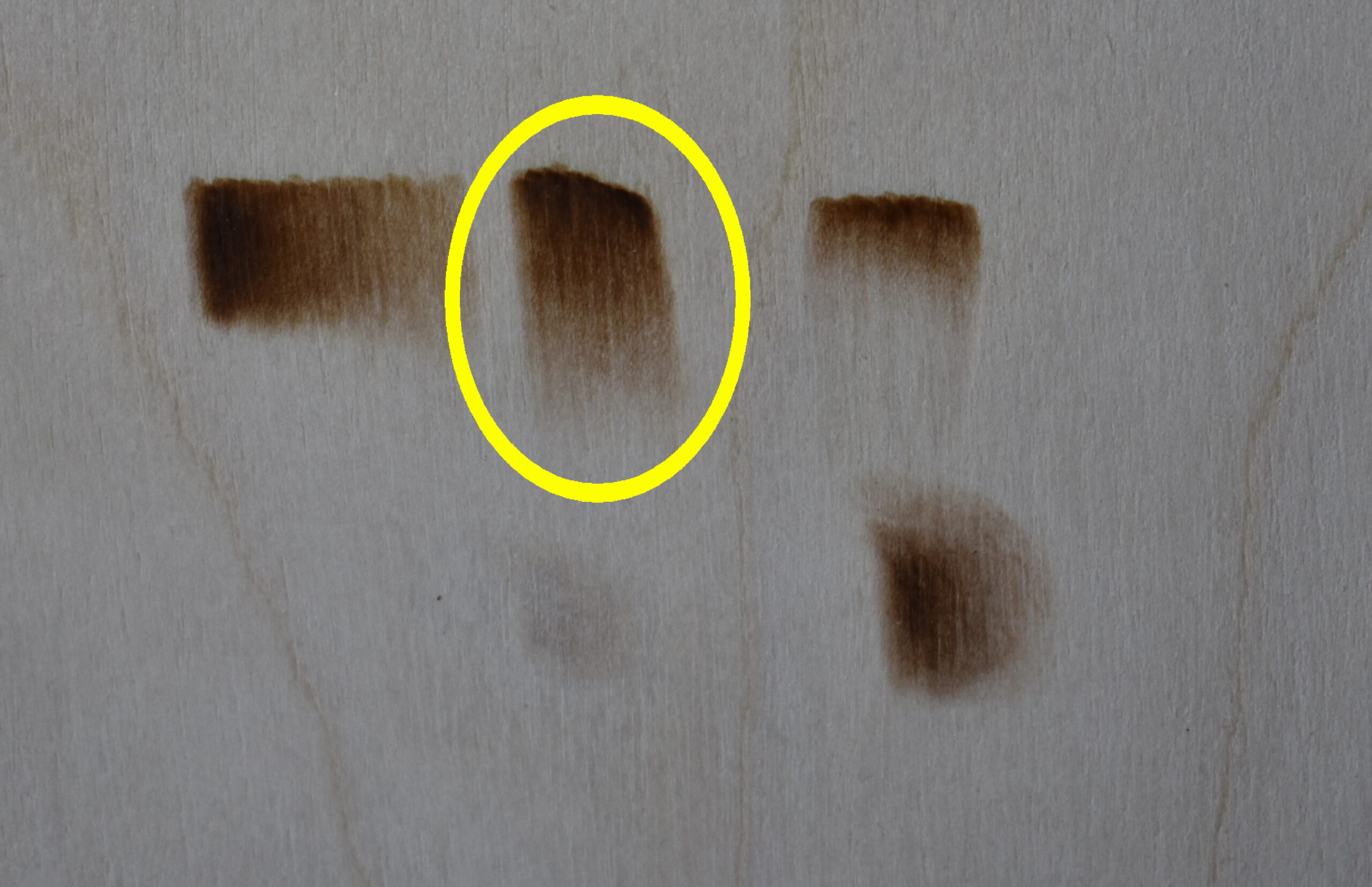 The first example is vertical gradient shading. The example I will be explaining has a yellow circle around it.
Sorry that these don’t go from left to right, but I didn’t burn them on the board that way. Since the video will show them in this order, I decided to keep the blog ordered the same as the video.
 Begin by burning in a block of solid semi-uniform color, but let the color fade a bit at the end.
This is done by increasing your hand speed towards the end of the burn stroke.
How much you want the color to fade is up to you. This is controlled by how quickly you move your hand towards the end of the burn stroke.
 Next, start re-burning over the block of color, but this time make the strokes longer than the first set of burn strokes.
Again speed up your hand towards the end of the burn stroke so the color fades a bit at the end.
Notice how the color is darker along the top where it overlaps the initial burn strokes. This is the start of the gradient color.
 Continue to re-burn over the area to build up the color.
There are two things you need to do. 1) Always start the burn stroke at the top of the color patch. 2) Let the color fade at the end of the burn by increasing your hand speed.
This combination does two things. First, the top of the area has more layers of burn strokes, so is darker. Second, the bottom of the burn was done at a faster hand speed, so the color is naturally lighter in value.
The down side of this method is that if you need the area to be longer, then burn strokes need to be longer.
 Often I will re-burn short burn strokes along the top of the patch so it is a nice dark color. Keep in mind that having a really dark top isn’t something that is always needed. It really depends on the application.
I only included this little tidbit as bonus information.
Example 2
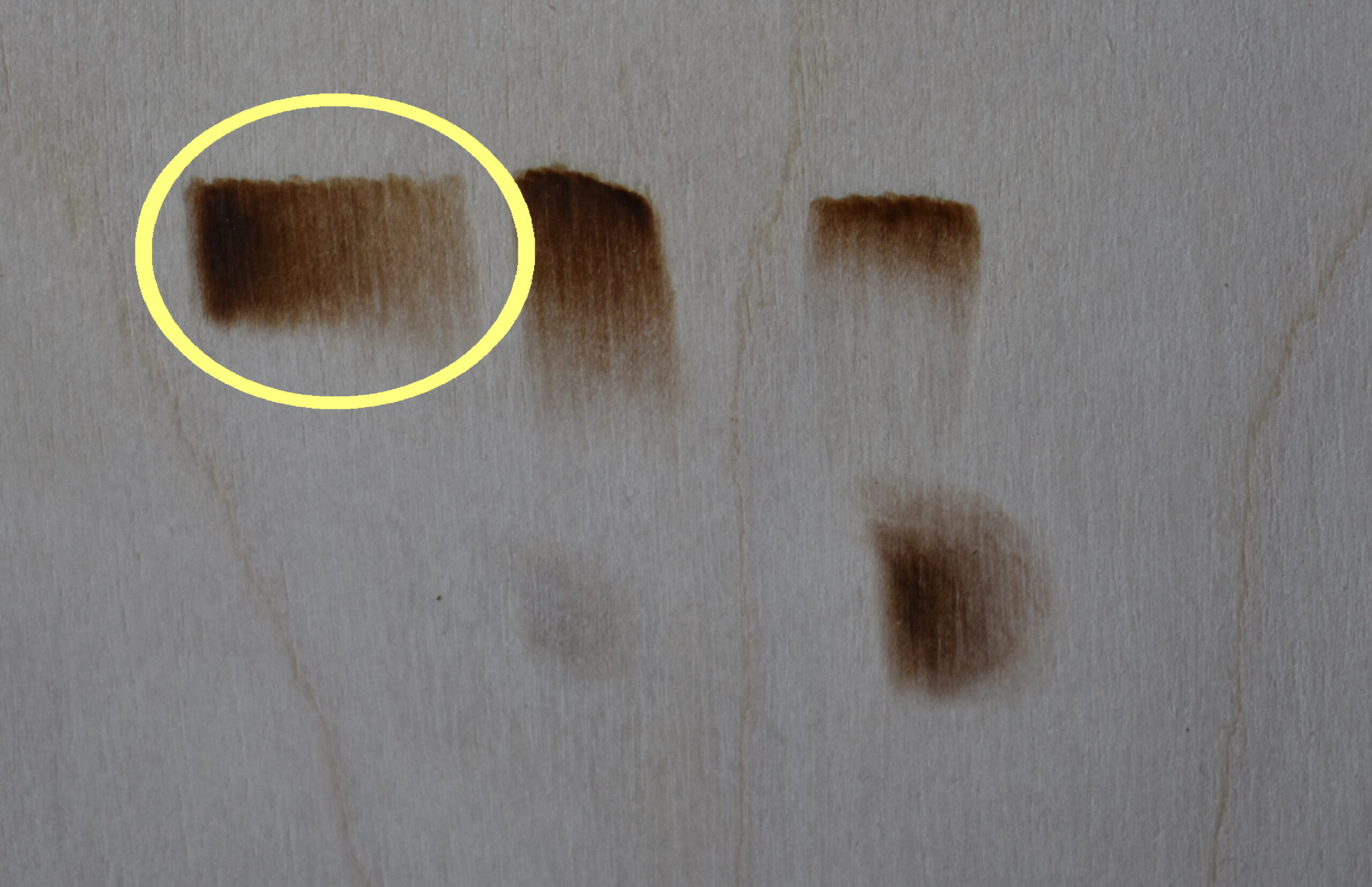 For example 2 we will do horizontal gradient shading. This is another example that relies on reburning. In fact, it requires a lot of reburning.
The benefit of this method is that it is easy to scale up for larger areas.
 Begin by burning a patch of uniform color.
The patch can be any size you desire. For some reason I tend to work small sections at a time even when I’m working in large areas.
Guess that is just one of my many quirks. 🙂
 Next, start re-burning over the patch. I like to start reburning over the fourth or fifth original burn stroke. Unless the area is really small, then I’ll pick the second or third original burn stroke.
You need to reburn over the entire rest of the color patch.
 Now repeat the reburning process, but the starting point changes. If I started on the fourth burn stroke for the 2nd reburn, then I’ll start on the 6th burn stroke for the 3rd reburn.
 If you decide you want the patch to be longer than the original patch you started with, then add more burn strokes at the end.
Then reburn over the new burn strokes until the match the left edge of the original patch. Afterwards, start reburning over the burn strokes just like we had been doing.
Example 3
 Example 3 is vertical gradient color again, but this time we’re using really short strokes. The burn stroke we’ll be using is one I call pull away strokes. I only use this method in small areas like flower petals. It doesn’t work well in large areas; at least I don’t think so.
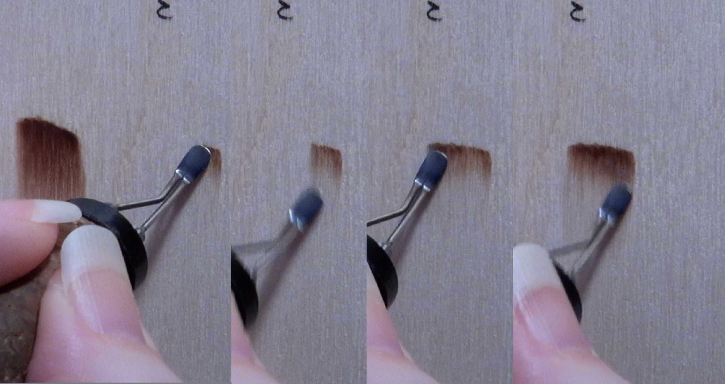 Start the stroke on the upper edge where the color is going to be the darkest. Pull-away strokes ALWAYS start on the darkest part of the stroke.
The pull pen quickly straight down. This cause the color to start dark, but fade quickly. Do not use a constant hand speed. How fast you move your hand will determine how long the color lasts. The faster your move, the quicker the color fades. The opposite is also true. The slower you move your hand, the longer the color will last.
Each new pull-away stroke should be touching or even slightly overlapping the previous stroke.
Re-burning over the area will smooth out the color, and, if desired, you can extend the color a little.
Example 4
 The last example relies on circular motion to extend the color out from a patch of uniform color.
 Circular motion is exactly like it sounds. You are burning a continuous chain of loops. I don’t burn in a straight line like the image shows on the far right. The straight line just makes it easier to see what is happening. Instead I let the pen meander around. This is being demonstrated by the burn I’m currently working on.
You can have open circular motion. This means you can see the underlying wood between the loops on the burn stroke. This is demonstrated on the far right.
Closed circular motion is the other option. This means you can’t see the underlying wood.
This demonstration relies on closed circular motion. I should also mention that circular motion tends to create irregular color.
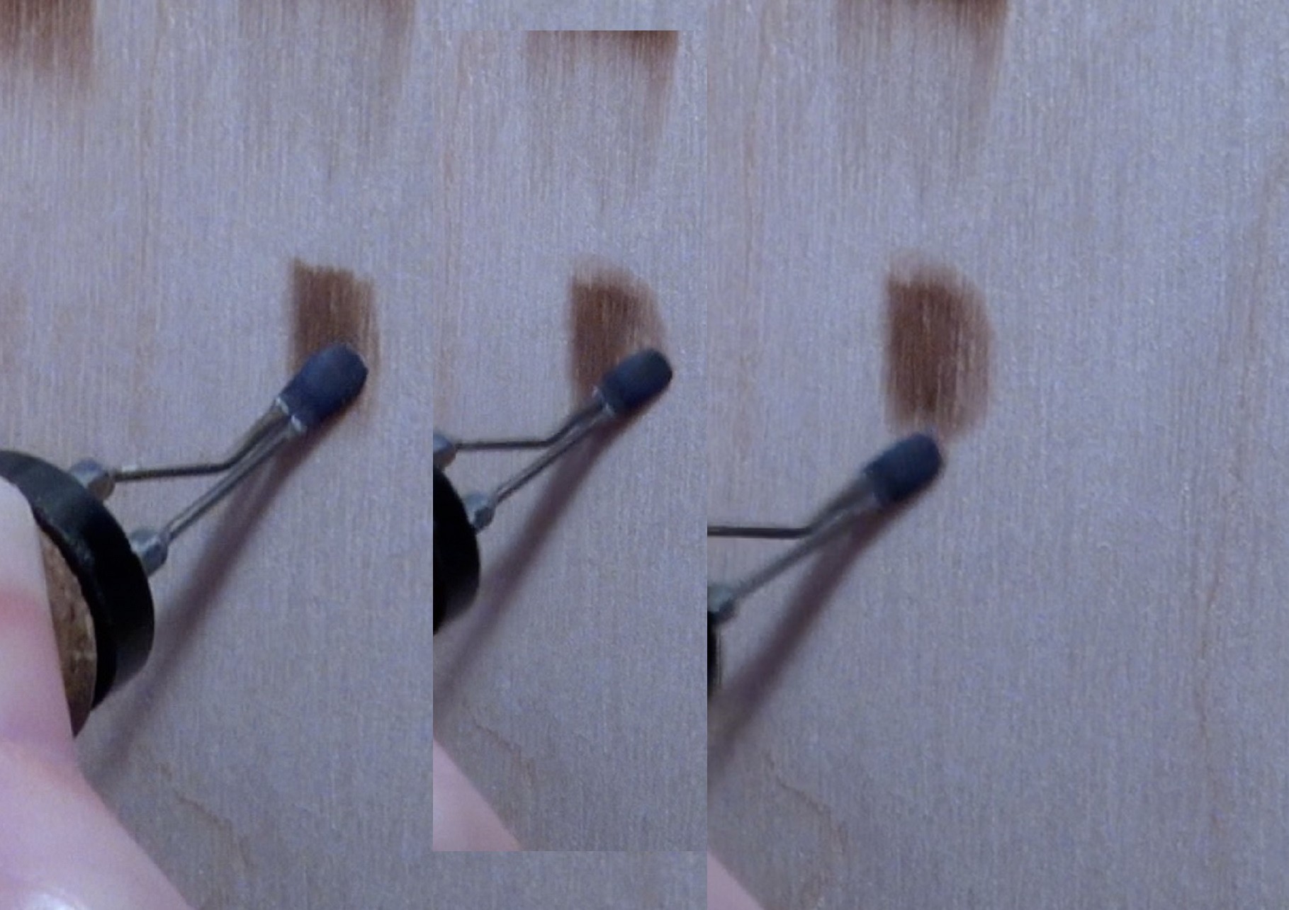 First burn a patch of uniform color (far left). The patch is the darkest area on this method of gradient color, so re-burn as often as needed to get it to the desired darkness level.
Then start burning around the patch using circular motion (middle).
Work your way around the patch using circular motion. Note that you only burn circular motion in the areas where you want to extend the color. In this example I choose not to extend the color along the left side of the patch (right).
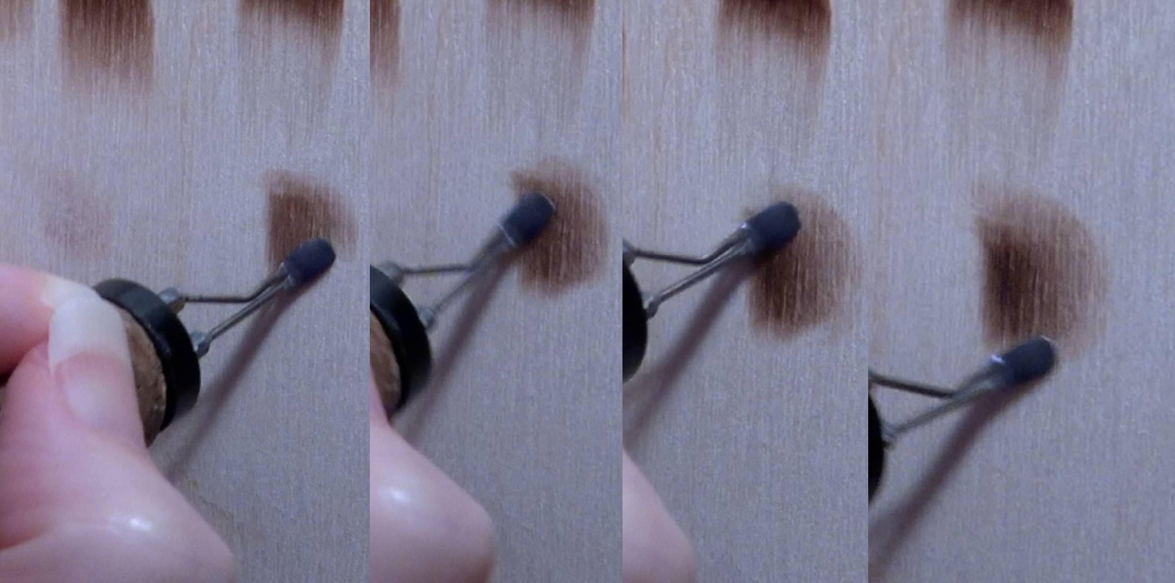 Make sure you overlap your burn strokes on the uniform color patch. You’ll need to re-burn over your circular motion burn strokes several times to edges of the uniform color patch.
Once the uniform patch edges have been blended, then start extending the color again. Like before, you burn around the area making sure to burn both in a new area and slightly over lap your last burn area.
Producing gradient color with circular motion is the hardest of the different gradient shading methods to master. I do use this method when I need something doesn’t have clearly defined ending edge (left edge excepted in this example).

An example would be the folds on the robe of this statue. The darkest part of the fold has a clearly defined edge, but there isn’t a clearly defined edge where the color fades away.
IN CONCLUSION
That is it for this blog. The ability to burn smooth uniform color is important and so is gradient shading. I hope that I was able to offer some tips and techniques to help you improve your pyrography skills. I love hearing from you, so leave a comment and let me know what you think. Like I said near the beginning of this tutorial, I worked really hard on this blog, so please let me know what you think. Did the tutorial help and answer your questions? Was the information understandable? If it wasn’t what do I need to clarify? Also if you have ideas for future tutorial leave a comment and let me know.
Until the next blog,
Brenda
Feb 22, 2019
Revised May 16, 2026
Want to subscribe?
- Click on the “Leave a Comment” field at the end of any post (blog) and a subscribe option will appear.
- Put something in the comment field (if you put “test” or “just subscribing” I won’t make your comment public)
- Fill in the sections for your email address and name, and then click on the “notify me of new posts via email.”
- You will get a confirmation email from WordPress confirming you want to subscribe.
- Click on the confirm button in that email and you’re done.
Please note that I do not send out emails. If you have a WordPress account there is a way to subscribe within the WordPress system, but I cannot provide specifics on how it works as I don’t know.
Hi Brenda can you please let me know what you think about what way I should get my D shader bent? I am having difficulty making it do what you make it do but you are also left handed so I was wondering if I bent it in the opposite direction of yours if I may get better results with it? I know you do not recommend personal bending but I have and extra set of 5 tips I got by accident when I ordered me pro ii so I do not mind taking the chance with that tip because I am having no luck with it like it is now.i did bend my J shader like yours and it works great. Thanks for all you help with the tutorials you do I have learned a lot from you. Have a blessed day!
I would have to honestly say that I never thought about it. I’m not even sure I bend all of mine the say way.
I know I prefer to use the short edge, and I tend hold my pen so I’m using the right edge. If you burn the same, then you’d be using the left edge.
The only thing I can recommend is equip the tip and hold it so it lays flat on the board. Then check to see which direction makes it so that the short edge is on the left edge, and bent it that way.
Thank you I will do that.
I did what you suggested and it was very successful. Thanks so much for your advice. It really made my burning much smoother and uniform. You are the best! Happy holidays.
That’s awesome! Glad the techniques worked for you.
Happy Holidays!
Brenda you are a wonderful teacher and I understood all that you were teaching about shading and gradient also uniform color. I believe you have found your true calling in life. I live learning from you. Keep up the great work please. God bless and Happy Holldays to you.
Thank you for the lovely comment. I’m glad my website is helpful.
Happy Holidays to you too!
Hi Brenda,
This is probably the wrong tutorial, but I can’t remember where I read your comments about white charcoal pencil many months ago. This may seem like a silly question, but how on earth do you sharpen the charcoal pencil. Sharpeners just seem to keep breaking the tip. I have resorted to an exacto knife and sandpaper, but was wondering if there is a better method?
Thanks,
Marlies
Hi Marlies,
I occasionally have that problem, but only if my sharpener is getting dull. I have a tendency to buy really cheap sharpeners and expect them to last forever. They don’t. I’d suggest trying a brand new sharpener. Hopefully one where the pencil just fits. I think if there is too much room it’s hard to hold the pencil without angling it and that will cause the tip to snap too. I won’t bother mentioning how I know this. 🙂
LOL, thanks, I won’t ask!
I’m gobsmacked by the quantity and quality of the tutorials you create (to say nothing of your artwork!). Thank you so much for sharing your craft and passion with the world.
Hi Rose,
Thank you for the wonderful comment! Pyrography is my passion and I’m having a lot of fun.
Hopefully people will find the tutorials helpful.
Brenda
Hi Brenda,
All your teaching information is fantastic, and I love all the pyrography art you have created!! I’m embarking on a pretty complex project as my first attempt, but I better practice A LOT, as you make it look so easy, that I’m kidding myself into believing how well I’ll do right from the start. But I do have a timeline of three months, which should help. Thanks so much for making all of your material available!
Thanks,
Marlies
Hi Marlies,
your project sounds exciting. The best advice I can give you is to take your time and breakdown the subject into small sections at a time. The other advice I’d give is don’t burn too dark at first. I think one of the most common mistakes all of us do when we first start is turn up the heat and try to get the job done quickly. I’ve learned that high heat is a lot harder to control, so now it’s lower heat and lots of reburning.
Thank you so much for your wonderful comment and good luck with your project!
Brenda
Thanks for the great advice, Brenda! I will most definitely do what you say.
You have taught me such already and I can’t wait until I go onto the next lessons.
Hi Connie,
I’m so glad to hear that. I love pyrography. It’s such a wonderful medium to work in and I love that others are wanting to create pyrography art too! I hope that you will enjoy pyrography as much as I do. Thank you for the lovely comment!
Brenda
Hi Brenda, Viewing your excellent tutorial again, to help perfect my shading. You certainly cover every possibility.
many thanks.
Roy C.
Hi Roy,
thank you. I tried to cover the major stuff without writing a book. 🙂
Glad you’re finding the information useful!
Brenda