 In this blog I will explain several different ways to create three dimensional letters; including one point perspective. At some point in time, it seems like all pyrography artists create signs, or add sayings to their artwork. My goal with this blog is to provide ideas that might help make your signs stand out or look unique.
Before we get going, I want to mention that you may see several different pen tips being using. I have purchased some handsets that were not made by Colwood. I need to get familiar with these handset and pen tips, so I use them on demonstration projects like this one.
 Click on the image to the left to watch a YouTube video version of the tutorial. You can also click on this link to watch the video: https://youtu.be/jveeLEMfJZQ
Where to Get Fonts
 A very obvious option is to use a stencil. There are a lot of stencils available at craft stores, art stores, and numerous places online. There is a wide selection of font styles and sizes to choose from.
 Another option is to use a word processing application. Applications of this sort tend to have a lot of fonts to choose from, and a number of them allow you to enter a custom amount for the font size.
To do this, just try typing the font size you want in the drop-down box. Then press enter.
Not all word processing application support this, but I do know that Microsoft’s Word program does.
 If you don’t have a word process program, there are numerous free font generators online.
I’m not going to recommend any particular one because I don’t use them.
1001 Fonts was the first search result that appeared when I googled “Free font generator.” It has a spot where you enter your desired message to text for the sign. Then you can scroll through the results to find a style you like. There is even a slider bar to change the size of the font.
 Most the free fonts I looked at had the option to type in a style of font. For example, I typed in “scary” and what you see are the results of that query.
What I don’t care for with 1001 Fonts’ site is that they want you to download your font results.
I personally wouldn’t do that. Instead, I would copy/paste it into a word document and print it from there.
For some reason I didn’t think to search for 3D font generator until just now. I had already written this blog and created the corresponding video. When I did an internet search, quite a few site showed up, so they do exist. Most likely, you can do a search for whatever font style your after.
How Every Style of Lettering Begins
Every single style of 3d lettering I explain in this tutorial begins the same way – the letters are transferred onto the board. I will be doing all of my demonstrations on watercolor paper, but I will often refer to it as the board since most of you would be burning on wood. There are two main methods for getting the letting onto the board.
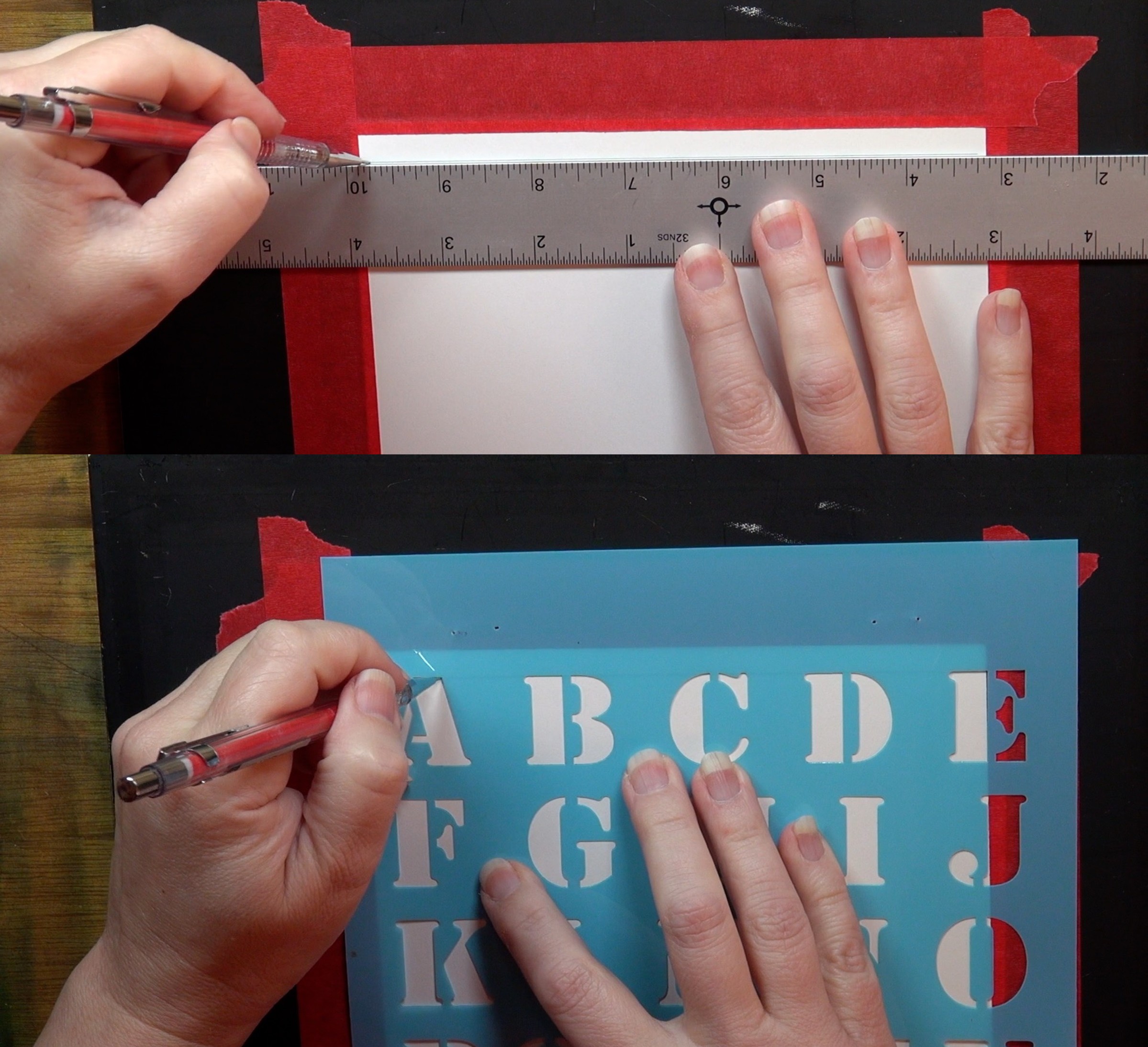 I use a straight edge and draw a guideline on the board.
Then I align the stencil letters with that line, and tracing in the letters I need.
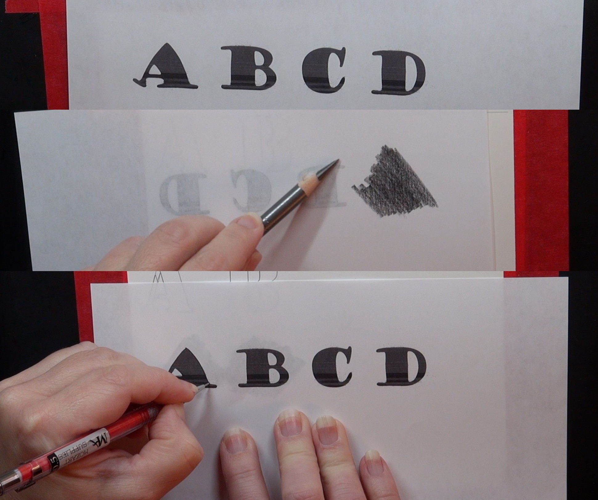 If using a word document or online font generator, then print out the letters or words onto a plain piece of copier paper.
Flip the print out over and coat the back with graphite. Or use graphite transfer paper (aka carbon paper).
I only coat the area with a letter versus the entire backside of the paper.
Next, position the printout graphite side down onto the board and trace over the letters.
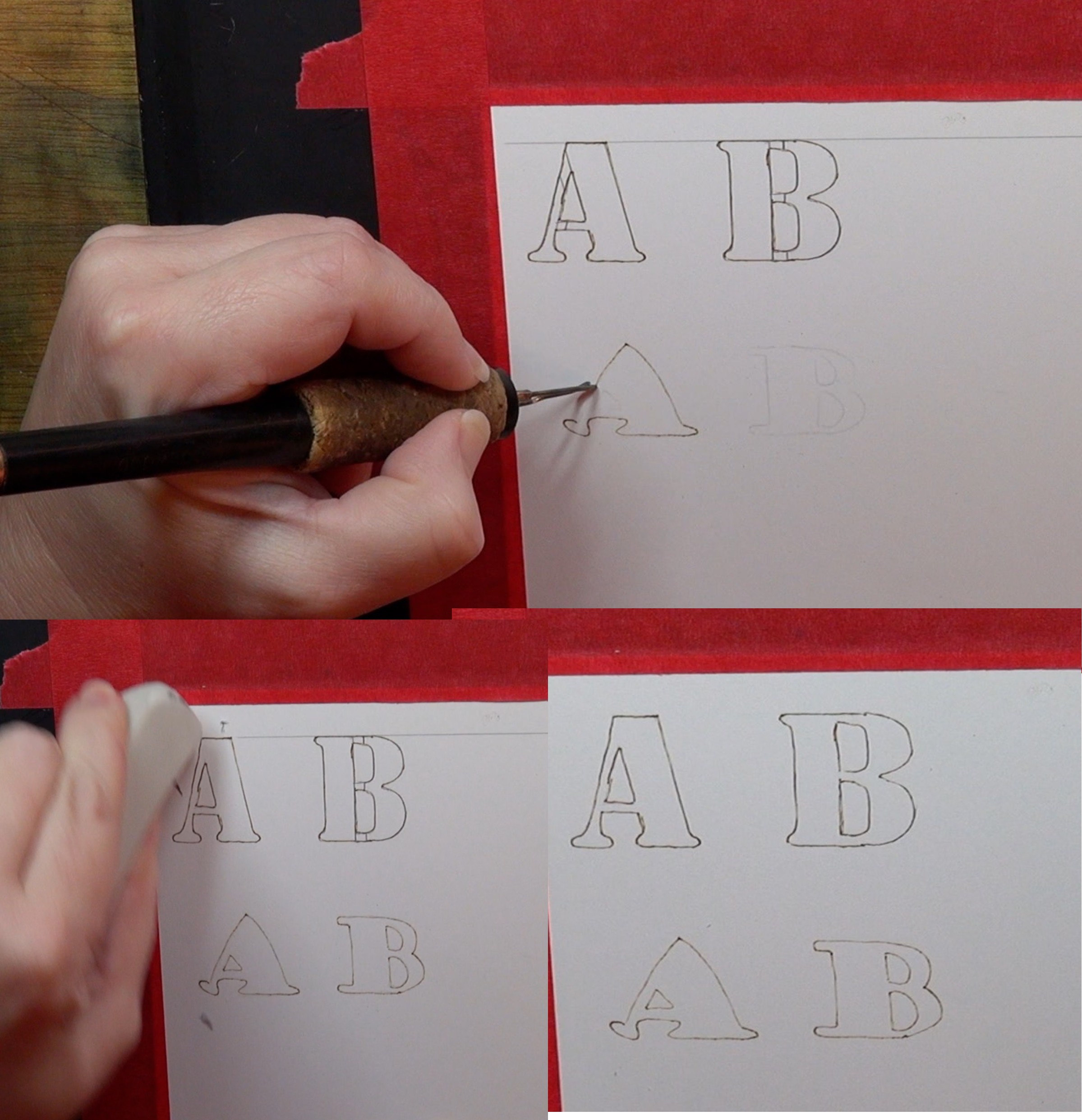 After the lettering is in place, then use a writer pen tip, and burn around the edges of the traced letters.
I want to point out that I close the gaps on the letters created with a stencil. This looks nicer, and makes it less noticeable that a stencil was used.
Once you have burned around the edges of the letters, then rub over the letters with a pencil eraser to remove any residual graphite.
Now the letters are ready to be turned into a 3d letter.
Puffed Letters
 The first style of 3d letter I will explain is the puffed letter. This style looks like it is sticking up from the surface of the board. I call it puffed because that is much quicker and easier to say than “sticking up from the board surface.”
This style relies on pull away strokes. Pull away strokes are short burn strokes that start darker than they end, so they create gradient color.
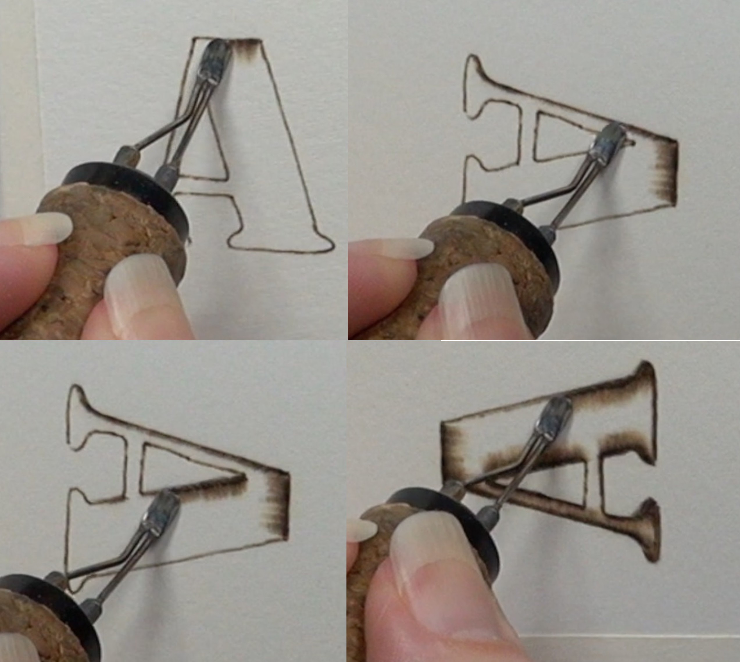 Always start the pull away stroke on the outer edge of the letter, and pull it towards the center. The outer edge will end up being darker and the center lighter. This contrast is what gives the letter a puffed appearance.
Rotate the board as needed, so you are always pulling the pen tip down towards yourself. Burning in this direction makes it easier to control the results so the burn strokes are consistent.
When working on wider areas of the letter, increase the length of the burn stroke.
As you burn, slightly overlap the burn strokes. This will help smooth out the results by making it harder to see individual burn strokes. Re-burning over the area will also help. Plus, that will further darker the edges.
 After all of the edges of the letter are burned along, and lightly burn over the center of the letter. Use any burn stroke you want for this. I used either uniform strokes or circular motion.
 It might be easier to draw in where you want your highlight or pale area to be on the letter. Since I’m burning on watercolor paper, I’m using a graphite pencil to mark my highlight.
If I were burning on wood, I would use white charcoal instead of graphite. White charcoal shows up better on wood and it will resist the heat of the pen tip. It won’t block it completely, so try to avoid burning over it.
Here’s an affiliate Amazon link to General’s white charcoal: https://amzn.to/3a3GFfq
After the highlight is marked, then burn pull away strokes along the edges. Stop the burn stroke once you reach the marked highlight.
Keep in mind that it is completely up to you where you put your highlight. It can be in the center of the letter, or closer to one of the edges.
 The only thing I recommend is keeping the highlight location the same on all of the letters when creating a sign. Otherwise, it tends to look off.
 Here’s how the letter looks once I was done. It might be hard to tell, but the burn strokes do not overlap onto the pencil highlight.
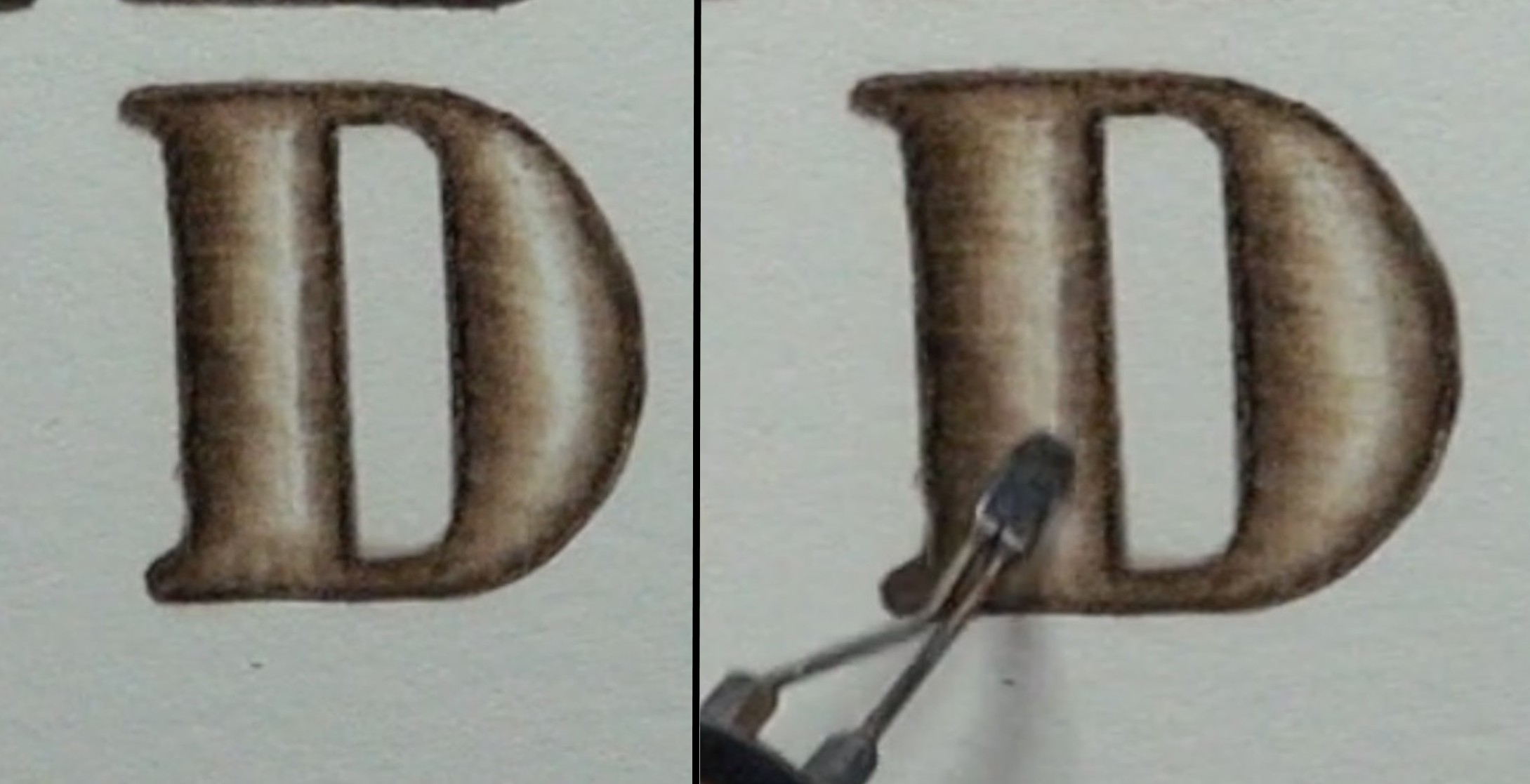 Now you just need to erase the graphite or charcoal, and burn over the highlight on the letter.
It is up to you how dark you burn this area.
The only thing I will mention is that the darker it is, the flatter the letter will appear.
Or to put it another way. The less contrast there is between the edges and the highlight, the flatter the letter will appear. The greater the contrast, the puffier the letter will appear.
I do want to point out that this style of letter doesn’t look as good on thin letters. At least I don’t think so. If your letters are thin, then make sure to keep your burn strokes very short. It might be helpful to use a writer pen tip to darken up the edges. That would increase the contrast.
Freehand Letters
 Now I will explain how to create freehand 3d letters.
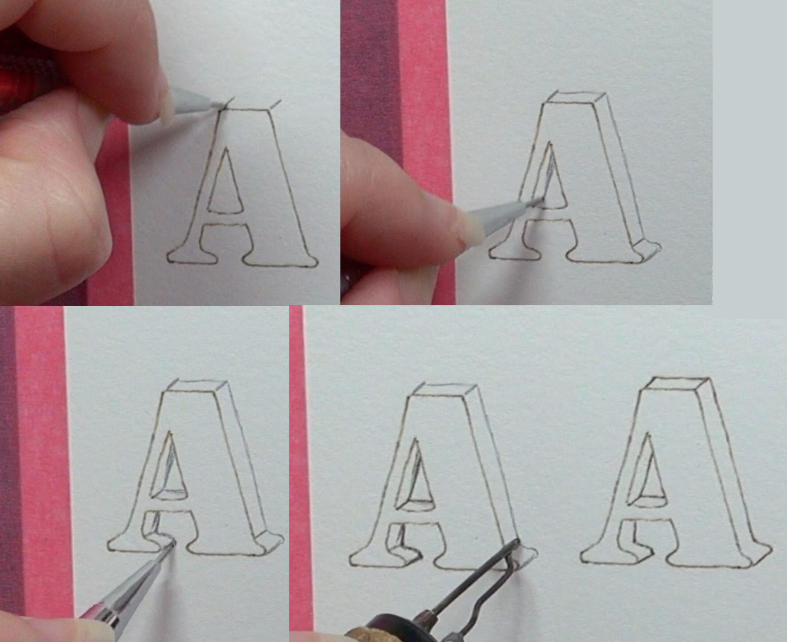 Start out with the front of the letter drawn and the edges burned in.
Next, start drawing short angled lines along the corners or direction changes on the letter.
Then draw a line connecting the outer tips of those lines.
As you draw the line, do your best to keep the line the same distance from the letter front.
I do want to mention, that if you don’t like how the sides of your letter looks, then erase it and try again. Since the edges of the letter fronts are burned in, they won’t get damaged.
Once the lines are in place, then using a writer pen tip to burn along the outer edges of the side of the letter. After the pencil lines have been burned over, then use an eraser and rubbed over the area to remove residual graphite.
 With this type of letter, I often keep things simple and burn it to a uniform color.
Since there isn’t a texture to be created, you can use any burn stroke you want.
As long as all of the letters are burned the same way, it will look good.
Make sure to rotate the board as needed so that the edges stay crisp and clean.
 I always make the front of the letter lighter in color than the sides. The reason is that lighter colored objects appear closer to the viewer; darker objects appear further away.
Since we want the sides to appear further away, making them darker in color will help create that illusion.
 Again, you are in control of the angle you want the sides of the letter to have.
In this composite image shows the letter ‘B’ drawn with different angles.
The top image shows the letter with the sides angled towards the left. The bottom images shows the same letter with an opposite angle direction.
What makes this method very flexible is that you can erase as often as needed until the sides look the way you want them to.
 You are also in control of how thick or deep the sides of the letters are.
Probably the hardest thing with this method is keeping the angle and depth of the letters the same on a sign. That’s why I don’t make very deep letters using this method.
 The nice thing with this style of letter, is that it works well regardless of how thick or thin the front of the letter is.
Offset Letters
 The next style of 3d letter I will explain is offset. This style almost identical to the previous method. What sets it apart is how it is created.
This is the only style of letter in my blog that requires a different method depending on whether you are using a stencil or a printout.
I will start by explaining how to do this method with a stencil, and then I will explain the printout method.
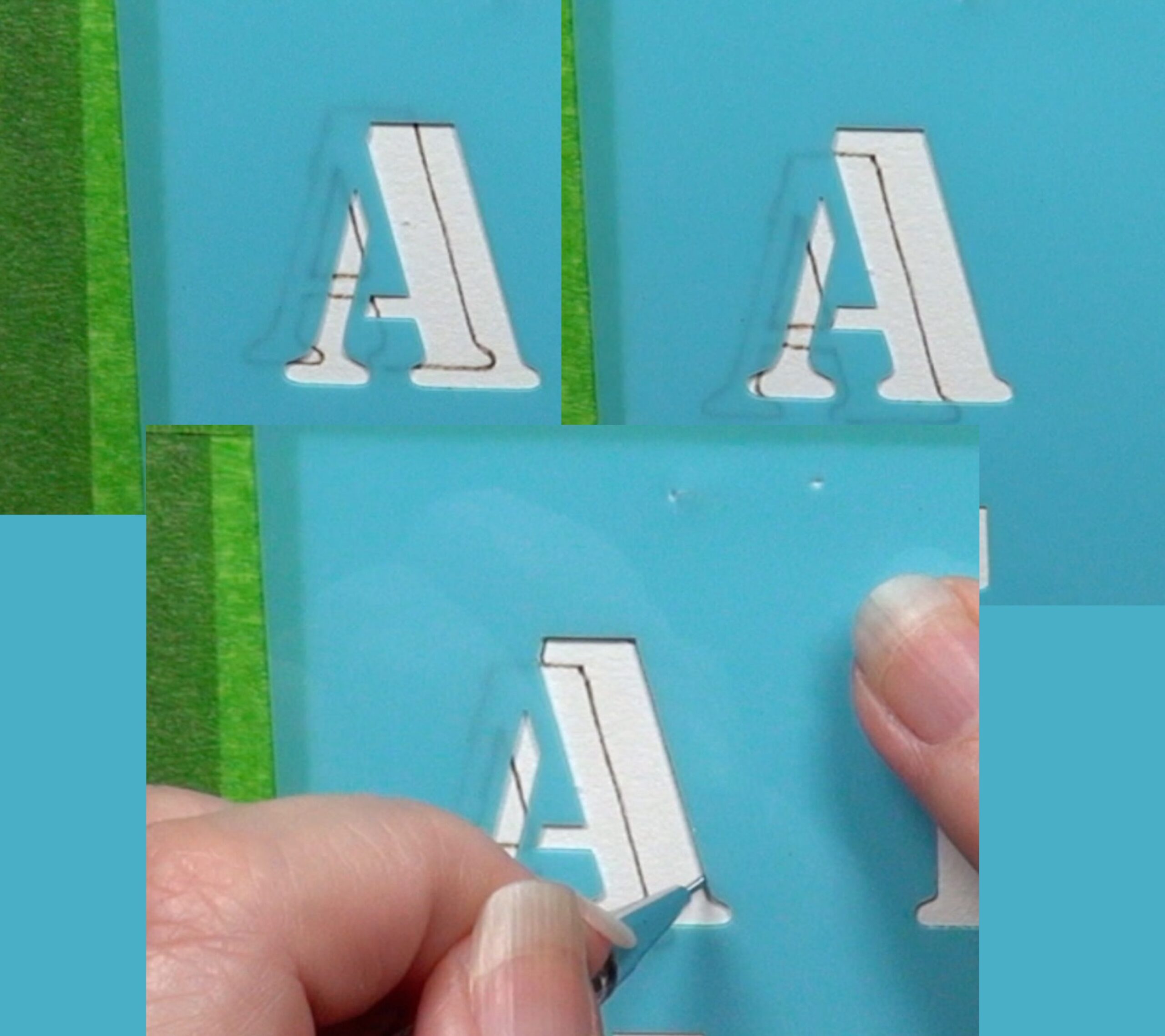 First, trace the letter and burn in the trace lines. This is the same basic step we have done with every single letter style. Now, place the stencil over the letter front. Move the stencil around until it’s at an angle and distance you like from the burned letter.
Note: you need a translucent or semi-translucent stencil for this.
Once you’re happy with the stencil position, then trace in the letter. It’s okay if you overlap onto the front of the letter, but if possible I would avoid doing so.
 Here’s how my letter looks so far.
You can see that I stopped drawing any line that overlapped onto the letter front.
 Now draw angled lines that connect the edges of the letter front to the back of the letter.
 The red arrow is pointing to one of the lines that needs to be ignored when you burn over the trace lines. The reason is that this line will not be visible once the letter is burned in.
Another example is the line that the yellow arrow is pointing to. Again, this line or edge will not be seen. I find it makes things easier by erasing all of the unneeded lines before burning along the outer edges.
 Use a writer pen tip and burn along the outer edges of the letter. If you didn’t erase the lines that wouldn’t be seen, then it is import to ignore them as you are burning along the outer edges of the letter.
The letter on the right side of the image is how the letter looked after I burned along the outer edges, and rubbed a pencil eraser over it to remove any residual graphite and unneeded lines.
 Like all of the lettering, you are in control of the angle direction and thickness of the letter.
You probably noticed that I tend to angle my letters towards the upper right. For some reason I like that angle direction.
Here’s the letter B. It starts out like all of the previous letters. I place the stencil over the letter, moving it around until it’s at an angle and distance I like (upper left). Then I trace in the letter (upper right).
I do want to point out that I did not avoid drawing over the letter front like I did with the previous letter.
Next, I drew in the connecting lines (lower left). The letter looks a touch cluttered. That’s why I prefer to avoid drawing over the letter front, but that option is not always possible.
Lastly, the lower right shows the letter after the outer edges were burned in, and the unneeded pencil lines erased.
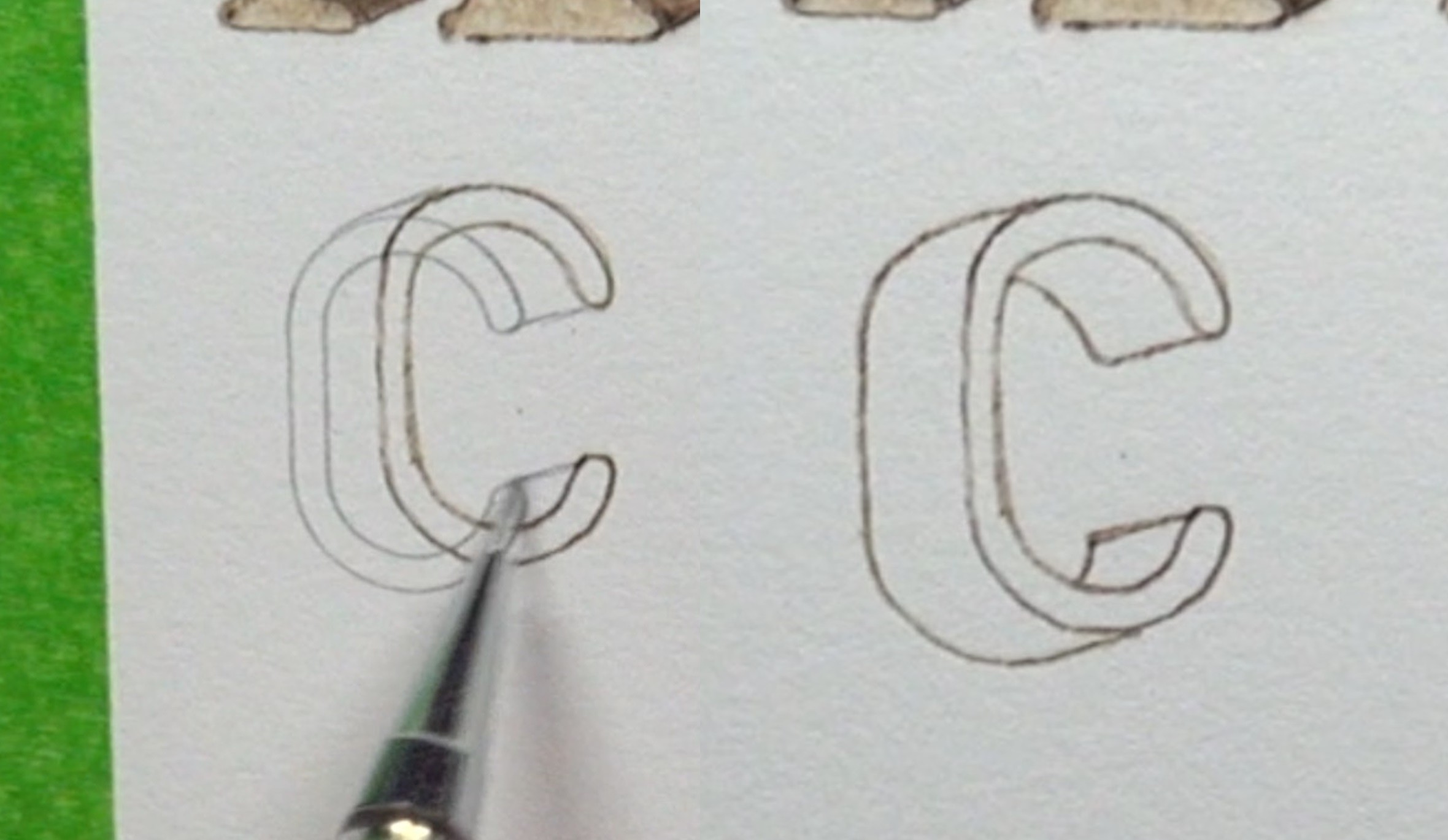 Just like the freehand style of letter creation, the offset method works with thin and thick letter fonts.
 Now let me explain how to use a print out.
Above the black line are the letters I plan to use. The letters were printed on plain copier paper.
Below the black line, I’ve got a straightedge aligned along the tops of the letters on the printout (a red arrow is pointing to the top of the straight edge). Again, I’m drawing the line on the copier paper printout, not the board the letters will be burned onto.
 The top image shows the printout after a line was drawn along the top of the letters. This line will be used as a guideline to align the printout on the board.
The bottom images shows me trimming down the printout to make it easier to work with.
I left a slight border around the letters.
This is an optional step, but I find it helpful
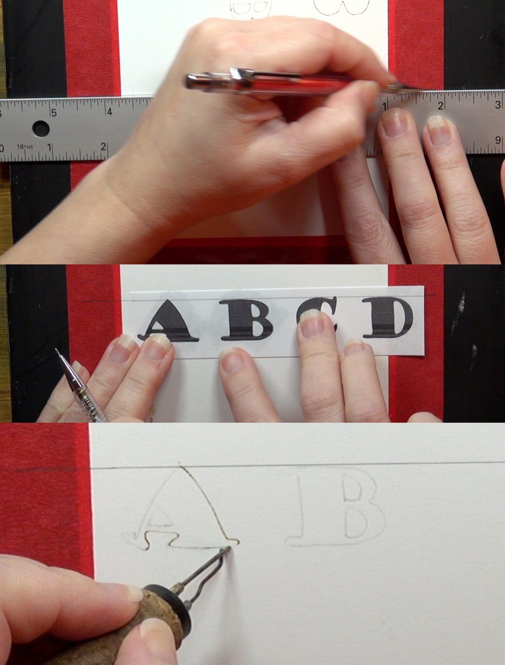 Now, draw a line on the board where you want your letters to be. Make sure that the line extended well past where the letters will be. (top image)
Now match up the line on the printout with the guideline on board. Secure the printout to the board, and trace over the letters. (middle image)
Then burn around the edges of the letter front, and rub over the area with an eraser. (bottom image)
 Draw guideline on the board where you want the back edge of the letters to end. A green arrow on the right is pointing to the line I drew.
Next, draw a line that connects the leftmost upper edge of the first letter with the guideline. This line needs to be drawn in the angle you want the sides to be. A yellow arrow is pointing to the line I drew.
Draw a vertical line that extends from the guideline. Make sure the line is drawn in a direction that will be seen, and that it is long enough to be seen past the printout. A blue arrow is pointing the line I drew. This line will be used to help align the printout to the board.
 Place the printout on the board. There are two things that the printout needs to be aligned with.
1) The horizontal guideline needs to match with the line on the printout. A yellow arrow on the left is pointing to the aligned guidelines.
2) The first corner on the first letter needs be to aligned with the vertical line. A green angled arrow is pointing to the spot on my printout. Since my first letter was the letter ‘A’, it only had one corner.
 After the printout is aligned secure it to the board, and trace over the letters in their entirety. There will be places where the back letter overlaps onto the front letter. That is okay; especially since it can’t be avoided.
Now draw the angled lines connecting the corners and/or direction changes of the letters. You can erase any lines that won’t be visible on the final letter.
 Use a writer pen tip to burn around the outer edges of the letter side.
Ignore all lines that overlap onto the front of the letter, and lines that won’t be visible.
Here’s how my letters looked after I burned around the edges, and rubbed over them with a pencil eraser to remove the unneeded lines.
One Point Perspective Letters
 The last style of 3d lettering I will explain is one point perspective. Of all of the letter styles, this one is probably the most impressive looking. In many ways it’s much easier to do than the other styles.
 Draw a perspective dot where you want your letter to start from, or disappear into. This dot is where the sides of the letter will be angled towards. A yellow arrow is pointing to my dot.
Be aware that this dot can be placed as close or as far away as your want. The dot can also be place anywhere around the letter.
 Next, begin with the side of the letter closest to the dot.
Use a straightedge and draw a line from the corner of the letter to the dot.
Work your way around the letter checking every corner or direction change with the ruler.
If the line will be visible, then draw it. Otherwise skip over it and check the next corner. One more thing. Stop drawing any line if it should touch the letter front.
 Here’s how my letter ‘A’ turned out. Look at the lines along the of the letter. I have two arrows pointing to them.
The yellow arrow on the right shows a line that doesn’t touch another spot on the letter front, so the line extends from the corner of the letter to the perspective dot.
The blue arrow on the left touched another spot on the letter front, so that line ended at the point of contact.
 If desired, you can shorten the sides of the letter by adding lines where you want sides to end at.
 Something I’d like to point out is that the perspective dot does not need to be located on the board.
A yellow arrow is pointing to the dot I placed off on the board or surface I’m burning on. Since the supporting board is dark, I used white charcoal to draw the dot.
 Even though the dot is located off the board, nothing changes. Use a straight edge to draw lines between the dot and the corners of the letter. Again, only draw the lines that will be visible.
 This last example starts out the same as the others by drawing in the perspective dot.
 Now use something that has a curved edge on it.
I will be using a very inexpensive protractor instead of a straight edge to draw the line.
Here’s an Amazon affiliate link to an inexpensive protractor and compass set: https://amzn.to/47vFKwy
 Align the protractor with the perspective dot and a corner of the letter. Then draw the line.
Work your way around the letter checking each corner or direction change to see if the line would be visible.
3D Sign
 In this section, I will briefly cover how to create the 3d letter sign I did.
 Trace you sign saying and burn along the edges of each letter.
This is exactly how all of the letter styles have begun.
Then mark your perspective dot. A yellow arrow is pointing to the location of my perspective dot.
Next, start with the letter that is closest to the perspective dot! Use the straightedge to draw lines connecting the corners on the letter with the perspective dot. Draw in the lines for the remaining letters in that row.
 After you finish the first row, then work on the next row (if there is one).
Make sure to stop drawing any line if it touches any other letter, or another spot on the current letter. Working in this fashion will make it a lot easier to see each individual letter, and know what lines go with each letter.
 Afterwards, burn over the pencil lines. The rub over the letters with an eraser to remove any residual graphite.
 I highly recommend creating a pencil version of your sign before you start burning!
This will give you a better idea of how you want your sign to look. The pencil version is easier to make change on. Plus, you can use the pencil version as a reference while burning the actual sign.
 I like to start with the letter closest to the perspective dot.
If the letter is curved, then I burn pull away strokes along the curved edge. I stop the stroke as it nears the top of the letter. I repeat the process along the top of the letter, but I keep the color more uniform and lighter in value. The reason is that I figured the tops of the letters would receive more light.

Continued work.
do want to point out that it is important to remember that my blog is explaining how I created the artwork. That does not mean this is the best or only way to get things done. Don’t be afraid to experiment. For example, you can burn the sides of the letters to a uniform color.
As I worked on the sign, I made sure to incorporate contrast anywhere that two letters touched.
For example, I’m burning the edge of the letter ‘E’ to a darker color than the adjacent letter ‘R’.
I did the opposite thing when the ‘R’ and ‘S’ touched. The ‘S’ was pretty dark, so I made the ‘R’ lighter in color. I did this just to make sure each letter was easy to see.
Make sure to rotate the board as needed to keep your letter edges crisp and clean.
Contrast
The last thing to consider is contrast.
Here’s how my sign currently looks. The fronts of the letters do not stand out from the background since they are the same color. This becomes a bit of a problem with the lower edge of the letters on the bottom row.
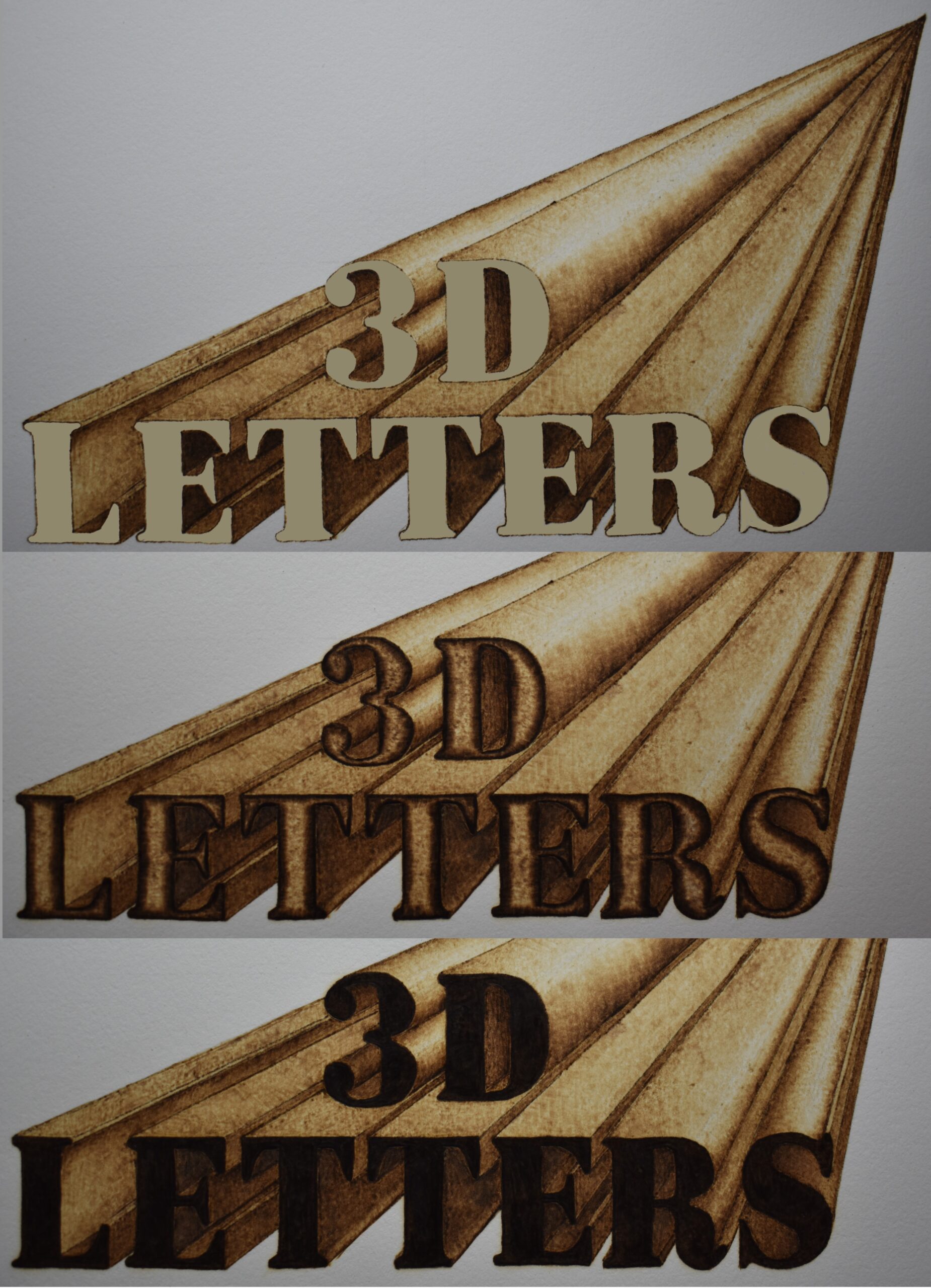 This composite image shows some options.
Top image. The letters are a uniform tan color. This allows them to stand out from the background. If you wanted the front of the letters to remain unburned, then I would burn the background to a tan color.
Middle image. This shows the letters with a slight puff to them. This is the technique we used in the first example in this tutorial. I have mixed feelings on this one. I like the concept, the the color is a touch dark in my opinion. Some of the letter fronts are hard to see.
Bottom image. The letters are a uniform dark color. Personally, I don’t care for this because I think it makes it hard see most of the letter fronts.
IN CONCLUSION
That is it for this blog. I hope I was able to provide some information that might be helpful for your project or a future project. I actually think that creating 3D letters is kind of fun; especially one point perspective.
The last thing I want to mention is that the techniques used with one point perspective can be used on many objects besides letters.
Until the next blog,
Brenda
Nov 21, 2023
Want to subscribe?
- Click on the “Leave a Comment” field at the end of any post (blog) and a subscribe option will appear.
- Put something in the comment field (if you put “test” or “just subscribing” I won’t make your comment public)
- Fill in the sections for your email address and name, and then click on the “notify me of new posts via email.”
- You will get a confirmation email from WordPress confirming you want to subscribe.
- Click on the confirm button in that email and you’re done.
Please note that I do not send out emails. If you have a WordPress account there is a way to subscribe within the WordPress system, but I cannot provide specifics on how it works as I don’t know.