 In this tutorial blog I’m going to explain how to create the colorful butterfly pyrography artwork that I put on a wooden book. The wooden book was nothing more than a hinged box that was designed to look like a book. I bought the box at a craft store and when I saw it I had this instant vision of a butterfly on a flower. My vision was that the book covers would show the same image, but opposite versions of it. The front looks down on the butterfly and the back looks up at the butterfly. This is one of the few times where I had a clear vision or concept of what I wanted to do. Plus the project was a lot of fun, and it’s very easy to do.
I should mention that the pyrography is extremely beginner friendly. The wooden box is not the best quality, so the box might be a little challenging to burn on. Most of the artwork on this project is colored pencil work. I will warn you that used a lot of different colors. Plus, I used PearlEx to give the butterfly a metallic sheen; which is completely optional.
 I bought the wooden book at Michaels craft store. Here’s a link to the wooden box on their site: https://www.michaels.com/product/95-wood-book-box-by-make-market-10308287.
There are similar wooden books on Amazon, but be aware that they are a LOT more expensive than the one at Michaels. Below are affiliate links for two boxes that are similar to the one at Michaels.
This first link is for a box that is a touch smaller than the one I used: https://amzn.to/49GIScc
This link for is for a box that is a touch larger than the one I used: https://amzn.to/49LJwoT
 Click on the thumbnail to the left to watch a YouTube tutorial video of this project, or click on this link: https://youtu.be/k-p3jefjk6M
Now, let’s get started.
SKILL LEVEL: 1
MATERIALS NEEDED:
- Writing tip
- Shading tip
- Box 9 ¾ x 7 3/8 inch (24.8 x 18.7 cm)*
- Pattern (enlarge or shrink as needed) Butterfly Book Front pattern, Butterfly Book back pattern, Book Border pattern, Book Binder pattern
- Ruler & Pencil
- Black Fine Tip Permanent Marker
- Colored Pencils
- Blending Stump
- Pearl Ex pigments (optional)
*Note that you do not have to use a wood book to do this project. Instead you can place the butterfly on a regular lidded box, or a flat board and hang it on the wall.
Colored Pencils used:
Black – Prismacolor 935
Cadmium Yellow – Polychromos 9201-107
Cobalt Violet – Soho 138
Dark Chrome Yellow – Polychromos 9201-109
Dark Green – Prismacolor 908
Indigo Blue – Prismacolor 907
Light Green – Prismacolor 920
Moss Green – Soho 182
Orange – Prismacolor 918
Pale Sage – Prismacolor 1089
Parrot Green – Prismacolor 1006
Peacock Green – Prismacolor 907
Permanent Green Light – Soho 181
Permanent Green Deep – Soho 184
Prussian Blue – Soho 161
Ultramarine Violet – Soho 155
Violet – Prismacolor 932
White – Prismacolor 938
Yellow Chartreuse – Prismacolor 138
I did mention I used a lot of colors.
Pearl Ex pigments use:
Antique Gold
Carbon Black
Interference Blue
Interference Gold
Interference Green
Interference Violet
Sparkle Gold
Sunset Gold
Super Copper
Here’s an Amazon link for a set of PearlEx pigments: https://amzn.to/3QVThpr
The only missing color is Carbon Black, but that isn’t a big loss. I thought that the black carbon pigment didn’t have much metallic sheen, so it was a waste of time to apply it.
STEP 1 – PREP THE WOOD

Wood burning is much easier if you take the time to prepare the wood surface. Always smooth the wood surface by sanding it with at least 220 grit sandpaper.

Then thoroughly wet the board by misting it with water or running it quickly under the sink faucet.
 The board should be damp to the touch, but not soaking wet.
Let the board dry. Once the board is dry, you will notice that the rough appears and feels rough. That’s because the grain swelled and is now sticking up from the rest of the board. To remove this, just sand again with 220 grit sandpaper.
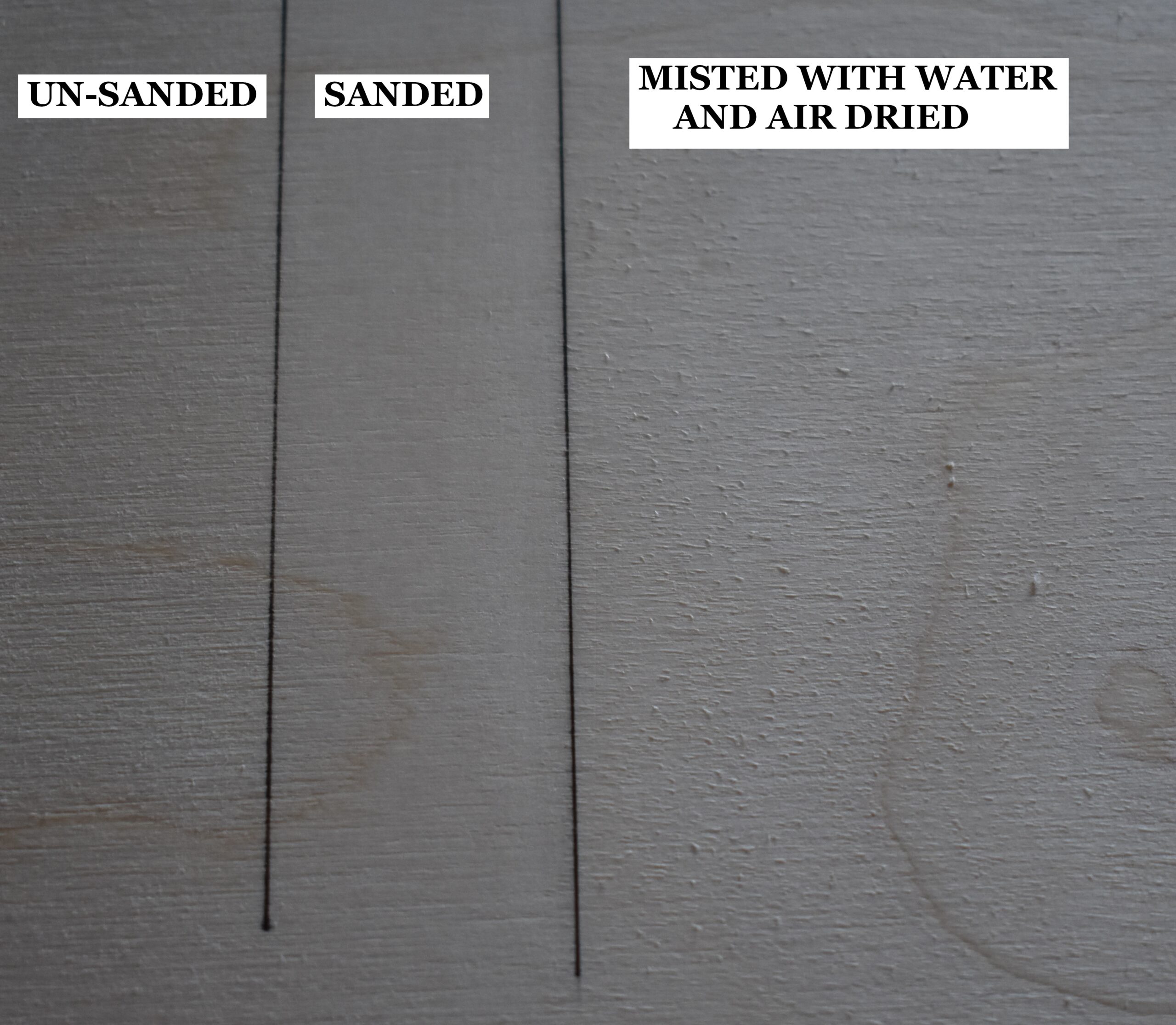 This piece of plywood board is broken up into three sections. The far-left section is how the board looks without any prep work. The board has a rough texture. The middle section of the board shows how it looks after it was sanded, and the surface is a lot smoother. The right section of the board shows it after it was lightly misted with water and allowed to dry. Notice how rough the board looks, but a quick sanding will remove that and leave an ultra-smooth board.
Doing the 4-step process (sand, mist, dry, sand) produces a super smooth surface, and the smoother the surface is the better the burn results will be. There are other benefits to the 4-step process.
- Humidity changes won’t impact the board. This means that the grain (or nap) won’t swell.
- You can safely add liquids without worrying about the nap raising (grain swelling). Liquids include things like watercolors and water-based wood finishes that are brushed on.
The wood lid on the box I used thin and VERY DRY. Unfortunately, the front cover or lid of the box bowed a lot after it dried.
To fix this I had to re-wet the front and back of the lid (very liberally), place a weight on the board, and let it dry. I would recommend that if you use a box similar to mine, that you place a weight on the box after wetting it out to make sure it doesn’t warp when drying.
STEP 2 – TRANSFER PATTERN TO WOOD
 There are several patterns for this project and I used the same method to transfer them to the box.
I printout the pattern on plain copier paper. I coat the back of the pattern printout with a dark graphite (usually in the B range). Then I place the pattern printout on the board graphite side down and secure with a couple of pieces of tape. Then I trace over the image.
Before I remove the pattern printout, I lift it up and look for missing lines. If there are missing lines, then I let go of the printout, trace over the problem area, and check again. Once everything is good, then I remove the pattern printout.
Yes, you can use graphite transfer paper or carbon paper if you prefer.
STEP 3 – PYROGRAPHY TIME
Now let’s burn in the butterfly design.
I want to mention that when I create any pyrography artwork that I plan to add color to, I ALWAYS do the pyrography portion first.
I never burn over paints, colored pencils, sealants, stains, etc.!
The reason is that all of the products contain chemicals, binders (glues), pigments, dyes, metals, etc. Most manufacturers don’t list what they put into the product as they fear the competition stealing their formula. Some items, like cadmium, can release toxic fumes when heated/ burned over, and the health risk isn’t worth it to me. Cadmium is a very common to made yellow, orange, and red hues.
Safety lecture done, so let’s start burning.
 Begin with the book binding side and burn a dark thick line along the trace lines.
I’m using a medium ball pen tip for two reasons. 1) It produces thick lines that have the same width. 2) It glides over the uneven surface of the wood better than my writer nib did. Note that nib and pen tip are different terms for the same thing.
I’m not sure what sort of wood was used for the side of this box, but it was very grainy and a number of sunken grain lines or missing thin lines of wood. Those depressed areas in the wood kept snagging my writer pen tip.
Notice how I place a finger on the wood. This helps steady my hand and I get better or more consistent burn results. If you look close at the burn lines, you’ll see round “dots” here and there. There’s where even my ball pen tip is snagging a bit on the sunken lines on this wood. Like I said in the beginning, this pyrography is very basic, but the wood box can make things a little challening.
After you are done, use a standard pencil eraser and rub over the area to remove any residual graphite.
 Then burn in the trace lines on the front of the box. Burn the lines to a dark brown or black color.
I switched to the standard writer pen tip for this because it can create wider burn strokes. If you have a large ball pen tip, you can try using that.
 After the butterfly is burned in, then use a writer pen tip to burn in the trace lines on the flower. I used a lower heat setting to ensure the lines weren’t very dark and remained thin.
 Also burn in the trace lines on the book border.
Notice how I kept the pattern nearby.
Some of my trace lines were tough to see, so I could look at the pattern and make sure I was burning the line more accurately.
 Here’s how the front cover looked at this point.
 Fill the center of the flower with lots of little circles. Also, the circles do not need to be perfect, or burned in concentric rows as I did.
 I decided I didn’t like the pale end of the book that was showing past the border pattern, so I’m burning it to match the color on the thin band on the other side of the pattern.
 Flip the book/box over and burn in the trace lines on the back.
Again burn the dark butterfly wing markings to a very dark brown or black color. The flower petals should be much lighter in value and thin.
Make sure to rub over all of the trace lines with a pencil eraser to remove any residual graphite. We don’t want the graphite to blend with the colored pencil and tint it.
ADDING COLOR
 I highly recommend using a print out of the pattern and testing out colors. Make sure to write down what color(s) you used, and how you layer your colors, so that you have an easy to follow instructions when it’s time to work on the box.
Make sure you write down HOW you layered your colors!
The reason is that depending on your starting color, you can get different results.
For example, if I start with white and then use purple over it, I will end up with an overall lighter color than I would get if I did the opposite. So it’s important to note the order you applied the colors.
You will discover that I use white a lot in my butterfly design. There are two reasons for this. One – it helps keep the colors soft and semi-translucent appearing. Two – I use white as a way to blend and even out the colors.

Blending stumps or tortillons were also used to help blend the color and push it down in the grooves or depressions the wood on this box had.
If you don’t have a blending stump, you can use a piece of paper towel wrapped around your finger.
 If using a blending stump, make sure to clean it before using it to blend new colors.
There are two ways to clean the stump.
One – rub it over a piece of sand paper. Two – rub it over an eraser.
When using an eraser, I like to use a kneadable eraser because I can push the stump down into the eraser and twist it around.
STEP 4 – FRONT COVER
We are going to start with the front cover.
 First use an orange colored pencil to color in the border design. The brand and color number is listed at the top of the blog in the “colored pencils used” section.
Apply as many layers of color as needed to get good coverage. Use the blending stump if needed to smooth out the color. Depending on the wood surface, it might help to alternate the direction you color in the layers. For example, the first layer is applied vertically and the second horizontally.
 Next start on the flower.
I used Cadmium Yellow, Dark Chrome Yellow, Violet, and White on the flower.
Color one petal at a time. Don’t use horizontal strokes to color across several petals at one.
1) Fill the entire petal with an even layer of White.
2) Then switch to Cadmium Yellow and color over the entire petal. Again, apply an even layer of the color.
3) Next use Dark Chrome Yellow. Starting at the top of the petal (furthest from the flower center) apply a very light layer. As you get closer to the base of the petal, the layer of color should get gradually thicker (more noticeable).
4) Now blend the color using a clean blending stump, tortillon, or blender of your preference.
5) Use Violet to draw a line that runs along the dark area or streak of a petal.
 I used red arrows to mark the dark streaks I created on one petal in this photo. I put 2 dark streaks on each petal to give it some shape and color variation.
6) Now switch back to Cadmium Yellow and color over the purple lines.
7) Rub the stump over the petal to blend again.
8) Use a white coloring pencil to color over the petal, but avoid the dark streaks.
9) Then use the dark chrome yellow to further define the dark streaks. Also, if needed or desired, use dark chrome to darken up the base of the petal.
 10) To darken up the streaks a little more, apply another layer of violet over them. How dark you want the streaks is really up to you. Heck you might not even want the dark streaks on your flower petals. Again that is your choice to make.
11) Blend one last time and you’re done with the petal.
Now color in the remaining petals on the flower using the same steps you did on the first petal.
I will mention that you do not have to color your flower the same way I did mine. You can reduce the number of steps, change the flower color to your favorite color, etc.
 Here’s how the cover looks so far. Now let’s start on the butterfly.
Note that a lot of the coloring involves layering the same colors a number of times. I’m not going to show a bunch photos showing that. Instead I will mention it like I did with the flowers.
Also, I want to point out that it is much each easier to do one step for all of the shapes that use a particular color combination before moving on.
For example, with the butterfly I start out explaining the ovals. I used Moss Green around the edges of each oval, so I colored that in on each oval before moving onto the next color.
 We’ll start with the icy green ovals on the wings. I’ve circled all of the ovals in red. There is a yellow arrow that is pointing to an oval that is found on the book binding.
For the ovals I used Moss Green, Light Green, Pale Sage, and white.
 1) Use Moss Green to color a thin line around the outer edges of the oval.
2) Fill the oval with white.
3) Use Pale Sage and fill the oval with that color.
4) Then blend the color using clean blending stump.
5) Repeat all four steps on the oval and you’re done. Color in the remaining ovals the same way.
 Now we’ll work on the gradient purple markings that run along the outer wings.
For those markings I used Ultramarine Violet, Violet, and white.
 1) Use white and fill the 3/4 of the marking. Start on the left side (outer edge away from the butterfly body), and stop coloring before reaching the right or lower side of the marking.
2) Use Violet to fill 3/4 of the marking. Start on the right inner edge, and stop coloring before reaching the left edge.
I applied a couple of layers of violet to really build up the right inner side of the marking.
4) Apply Ultramarine violet to the right half of the marking.
3) Use a clean blending stump to blend the colors.
 5) Use Ultramarine Violet and color in the right half of the marking.
7) Blend.
8) Color white over the entire marking to smooth out the color.
9) Apply more Ultramarine Violet along the right edge and extend the color for approximately 1/4 of the way.
 Now we’ll work purple streak near the center of the wing.
This using two colors; violet and white.
 1) Filling the marking with Ultramarine violet colored pencil.
2) Blend the color.
3) Color over the area using a white colored pencil.
4) Repeat until the color is as dark as you want it to be. I applied two layers of both colors blending after each application of color.
 Here’s a progress photo.
 Now we’re going to take care of the Green and Yellow markings.
For these markings I used 3 colors: Light Green, White, and Yellow Chartreuse.
 1) Fill the dumbbell shaped marking with a Light Green color.
2) Then move over to the markings adjacent the purple streak we just finished coloring. Use the same light green color and color in 1/4 of these markings along their outer edge.
3) Blend.
4) Use Yellow Chartreuse and fill in the markings. Don’t color over the dumbbell shaped ones.
5) Now apply another layer of light green to all of the same areas we did before.
6) Apply white over all of the markings including the dumbbell shaped one.
7) Apply the yellow Chartreuse to the markings, but not the dumbbell shaped one.
8) Blend. Repeat if desired.
 1) Use yellow chartreuse and color over the very center markings next to the butterflies body.
2) Use white color over very center markings.
3) Blend.
4) Repeat until as dark as desired.
 Here’s another progress photo.
You may or may not agree, but I think the butterfly is looking very striking. I’m not a big fan of yellow or green, but I think they look great on this butterfly.
 Now we’ll start with the upper blue markings.
Ironically these two small markings use a number of colors. Here’s what I used: Cobalt Violet, Prussian Blue, Ultramarine Violet, Violet, and white.
 1) Filling the area with Prussian Blue.
2) Then color along the edges of the marking(s) with Ultramarine Violet. For this marking, the edge is actually a band of color that is approximately 1/8 – 1/4 inch wide (0.33 – 0.64 cm).
3) Blending
4) Apply another layer of Prussian blue over the entire marking.
5) Color along the edges with Ultramarine Violet and blend the color.
 6) Switch to Cobalt Violet and apply that color along the edges of the markings. This image shows the color along the edges better than the others.
7) Fill the marking with white.
8) Apply more Prussian blue over the entire marking.
9) Color along the edges with Cobalt Violet. Also, the lightly color over the center of the marking.
10) Apply another layer of Prussian blue along the edges.
11) Blend.
12) Apply a layer of white over the entire marking to finish up.
 Now let’s color in the blue-purple markings.
These markings use the same colors as the last ones: Cobalt Violet, Prussian Blue, Ultramarine Violet, Violet, and white.
 1) Filling the entire markings with Prussian blue.
2) Then color around the border or edges of the markings with Ultramarine Violet.
3) Blend.
4) Apply white over the entire marking.
 5) Next use Prussian blue to apply a layer of color along all the edges except the right or inner.
The outer left edge should have a wider layer of color than the sides of the marking.
6) Repeat the exact same thing with the following colors: ultramarine violet, cobalt violet, and violet.
7) Blend the colors using a blending stump.
8) Apply a layer of white over the markings
9) Apply a little more Prussian blue along the outer edges.
 The last area on the wings to do is the spot where the blues fade to green.
For this area we will use Light Green, Prussian Blue, White, and Yellow Chartreuse.
 1) Use a white colored pencil and apply a 1/4 inch (0.63 cm) wide band along the inner or right edge of the markings.
2) Fill the rest of the markings with a thin layer of light green, and just slightly overlap the green on the left edge of the white band.
3) Switch to the yellow chartreuse and color over the light green.
4) Use Prussian blue colored pencil and color over a small amount of the green color on the lower end of it.
Where the pencil is in the photo is where I stopped with the blue.
5) Next apply a layer of white over the entire marking.
6) Blend.
 If you lost some of your thin dark wing lines, use a permanent fine tipped black ink marker and draw over the line to restore it. I’m using a Sakura Micron archival ink pen size 0.45 mm for this. Here’s an Amazon link: https://amzn.to/43gVsLF
 Now we’ll color in the butterfly body and I will tell you that I wasn’t overly thrilled with what I did. I used Black, Dark Green, Indigo Blue, Violet and white. I’m not going to bore you with the steps I did. Instead, I will tell you to color the body to a black or dark brown color.
Quite truthfully, the body could have been burned to a dark color when we were burning in the lines on the wings. I didn’t think of that until now.
STEP 5 – BINDING and BACK COVER
 Let’s color in the side binding and the back trim.
1) First apply orange over the designs.
2) Apply a layer of white over the design.
3) Finish the designs with another layer of orange.
 I did the same thing with what shows of the wings that I did on the front of the book.
With the flower, I colored it a touch darker than the front. To do this I used more dark chrome yellow and violet. In fact, I was was very liberal with my use of violet. Keep in mind that the layers were light.
Another aspect of coloring the flower was that I didn’t use as much of the white and cadmium yellow.
 1) Peacock Green was applied to the stem.
 2) Then Permanent green deep was applied around the edge of the center circle. The circle represents where the stem would connect.
3) Blend
4) Apply permanent green deep over the leaves.
5) Follow this with permanent light green.  6) Blend and you’re done.
STEP 6 – SEAL
 It is very important to seal the wood with some sort of finish at this point.
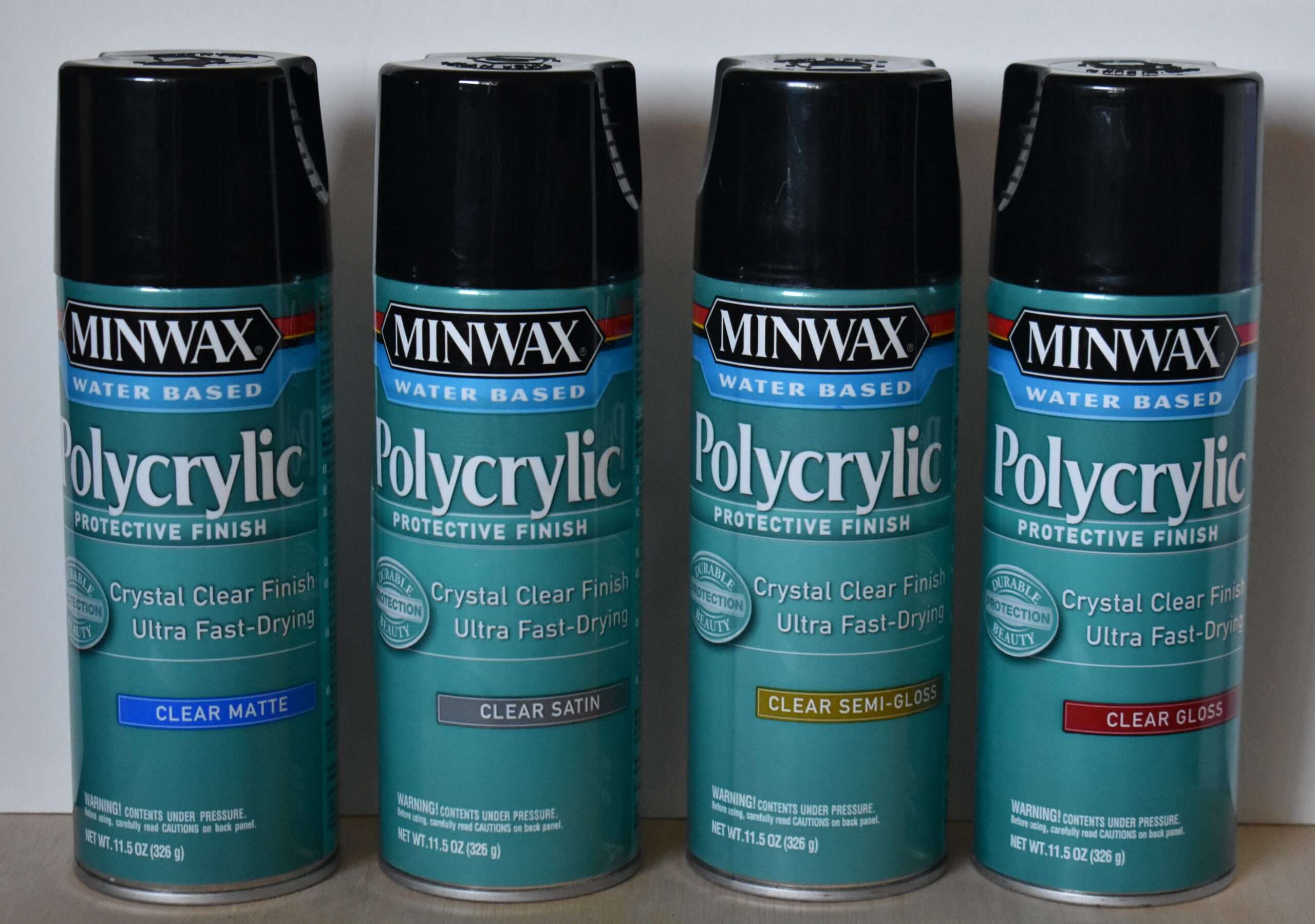
I recommend using a spray on finish. I prefer Matte finish because I don’t like how glossy finishes reflect the light. To me the reflected light distracts from viewing the artwork.
Matte and satin finishes will remove the metallic sheen of PearlEx. Apply these finishes before you apply PearlEx.
If you plan to use a glossy finish, then you can apply that after the PearlEx has been applied.
If you plan to line the box with velvet, then do not seal the inside of the box. I do recommend sealing the underside of the front cover (lid) as it won’t get covered with velvet.
STEP 7 – PEARL EX
 Pearl Ex is a powdered pigment. The pigments provide a metallic sheen to surfaces.
 Why bother applying PearlEx to the butterfly since it already has color? Quite simply, I love the metallic sheen it gives. This image shows the butterfly after I applied PearlEx. The board is angled to show the metallic sheen.
 Since Pearl Ex is a powder, it must be mixed with a binding agent. I use PearlEx varnish for this. Here’s a link to the product on Amazon: https://amzn.to/4tJ9Wi4
Be aware that you can use a brush on glossy wood finish instead.
If you use a brush on finish to mix the PearlEx finish with, make sure it is the same brand that you used for sealing the art in step 6!!!
The reason is that not all brands of finish are compatible with each other.
Put a little of the varnish into a small mixing tray. To do this I use a clean paint brush and dip it into the varnish and wipe the brush along the edges of the mixing tray. Next, sprinkle a small amount of PearlEx powder into mixing tray and mix well. Now the paint is ready for use.
 I applied a glaze (thin coat) of Super Copper over the orange border design on the front cover, the side binder (shown), and the trim on the back cover.
I do recommend mixing very small batches of pigment because a little goes a long way.
 The bare wood areas of the border on the front cover were painted with Antique Gold.
 This close up photo shows how the front border looks angled in the light. I really do like the metallic color.

On the pale yellow center wing markings I used Interference Gold.
 On the Green and yellow markings I used Interference Green.
 I also used Interference Green on the icy green ovals along the outer edges of the wing.
 The purple markings were glazed with Interference Violet.
 The blue markings received a glazing of Interference Blue
The wings on the back cover received the exact same treatment as the front butterfly winds did. Like before, use a fine tipped black marker to restore any thin black lines that get painted over.
 Since I wanted this to look like one of those old ornate books, I decided to treat the sides of the box.
I started by drawing lines down the side with a fine tipped permanent black marker. Again, I’m using the Sakura Micron marker.
 After the lines were drawn, I applied a layer of Sparkling Gold.
I thought the sparkling gold was a little too bright. Plus, I didn’t like how much the lines stood out, so I applied a layer of Sunset Gold.
This I liked as you could still see the lines, and the color was darker.
Obviously you need to do the same steps on the two sides of the box. I didn’t worry about matching the lines up when I worked on different sides of the book. In fact, I didn’t even worry or try to draw in the same number of lines on each side of the box.
STEP 8 – VELVET LINING
 Let’s do the last step and line the box with velvet.
 Begin by using a watercolor paint that is a shade or two darker than the velvet you are using. You only need to paint along the corners. The reason is that this will hide any small areas if the velvet is missing.
In the corners there might be glue that prevents the watercolor from sticking. In those spots I used a permanent marker.
I don’t use flocking because it’s a lot more expensive than velvet. If you use flocking, then paint the entire inside of the box. It will help hide any areas that didn’t receive a lot of flocking.
 Next measure the inside dimensions of the box. Transfer those measurements to a piece of paper to create a pattern or template to use with the velvet.
Make sure to test fit the paper template. It should fix in the box without bowing or leaving lots of gaps around the edges. If it bows, trim it down until it does. If there are a lot of gaps, then create a new template.
 Pin the template to the fabric and cut around the edges.
Rotary Fabric cutters work great for straight lines as you can use a straight edge to guide the cut.
Once you’re done cutting out fabric, you should have 1 large piece for the bottom of the box and 4 pieces for the sides.
Of course you should test fit your fabric before gluing it into the box.
 After test fitting and assuming there weren’t problems, apply a thick layer of glue to the bottom of the box.
 I use permanent stick glues for this.
I do not use liquid glues because the glue can soak through the fabric. When the glue dries it is VERY noticeable that the fabric has dried glue on it.
 Place the fabric onto the area you just coated with glue. Then rub over the fabric to smooth it out. Make sure to firmly rub along the edges to ensure the fabric is making good contact with the wood.
Repeat this process for the sides of the box.
Once the fabric is in place let it sit undisturbed for several hours. I let it sit overnight. This will allow the glue to dry and permanently bond the fabric to the wood.
 After the glue has had time to set up, gently tug along the edges of the fabric. You’re looking for any loose spots. If you find any, apply glue to the area and press the fabric firmly into the glue. Then let it set for a couple hours.
Once the fabric passes the tug test, then trim any excess fabric.
 I had to use small scissors to get into the corners.
 For the side that is on the book ‘binding’ edge, I used an X-acto knife and a straightedge to trim the fabric down.
IN CONCLUSION
We’re done. What did you think of this project? I said at the beginning that this was an easy project to do, so hopefully you agree with that statement. This project was more of a craft project versus pyrography art, but I had a lot of fun creating it and I hope that you will too. For me I was an opportunity to use my Pearl Ex pigments which I love using. I thought the colors on the butterfly were beautiful and the metallic sheen is very striking.
One last thing I will mention is that the “book” measures 9 3/4″ tall x 7 3/8″ wide x 1 7/8″ deep (24.8 x 18.7 x 4.8 cm). It took me 3 3/4 hours to do the pyrography portion, 5 hours to color it with the colored pencils, and another 2 1/2 hours to apply the pearl ex pigments. More importantly is that I think it turned out well and I had a lot of fun designing and creating this project.
Until the next blog,
Brenda
Oct 25, 2019
Want to subscribe?
- Click on the “Leave a Comment” field at the end of any post (blog) and a subscribe option will appear.
- Put something in the comment field (if you put “test” or “just subscribing” I won’t make your comment public)
- Fill in the sections for your email address and name, and then click on the “notify me of new posts via email.”
- You will get a confirmation email from WordPress confirming you want to subscribe.
- Click on the confirm button in that email and you’re done.
Please note that I do not send out emails. If you have a WordPress account there is a way to subscribe within the WordPress system, but I cannot provide specifics on how it works as I don’t know.
I tried to leave a message but I don’t think it went thru. Anyway I loved doing the butterfly but have a few questions. One is I saw in two of the butterfly wings with color little what looked like eyelashes on the edge of the wing but didn’t see those in your later photos? I added them because I thought it was part of the pattern. https://i0.wp.com/pyrographymadeeasy.com/wp-content/uploads/2019/10/Design-1f.jpg?ssl=1
Also what size Prismacolor set do you have ? I have a set of 75 and realized I don’t have all the numbered pencils you list. Also with the Pearl Ex powder Micropearl 650 and varnish I found them expensive to buy as many colors as you used. So I just used the Micropearl on most of the butterfly and it does have a nice sheen. Probably not as striking as yours is.
Hi Jean,
the eyelashes were part of a test design. I had drawn several butterfly wing styles to see what I like the best. Then I used those test drawings to try out colors.
As for Prismacolor, I have the compete set that includes 150 colors or something like that. I bought small variety sets of the Pearl Ex many years ago before they got popular. The small jar don’t hold much, but not a lot is needed.
You’re probably has a better sheen than mine. I made the mistake of using a matte finish and that took away most of the sheen. All of the photos that show the gorgeous metallic sheen was done before I applied finish. That was definitely a learning lesson!
Im so excited to try this. I am new and i told my granddaughter i would make her a butterfly box. I got the box yesterday and found this today. I love pyrography and prefer the colorful creations and need help with the painting parts.
Hi Tami,
well I hope that you enjoy creating the box.
I have to admit that I need help with color too. I generally do a number of color tests to work out the color scheme.
It is not something that comes naturally to me. 🙂
Thanks for the comment!
I see you used a couple different brands or lines of coloured pencils, which one seems to work the best with the wood…in your opinion?
Hi Dawn,
I honestly couldn’t tell a difference between them. I truly think the only real consideration is how well the color ages. The more lightfast colors you use, the better it will age.
I will be brutally honest and admit I didn’t even look at the lightfast ratings of the colors I used.
The book was in my possession for for a little over a year and I didn’t notice a color change. Everything still looked very bright and vivid. The book is no longer in my possession, so I won’t know how it looks as time goes on.
I’ve been burning for a while, but I hadn’t found a solution to the color issue….I love your usage of pencils, and I especially love the metallics. In the past I had added ink to varnish, but it didn’t work as well as I would have hoped…the colors came out watered down (because they were, by the varnish) and they just weren’t as vivid as I was hoping for. I was kind of giving up, and then I saw your post. I’m going to watch every tutorial you have, lol!
I have a razertip duo (I love it) and I am looking to expand my skills, maybe do some more realistic work. It’s hard because I have to recognize I’m a good burner, but a mediocre artist. But we can’t all be good at everything, and I can work with what I have.
I put my finished projects link in the information request if you want to see some of my work. I’m sure you’re very busy, so no worries or expectations here. Just gratitude for your sharing of information, and love for the work.
Thank you for inspiring me to go higher, further, faster!
Hi Mowg!
I’m glad my blog was helpful. I like to experiment as well, but not all experiments turn out well. Nature of the game.
I looked at your site and you’re doing great work! Your boxes have great designs and are visually interesting.
I don’t think a person has to be a great artist to be a great burner. It helps, but isn’t a requirement. Mostly, like any hobby, the more you produce that better you get at it.
Thank you so much for the wonderful comment and sharing your artwork with me!
Brenda
So I am starting to learn and do intarsia. For certain aspects, wood burning was suggested for certain details. During my research and trying phase, I bought a Colwood Super Pro II, grabbed a piece of scrap wood and played around with five tips. I got more interested and continued my research to find your tutorial for a butterfly box. Watched tutorial, then did wood burning of the lid butterfly and results are awesome. Waiting for colored pencils ordered to come in so that I can finish this project. Thank you ever so much for an easy to understand tutorial that enabled me to create such a beautiful gift. Looking for another of your tutorials now. Thanks for making me look good. I did the above in very little time.
Hi Rob,
Sounds like an awesome project. Thank you very much for the kind words. I’m glad the tutorial was helpful.
Brenda
Liked it will try
Awesome. I hope that you will. it is a fun project.
I am in awe of your tutorials. I love how extensive they are. Great detail for beginners and something informative for more experienced users. This was the second tutorial I read tonight. The other was the postcard of the drawing of the rabbits in the snowy mountains with the large trees on either side. I thought that one might be a little ahead of me so I decided to check out some beginner tutorials. Thank you. Vickie D
Hi Vickie,
thank you for the wonderful comment! I hope you will find some tutorials that you will enjoy doing.
Have fun burning!
brenda