
In this tutorial I’m going to explain to you how to create the look of denim fabric. My goal with this project is to showcase one or two skills and how to implement them in a small artwork. With this project I will explain two skills; circular motion and uniform strokes. These two burn types are used in almost every single piece of artwork I create. I consider them to be essential skills that help me create the levels of realism I accomplish in my artwork.
 Click on the icon to the left to watch the YouTube tutorial for this project. Or click on this link: https://youtu.be/gNMTYdCgieU
Now, let’s get to work.
SKILL LEVEL: 1
MATERIALS NEEDED:
- Writing tip
- Shading tip
- 4 x 5 inch (10.2 x 12.7 cm) piece of wood
- Pattern (enlarge or shrink as needed) Denim Fabric pattern
- Embossing Tool*
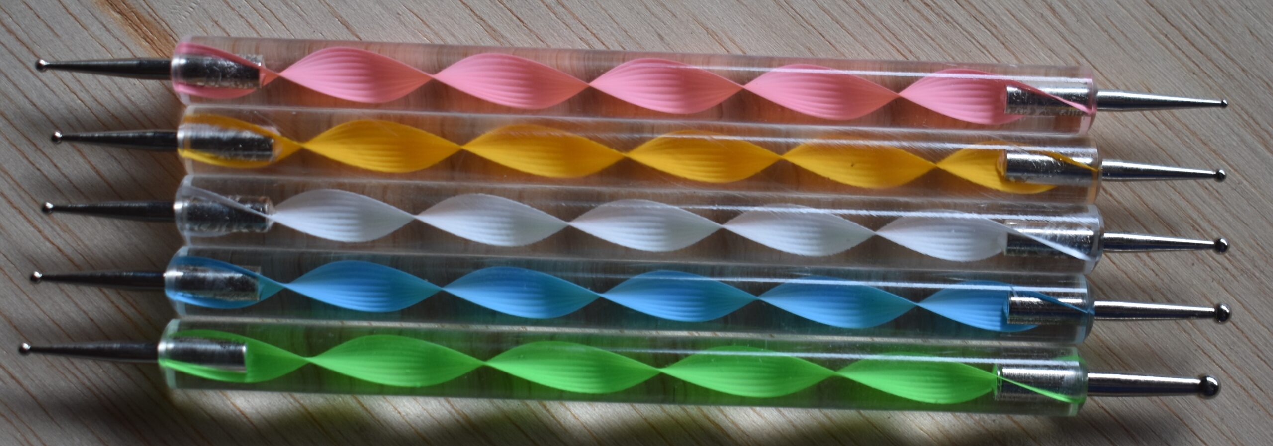 An embossing tool was used to create the some of the stitching. You can pickup a set of embossing tools for under $10 on Amazon. Be aware other items can be used. For example, I’ve used really small crochet needles. Also, a writer nib can be used.
In this tutorial I will demonstrate the embossing tool, and a writing nib. You can decide which one you would prefer to use.
Here’s an Amazon affiliate link to a set of embossing tools: https://amzn.to/3uAC7o3
 This is the reference photo for this project.
Burn Strokes
There are two burn strokes I used for the fabric; circular motion and uniform strokes.
 Circular motion is burning a continuous chain of loops or circles. There is open and closed circular motion. Open means that you can see the underlying wood between the loops (top). Closes means that you can’t see the underlying wood between the loops because the burn is solid (middle).
I like circular motion because it allows me to create transitions that can be very subtle, very bold, or somewhere in between. One of the defining features of circular motion is that the transitions do not have a clear line that defines them. You can see that the color changes, but you can’t draw a line to indicate that this is the precise moment it happens.
I often use circular motion to transition between color changes. For example, I often block in a shadow to a uniform color. Then I burn circular motion around the shadow to let the color gradually get lighter in value.
 To darken up areas, you can reburn over them. If you look at the lower right burn, part of it is darker. That was accomplished by reburning over the area until it was a dark as I wanted it to be.
One more thing I want to mention is that your hand speed can impact the color results. For example, if I move my hand rather slow, then I can get a pretty dark color (top left). The opposite is also true, using a much faster speed results in a paler color as I’m demonstrating in the bottom left example.
Try not to get into the habit of constantly adjusting the heat setting on your burner. Darkening areas by re-burning and altering your hand speed will give you so much more control and flexibility in your work.
 Uniform strokes means that the color is the same throughout the entire burn stroke. This is used to create a smooth looking swath of color that has very little if any tonal variations in it. This is perfect when rendering glass and other very smooth surfaced objects. With the denim fabric, I’m use another aspect of uniform strokes, and that is to give the fabric a base color.
There are three things that will help you get smooth uniform color.
1) Pull the nib down towards yourself. Burning in this direction makes it much easier to control the burn.
2) Keep your hand speed constant! This applies to each burn stroke. Use the same hand speed for all of the burn strokes.
3) Use a light hand pressure! A heavy hand pressure can create a number of problems when burning.
 I have a video tutorial that demonstrates how hand pressure impacts burn results. You can click on the video thumbnail to watch, or click on this link: https://youtu.be/q8OGqS5kyHg
STEP 1 – PREP THE WOOD
 Smooth the wood surface by sanding it with at least 220 grit sandpaper.
 Then thoroughly wet the board by misting it with water.
 The board should be damp, but not soaking wet.
Let the board dry. Once the board is dry, you will notice that the rough appears and feels rough. That’s because the grain swelled and is now sticking up from the rest of the board. To remove this, just sand again with 220 grit sandpaper.
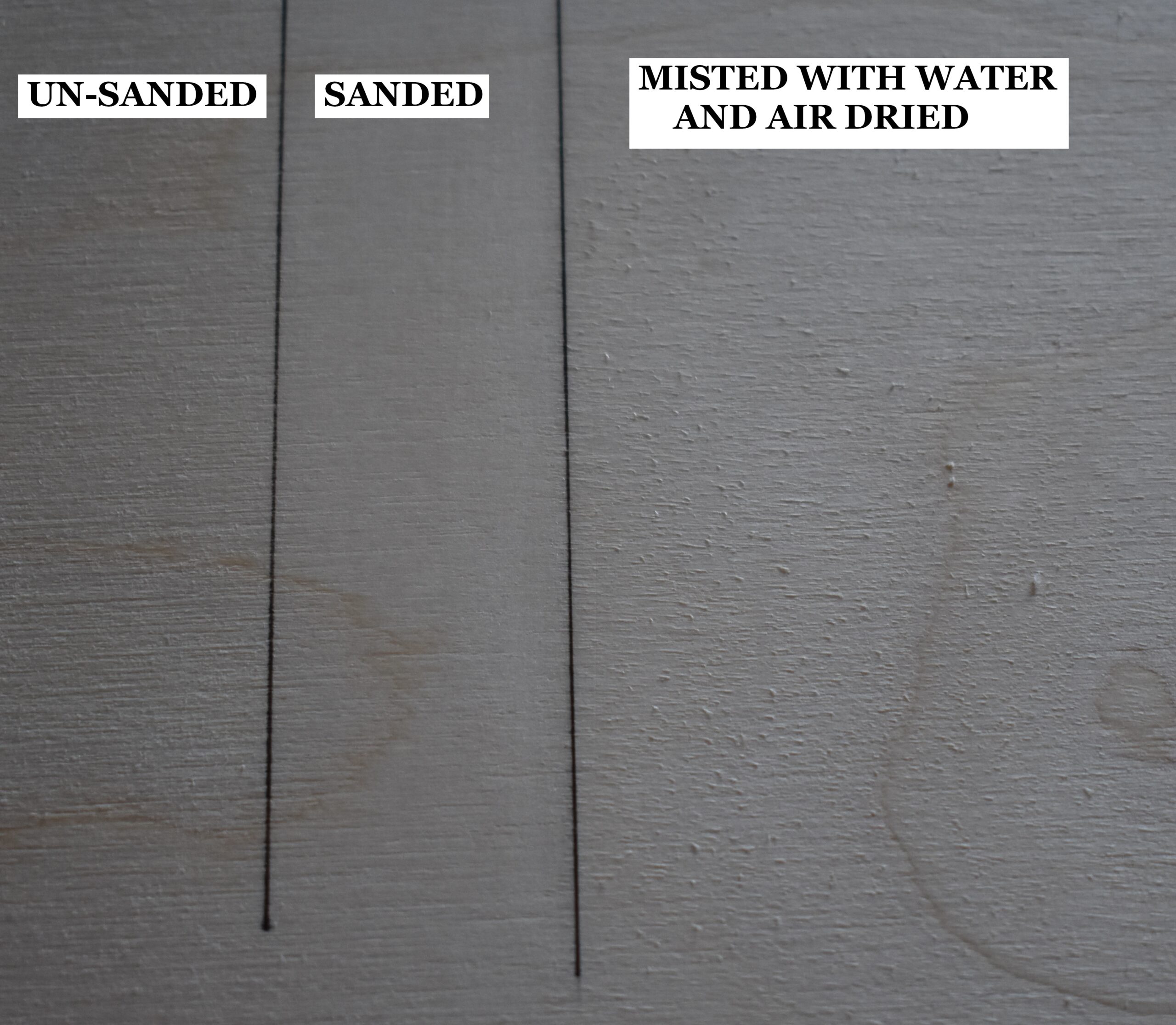 This piece of plywood board is broken up into three sections.
The far-left section is how the board looks without any prep work. The board has a rough texture.
The middle section of the board shows how it looks after it was sanded, and the surface is a lot smoother.
The right section of the board shows it after it was lightly misted with water and allowed to dry. Notice how rough the board looks, but a quick sanding will remove that and leave an ultra-smooth board.
Doing the 4-step process (sand, mist, dry, sand) produces a super smooth surface, and the smoother the surface is the better the burn results will be. There are other benefits to the 4-step process.
1) Humidity changes won’t impact the board. This means that the grain (or nap) won’t swell.
2) You can safely add liquids without worrying about the nap raising (grain swelling). Liquids include things like watercolors and water-based wood
STEP 2 – TRANSFER PATTERN TO WOOD
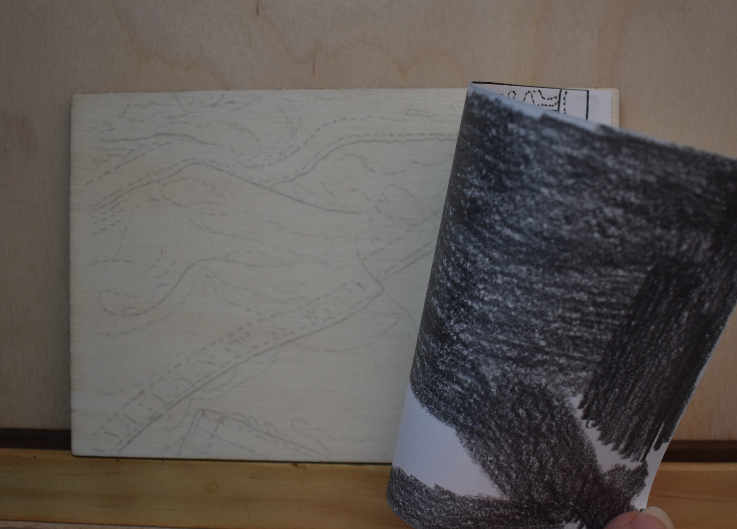 I use the tracing method to transfer all my patterns to my projects. It’s cheap, easy, and gives me control on what I want to include.
Print off your pattern on lightweight paper (standard copier paper is perfect), coat the back of the pattern with a graphite pencil, position on the wood, and trace over the pattern. Make sure to check the trace results for accuracy before removing the pattern.
STEP 3 – SEAMS & EMBOSSING
 Begin by burning a dark line along the seam edges.
You can use the front edge of a shader or a writer nib for this.
 This photo is marked with white arrows. The arrows all point to seams along the fabric where the top layer of fabric gets folded over and stitched into place. This thicker section of fabric casts a shadow onto the fabric next to or below it. That dark line we are burning represents in that shadow.
If you are using a shader nib to burn in the line, make sure your nib in is optimal position. This means that the end or front edge of the nib needs to be on the shadow edge. The body of the nib needs to be angled below the shadow edge, and NOT on the folded fabric edge that contains the stitching. This will ensure that the folded fabric edge is crisp and clean.
 With the seam lines burned in, then emboss all of the stitches. Embossing means we will carve the stitches down into the wood so that we can burn over the top of them and they won’t darken.
Before you emboss the stitching, gently rub over the pencil stitch marks with an eraser to lighten them. The embossing process forces all of the graphite from the pencil down into the wood. Heavy graphite will make the stitching look dark or grey, so removing most of the pencil marks will keep the embossed stitching nice and light.
Note that you can work in small sections when you do this. By this I mean you can lighten a few stitches with the eraser, emboss them, lighten a few more stitches, and continue on in this fashion.
Take your time as you very firmly press the tool into the wood and deeply score the wood along the stitch mark until you reach the end of that stitch. It is much easier to create the stitches by pulling the tool or pen tip towards you. Also, if you place a small lamp above and to the side of where you are working, then the light will light up an edge of the embossed stitching making it easier to see what you’ve done.
 Another option is to use a writer nib. When I do this, I have my burner set to a very low heat. The heat from the pen will help the tip gouge into the wood, and if it’s on a super low setting then it won’t color the wood. For reference, my Colwood unit goes to 10 and I had the heat setting on 0.5.
A word of warning! Depending on the type of wood being used, you may need to exert considerable force on the nib. This can damage the nib. I actually bent one doing this when working with maple.
Other than the warning, the same guidelines I explained for the embossing tool need to be used with the writer nib.
STEP 4 – BASIC SHADOWS
 Now block in the basic shape of the shadows. I used circular motion for this.
Do not worry about burning the shadows to the proper darkness level. Our only goal right now is to get the areas lightly colored so we can erase the pencils lines. Pick a shadow and fill in the area so it is tan to medium tan in color. The color doesn’t need to be perfectly uniform, but try to stay within the pencil lines.
Why is that a big deal you ask? The pencil lines are right on the transition zones where the shadows end, so we don’t what them in the way. Also pencil can smear, especially when rubbed over and that would interfere with our pyrography work.
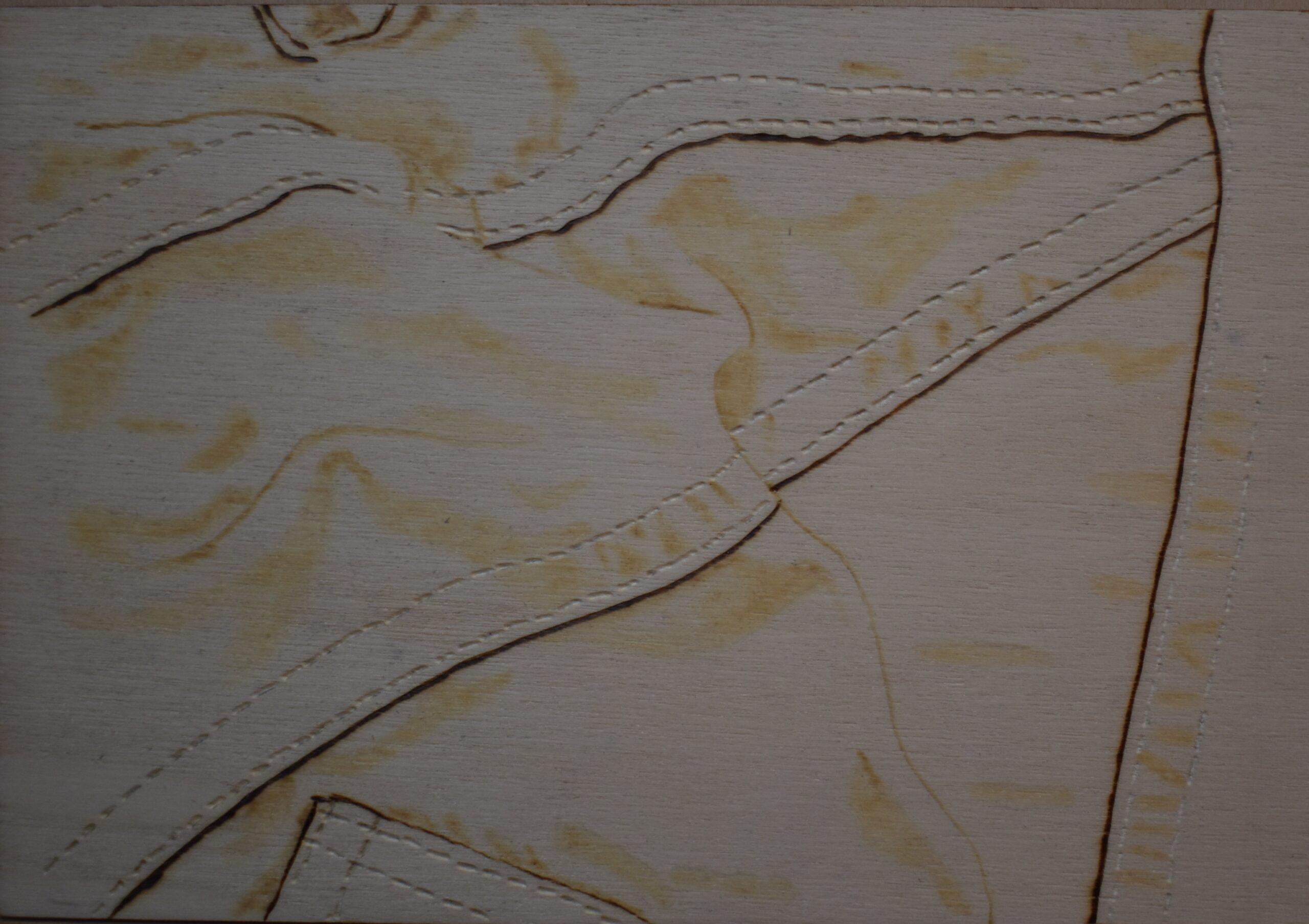
Here’s how my fabric looks after I block in the major shadows and rubbed an eraser over the area to remove excess graphite.
STEP 5 – FABRIC
 Here’s the reference photo broken down into sections. To me it makes sense to work in small areas at a time. I used the stitched seams and fabric wrinkles to help determine the separate sections on the fabric.
When I’m first starting a project, I like to begin with the easiest area first to work out how to do things. With that in mind, I started with section four because it didn’t have many wrinkles.
 SECTION 4 – Lower Right

We’ll start with the folded seam. Begin by burning uniform strokes to give the area a base color. Use the flat of the shade as you burn. This will ensure that the stitch marks stay clean.
 Darken up the little wrinkles between the two rows of stitching as you work your way along the folded seam. A reminder that darkening up the wrinkles just means that you reburn over them a couple of times until they are as dark as you want them to be. Or, you can slow down your hand speed to create darker results.
 A quick word about the little wrinkles between the two rows of stitching; don’t get hung up on replicated the reference photo exactly. I started out trying to replicate the photo and what a waste of time. No one is going to compare the reference photo to the artwork, so make the process as easy as possible. What I did was to add a wrinkle between almost every set of stitches. The key is to vary the darkness and the shape of the wrinkles and it will look great.
For example, some of my wrinkles were barely darker than the base fabric color and others were considerably darker. Most of my wrinkles were semi-curved lines, but I also did a number of ‘Y’ shaped wrinkles.
 After you burn the seam a uniform color and darken the wrinkles up, then use the razor edge of the pen tip to burn a thin line along the right side of both rows of stitching.
The slightly darker color of the thin line really helps the stitching stand out.
 Use the writer pen tip to burn dark tiny dots between each stitch on the rows.
If you embossed the stitching with great precision, only 1 dot will fit between the stitches. If you can fit more than one dot, then join my club.
I wasn’t very precise with my embossing, so there are stitches where I could easily fit 2 or 3 dots. With this close-up photo you can see some of the areas. Remember that under normal viewing conditions no one is going to notice this, so don’t worry if your stitching isn’t perfect. In the areas where more than one dot could fit, I burned a dot at the end of each stitch.
 We are done with the seam, so let’s move onto the rest of the fabric. Start by darkening up the shadows. Use the reference photo to judge how dark the shadows need to be compared to the base fabric color. I use circular motion on the shadows because I don’t want them to have crisp clearly defined edges. Instead, I want the shadows to have soft edges.
After a shadow is darkened up, then extend the color slightly using circular motions. The extended color should not be as dark as the shadow. Make sure the extended color has soft edge.
 Now fill in the rest of the fabric section with uniform strokes to give it the base color. I often burn over the same stroke a couple of times to slowly build up the color.
Make sure that the base layer of color matches the stitched seams base layer of color. The color doesn’t have to be an exact match, but it should be very similar.
You probably noticed that I rotated the board. For some reason uniform strokes is easier to do if you are burning with the wood grain. The grain on my board is horizontal. It’s not easy to burn horizontally and keep the color uniform. By rotating the board, I can burn with the grain while pulling the nib down towards myself.
 Here’s how my section 4 looks after I was done.
Each section of the fabric, follows the same basic steps that were used in section 4. Let’s recap before moving on.
Step one: take care of the stitched seam; if there is one. Give the seam a base layer of color. Add shadows that vary in color and shape between the stitches. Add a dark dot between the stitches.
Step two: Take care of the remaining fabric. First, reburn over the shadows to darken them up. Consult with the reference photo to determine how dark they should be. Makes sure the shadows have soft edges.
Step three: give the rest of the fabric a base layer of color. Make sure the base layer of color matches the color of the stitched seam and/or other sections on the fabric.
I do want to point out that the steps do not have to be done in the order that I listed them. You can give the fabric a base layer of color and then reburn over the shadows. Or you can give the fabric a base layer of color and reburn over the shadows as you encounter them. You can burn the stitched seam last. There isn’t an absolute set order for things to be burned in.
Let’s work on another section.
SECTION 5 – Lower Left
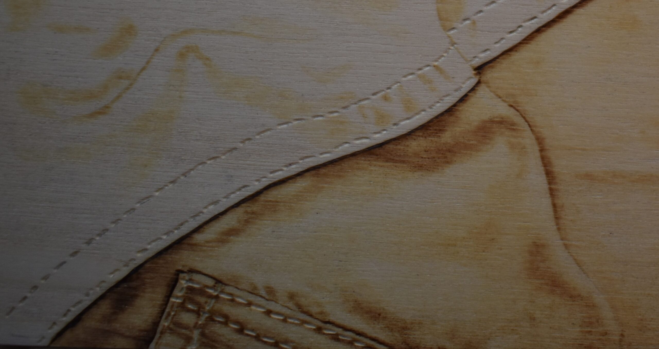 This will be the last section I explain. I think you will be able to use the information provided in this and the previous section to get a good understanding of what needs to be done. I will mention that the video tutorial covers all five sections, so you can use that if needed.
 Start with the larger and darker shadow near the top of the stitched seam. Make sure to slightly extend the color along the seam. Also, keep all of the shadow edges soft.
 Continue to follow along the seam adding shadows as needed. Consult with the reference photo often.
The fabric gets a lot darker near the left end of this section between the stitched seam and the pocket on the right.
Burn uniform strokes to fill in this little area, but burn them a couple of shades darker than normal.
 Afterwards, begin reburning over the shadows above the pocket.
 Take your time. Rushing to get the job done seldom produces great results.
Add the base color to the fabric by burning some uniform strokes over any unburned areas. I did not try to avoid the little shadows I had already burned when I did this.
 Once everything else in this section is done, then burn in the pocket.
Give the area a base layer of color using uniform strokes. Burn a slightly darker line along the edges of the stitching.
 Note that you can add the dark dots between each stitch now or later. I ended up doing it later as I didn’t want to change out pen tips right then and there.
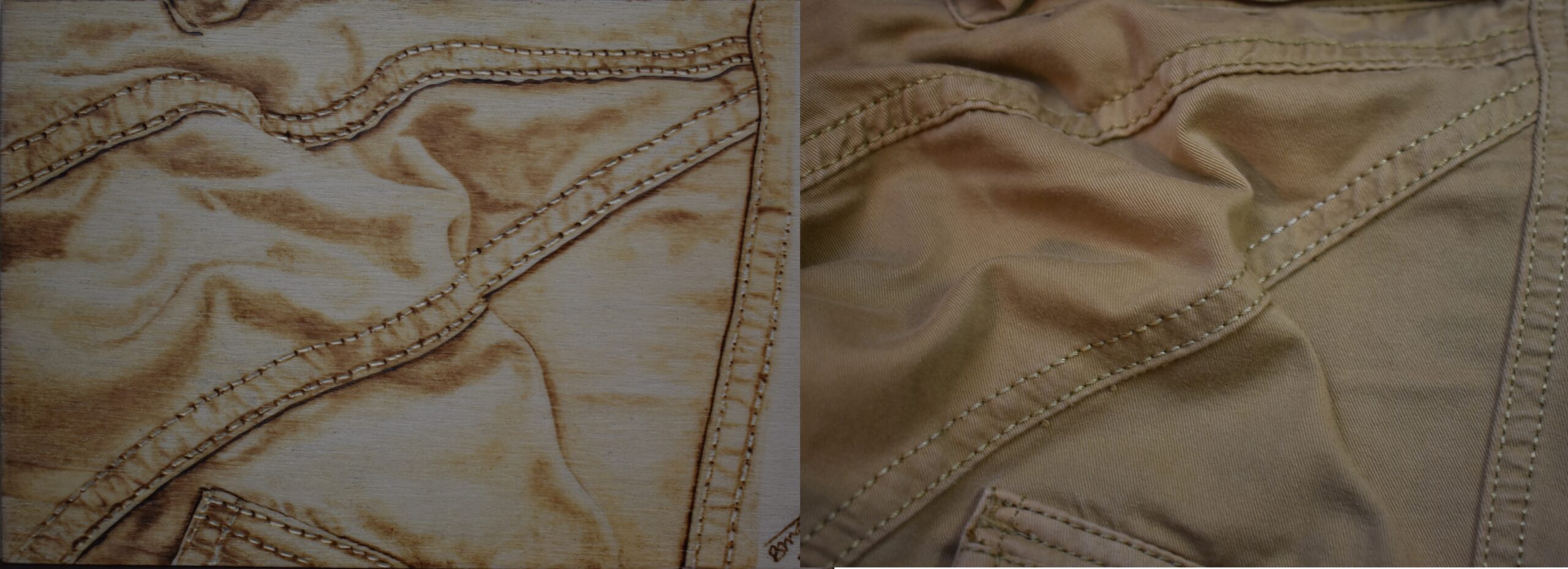
Below is a comparison photo of my artwork with the reference material. I could have made my fabric a touch darker, but overall I think it looks pretty good.
IN CONCLUSION
We’re done. If circular motion and uniform strokes are not a part of your current pyrography skill sets, then I highly recommend you make the effort to learn them. Also watch some YouTube videos on pyrography and pay attention to what the artists hands are doing. Ignore the art, just look at the hand movement. At some point you will most likely see the artist using one, if not both, of the burn types. Now the artist might not call them what I do, after all they are terms I made up, but it’s what they are doing.
Also use re-burning and different hand speeds to alter the darkness levels in your artwork. By doing this you can achieve a large range of color hues and gain more control and flexibility in your artwork.
I hope that I was able to provide you with some valuable information in this tutorial. I love hearing from you, so please leave a comment and let me know what you think.
Now to answer a couple of questions I get asked frequently. This artwork was burned on Die-cut Birch plywood that measures 4 x 5 inches (10.2 x 12.7 cm). It took me 5 1/2 hours to complete the artwork. That said, this is not a race or contest. I only put how long a project takes me as I get asked that question a lot. Art takes as long as it takes to be created. The only thing that is important is that the artist is having fun during the creation process. I’m happy to report that I’m having a blast! 🙂
Until the next blog,
Brenda
Mar 30, 2018
Want to subscribe?
- Click on the “Leave a Comment” field at the end of any post (blog) and a subscribe option will appear.
- Put something in the comment field (if you put “test” or “just subscribing” I won’t make your comment public)
- Fill in the sections for your email address and name, and then click on the “notify me of new posts via email.”
- You will get a confirmation email from WordPress confirming you want to subscribe.
- Click on the confirm button in that email and you’re done.
Please note that I do not send out emails. If you have a WordPress account there is a way to subscribe within the WordPress system, but I cannot provide specifics on how it works as I don’t know.