 The shading pen tip is my workhorse in pyrography. Just guessing I would estimate I use it at least 95% of the time if not more. In this blog I will talk about the shader and how I use it. The information includes how different things like angle and hand speed impact your burn results. I also explain the major burn strokes I use.
 As I’ve mentioned before, I have a Colwood super pro II and the shading tip I use most often is called a tight round J. This image shows the J shader in both regular and mini (left nib) form.
 There are a large variety of shader styles, but they can all do the basic same functions. The big difference is how wide of a burn stroke they are capable of making.
I match the size of the shader to the size of the area I’m working in. The bigger the area the larger the shader I like to use. That’s only because it is quicker to burn in the area.
Be aware that pen tip, tip, and nib all refer to the same thing.
 You can watch a YouTube video version of this tutorial by clicking on the thumbnail to the left. Or click on this link: https://youtu.be/PI_U7dXHwRo
I should mention that I purposely bend the pen at the seam where the pen begins. I do this to make it easier for me to use.
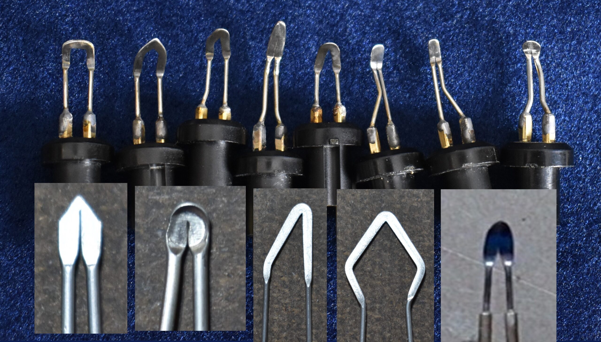
 Normally the shader I use is straight (left nib). In fact a lot of the shaders I have encountered are straight. I prefer to use a shader that has a 45 degree bend the pen tip end (middle nib). This makes it more comfortable for me to use, but note that my modification is NOT sanctioned by Colwood.
 Bending your pen tip will void any warranty the nib has and you can damage the nib.
You can purchase pre-bent nibs from Colwood. Colwood bends the nibs on the thick lead wires (right nib). now offers to bend the pen tips to a 45 degree (yellow arrow), and you can see they bend the tip along two metal bars. Personally, I don’t care for this. It feels awkward to me and the lead wire can come in contact with the board.
 I do have a short video that demonstrates how I bend a shader nib. Be aware that I only bend shaders. I do not bend skews, writers, ball tips, etc. To watch click on the video thumbnail or click on this link: https://youtube.com/shorts/wVAY2566TjE
Below is what I’m going to cover in this blog:
1) Color darkness control
2) Pen angle
3) Pen position
4) Four burn strokes: circular motion, uniform strokes, pull away strokes, and zigzags
5) Burn stroke combinations
1) COLOR DARKNESS CONTROL
 When I’m creating pyrography art, I can get a range of tan colors from a super pale tan to a very dark brown-black. There are four things that control the color darkness; pen heat, hand speed, repetition, and hand pressure.
PEN HEAT
Pen heat controls how hot the pen tip gets and how quickly the wood darkens. Obviously a higher heat means the quicker the wood darkens up.
I’m not a fan of high heat because of heat buildup. Heat buildup happens when the pen tip is not in contact with the wood. Excessive pen heat can create unwanted charred spots upon first contact with the wood. Since I often pause while I’m burning to look at my reference material, I keep the heat setting lower on my unit to counteract heat buildup. More on this shortly.
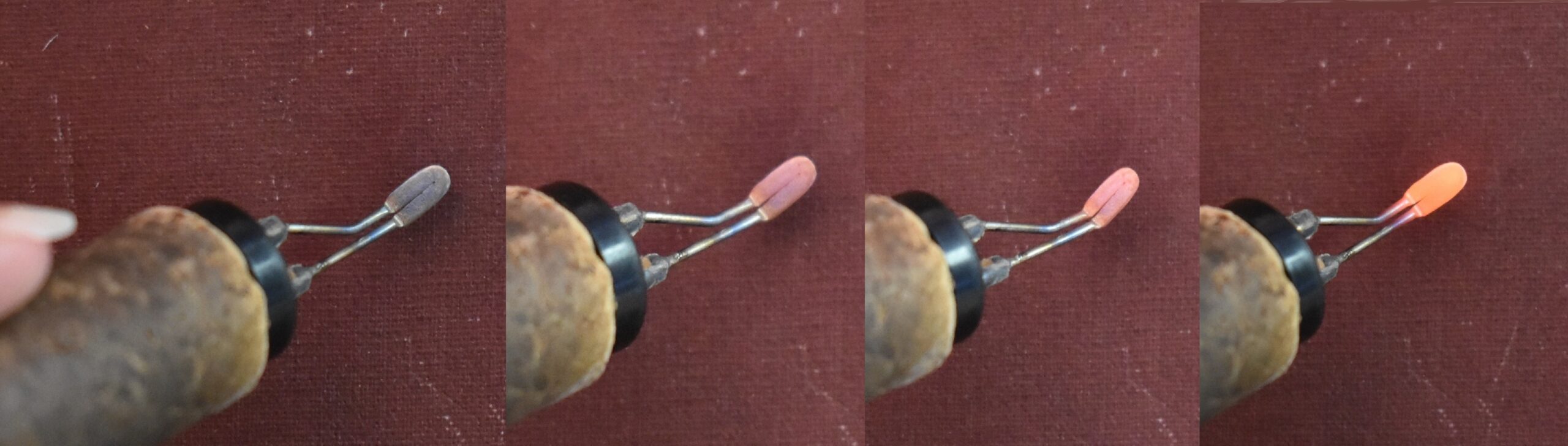 I do want to mention that you should NEVER allow your pen tip to get so hot that it starts glowing red. This is extremely bad for the pen tip! It can cause metal fatigue which can substantially reduce the life of your pen tip.
Using a lower pen heat means you don’t have to worry as much about heat buildup and instead you can use hand speed and repetition to control the color or darkness of an area.
Let’s get back to burner temperature. What temperature you should use really depends on a number of things. For example, what type of wood are you burning on? Hardwood requires a higher heat setting than softwoods. I usually burn on basswood (also called linden and common lime) which is a pale colored softwood. Basswood has a hardness rating of 410 whereas maple rates 1450. This means that maple will require a higher heat setting than basswood.
Another factor is what type of pen tip are you using? Larger pen tips almost always require a higher heat setting than smaller ones.
Also, how many burn hours does the pen tip have? The more burn hours the nib has a lower the heat setting is required. I’m not sure why this is, but it is. The pen tip I use most often has over 1000 hours of burn time on it. It requires a lower heat setting than a brand new pen tip of the same type.
Don’t focus on the number. Instead focus on the color of the burn result you get.
 I have a video that goes into detail on this subject. To watch click on the thumbnail or this link: https://youtu.be/vL8UhK5mBzc
HAND SPEED
 Hand Speed is simply how fast you are moving the pen tip across the wood. The faster you move the pen the lighter the color will be. The opposite is also true; a slower hand speed results in a darker color.
This first line is being burned with my normal hand speed and my burner was set to 3.0. My goal is to have my burner set so that I achieve a nice tan color with my normal hand speed.
The middle or 2nd line in this photo was created by increasing my hand speed. I did not alter the heat setting on my burner unit. Notice how much lighter the color is.
Lastly, the bottom line in this photo shows how slowing down my hand speed produces a darker burn result. Again, I did not alter the heat setting on my burner unit. If you move your hand slow enough you can get very dark results with a low heat setting.
REPETITION
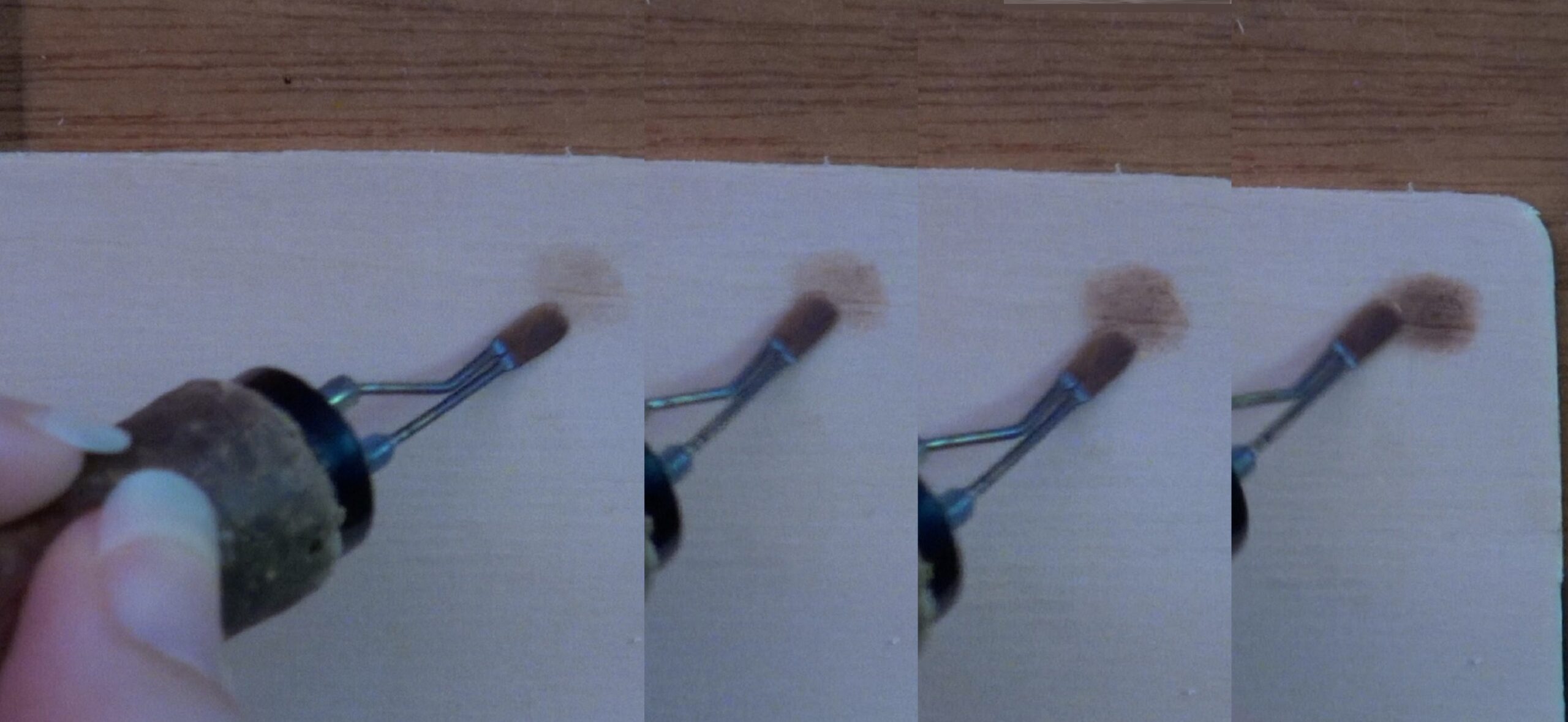 Repetition means to repeatedly burn over the same spot building up the color until the desired darkness is achieved. How many times you must re-burn over the same area before your desired darkness level is achieved is determined by both the heat setting and hand speed.
This composite photo shows an example of how re-burning over the same area increases the darkness level. Again, I want to point that that I did NOT alter the heat setting on my burner unit. Instead I kept reburning over the same area to increase how dark the color is.
HAND PRESSURE
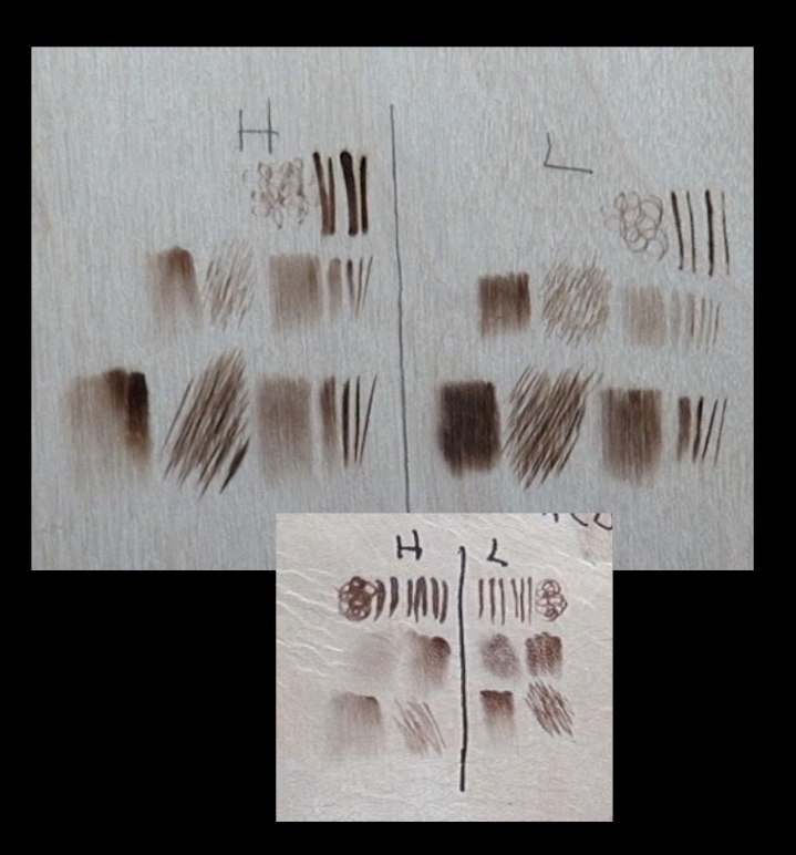 Your hand pressure has a huge impact on your burn results. A light hand pressure produces better results than a heavy one. A heavy hand pressure can cause the nib to quickly lose heat, so the burn results aren’t even in color. A heavy hand pressure can cause the nib to sink into the wood surface making it difficult to create burn strokes.
This image shows the same burn strokes made using a heavy hand pressure to the left of the line. A light hand pressure was using on the right side. The burn strokes on the left are thicker, the color isn’t as uniform, and the nib really dug into the wood on some of the burns.
 The importance of hand pressure is something that I didn’t truly know when I originally wrote this blog. Because of that the video version doesn’t include a section on hand pressure. This is such an important subject, I created a video that covers the subject in great detail. Click on the thumbnail to watch or click on this link: https://youtu.be/q8OGqS5kyHg
All four factors pen heat, hand speed, repetition, and hand pressure go hand-in-hand to control how dark a burn is.
I truly think lower pen heat, a light hand pressure, and repetition is the key to the realism I achieve in my artwork. With time and practice you will discover the speed and heat combo that works best for you.
2) PEN ANGLE
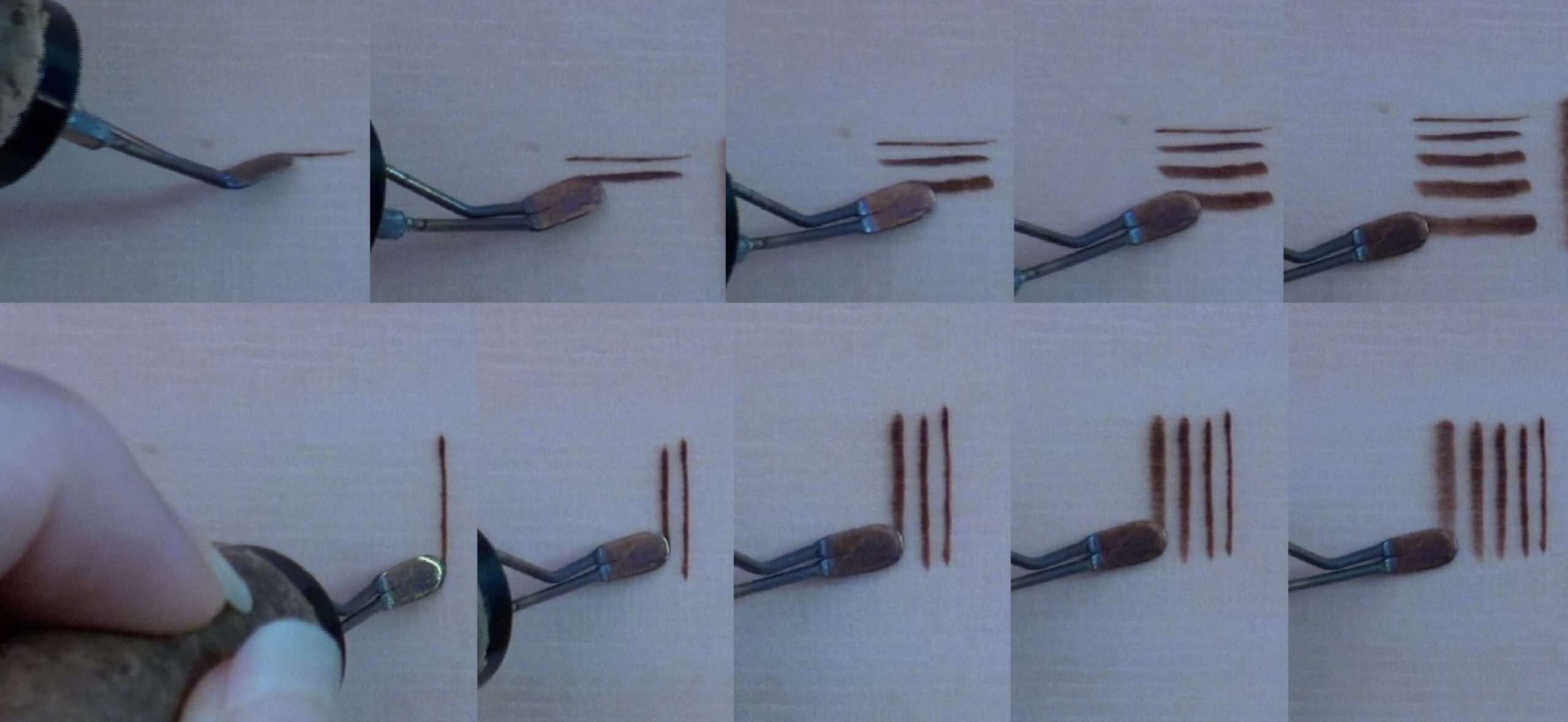 Pen angle controls how fine of a line you can draw and how quickly you can fill in an area. This photograph show 5 lines drawn with the shading pen tip, but the width of each line is different because I held the pen at a different angle. The steeper the angle the thinner the resulting line will be since there is less metal in contact with the wood.
I think that the top row of burn strokes makes it easier to see how the angle the pen is held at controls the line width. The bottom row illustrates that you can use the front of the shader to achieve the similar results. It is just harder to see the nib angle.
Obviously, when burning with the razer edge of the shader, you will get thin lines. These type of lines are great of burning along edges of objects.
Using the flat of the shader engages all of the metal on the nib to come in contact with the board. This produces a much wider line and is good for filling in objects. The larger the shader is, the wider the burn stroke and the quicker an object can be burned in. That said, I do try to match the size of the object with the shader. For example, if I’m burning in a small animal eye, I use a small shader. If I’m working on a large background, I use the largest shader I own.
3) PEN TIP POSITION
 Another important thing I need to discuss is pen tip position. How you place your pen tip in relationship to the object you are burning can alter whether or not you have sharp crisp edges or soft blurry edges. This images shows three spheres that start out with crisp edge and end with blurry edges.
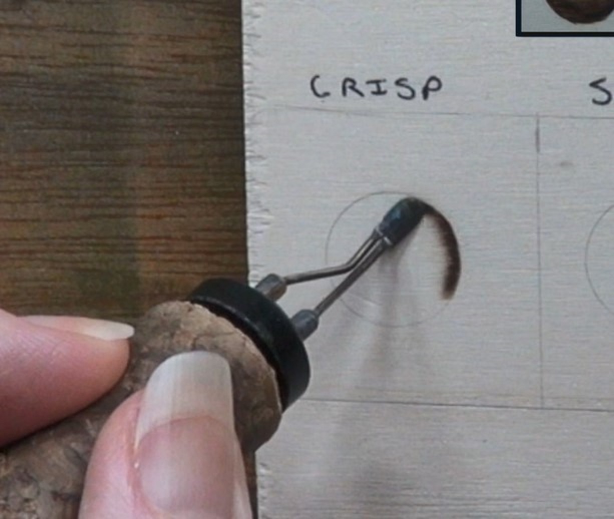 In this photo I have the end of the pen tip right on the edge of the sphere line. The rest of the pen should be angled over the area you will be burning; in this case that is the sphere. This is what I frequently refer to as optimal position.
Optimal position ensure that the object you’re burning in will have crisp clean edges.
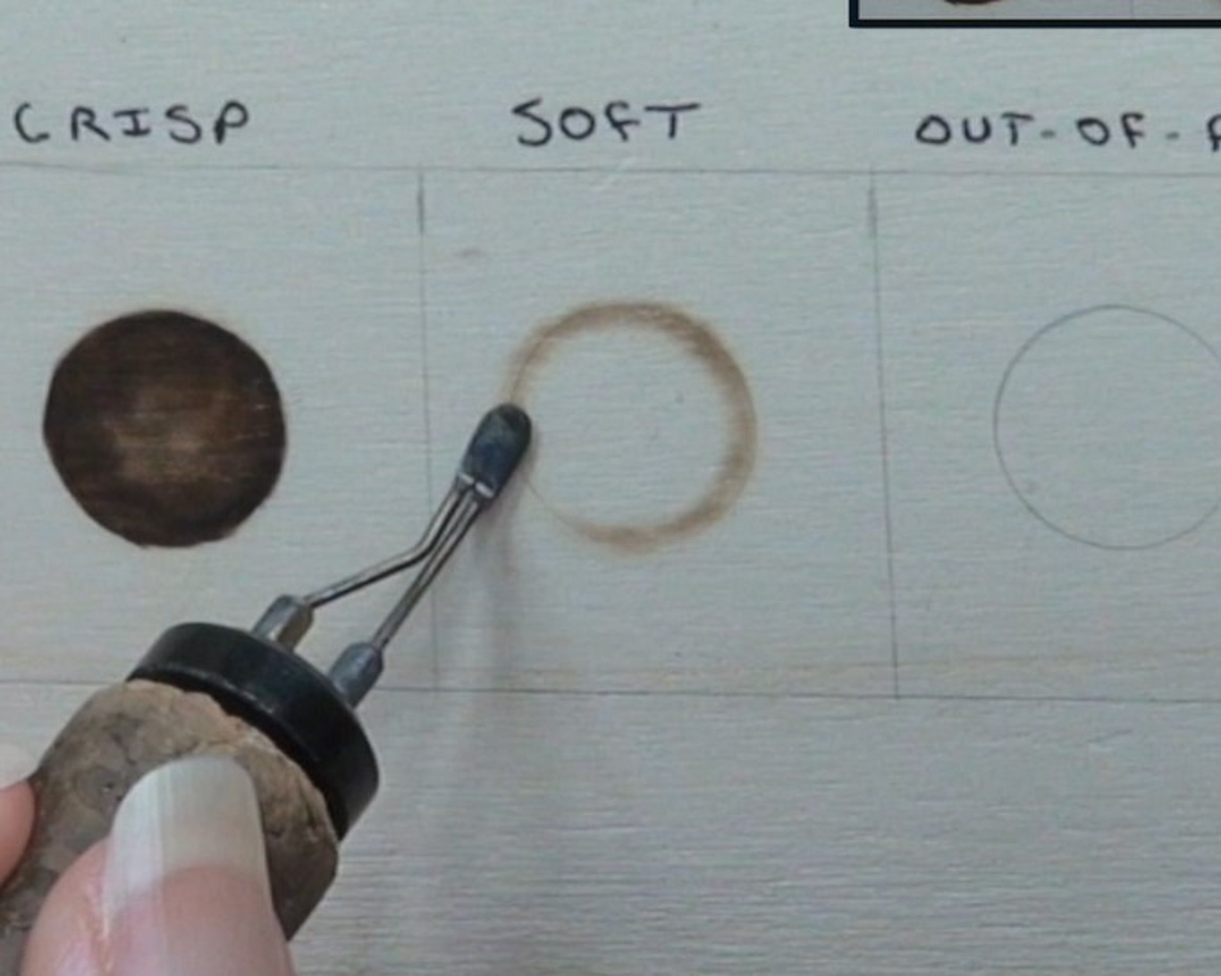 To get a soft edge, then placing the pen tip on top of the line using the flat the shader. This produces a thicker line with soft edges that is great for creating a slightly out-of-focus look.
This technique has several applications. One I can think of is a shadow along a gentle fold in fabric. Or a tree that is a behind the subject. Burning the tree with softer edges will push the tree into the background creating dept in the artwork.
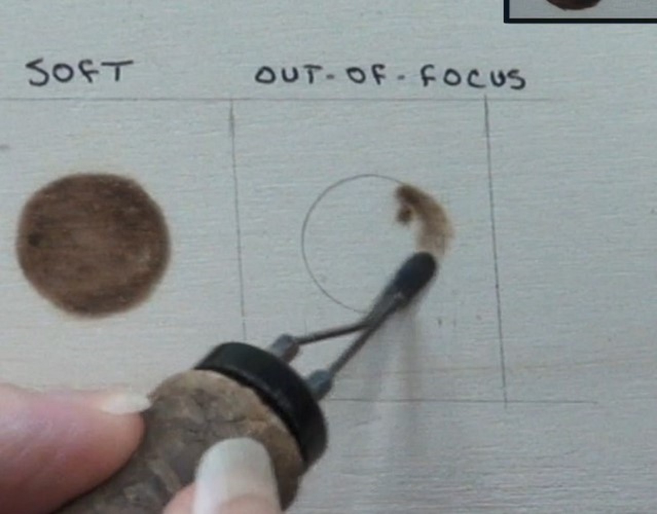 Lastly, to create a really out-of-focus object, burn past the line in places. Generally I use a circular motion burn stroke for this. Circular motion will be explained in the next section.
 How you place or position the pen can create objects that appear in or out of focus.
Look at this photo from my Dewy Leaf mini project. This project shows leaves that have clearly defined edges. Then there are leaves with softer with less distinct edges. Lastly, there are leaves that are semi-leaf shapes. The less defined the leaves are, the further into the background they appear.
 The koala artwork uses the same principals to create depth. The tree the koala is clinging to has crisp edges. The nearest tree behind the koala has softer edges. A thin tree in the distances has very soft edges and looks out-of-focus.
4) FOUR BURN STROKES
There are four basic burn methods I use in my artwork; circular motion, uniform strokes, pull away strokes, and zigzags. No matter which burn method is used, the heat, hand speed, and pen angle all affect how the burn looks. For example, burning Zigzags using the razor edge of the shader will look a lot different than using the flat of the shader. Of the four burn methods, circular motion is the one I use most often, so I’ll start with that one.
CIRCULAR MOTION
 Circular motion is what I use to transition darkness levels and create an assortment of textures. The burn stroke is just like it sounds. It is created by literally moving your hand in a circle while burning.
This photo shows a highly exaggerated example of circular motion, but, as you can see, I am literally burning a chain of tiny circles.
Open circular motion (top) means that you can see the underlying wood. Closed circular motion (bottom) means the the burn looks solid, so you cannot see the underlying wood.
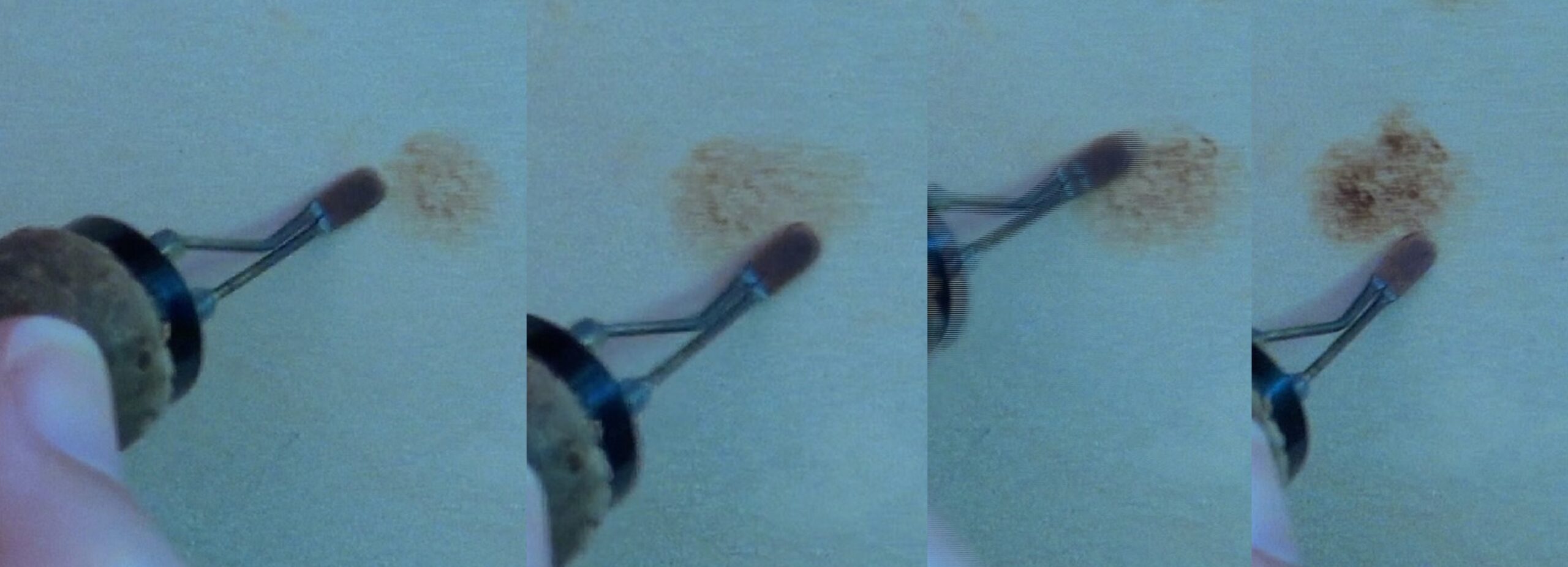 Most of the time I’m burning patches of closed circular motion versus a straight line. The patch is created by allowing the nib to meander around the area.
The patch can be fairly uniform in color by reburning over the entire thing. Or the patch can have a lot of tonal variety by reburning over small areas in the patch.
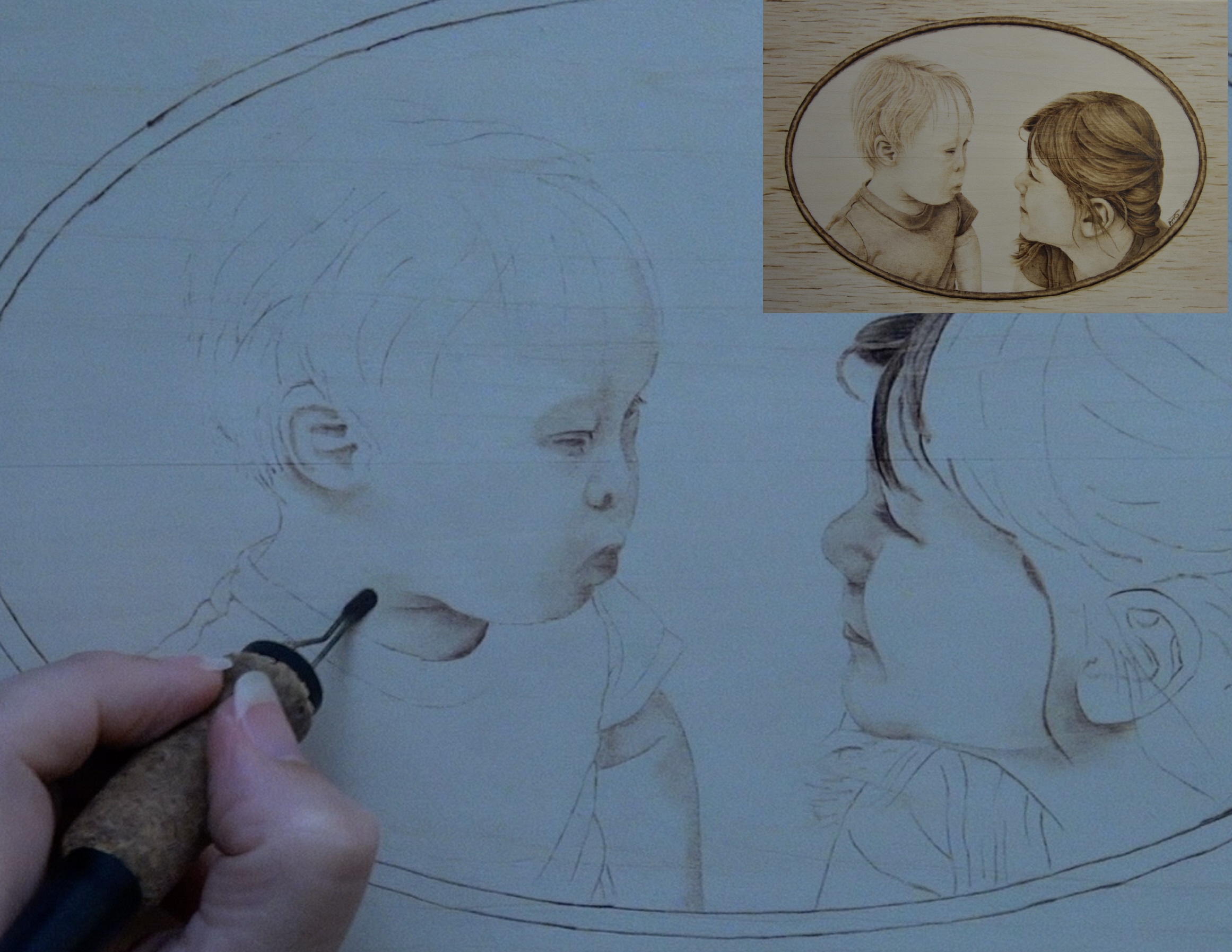 I often use circular motion as a way to transition between colors. For example, I have a shadow on the neck that I want to fade out. I use circular motion because it doesn’t tend to create crisp lines. Plus, it can produce very soft gradient color.
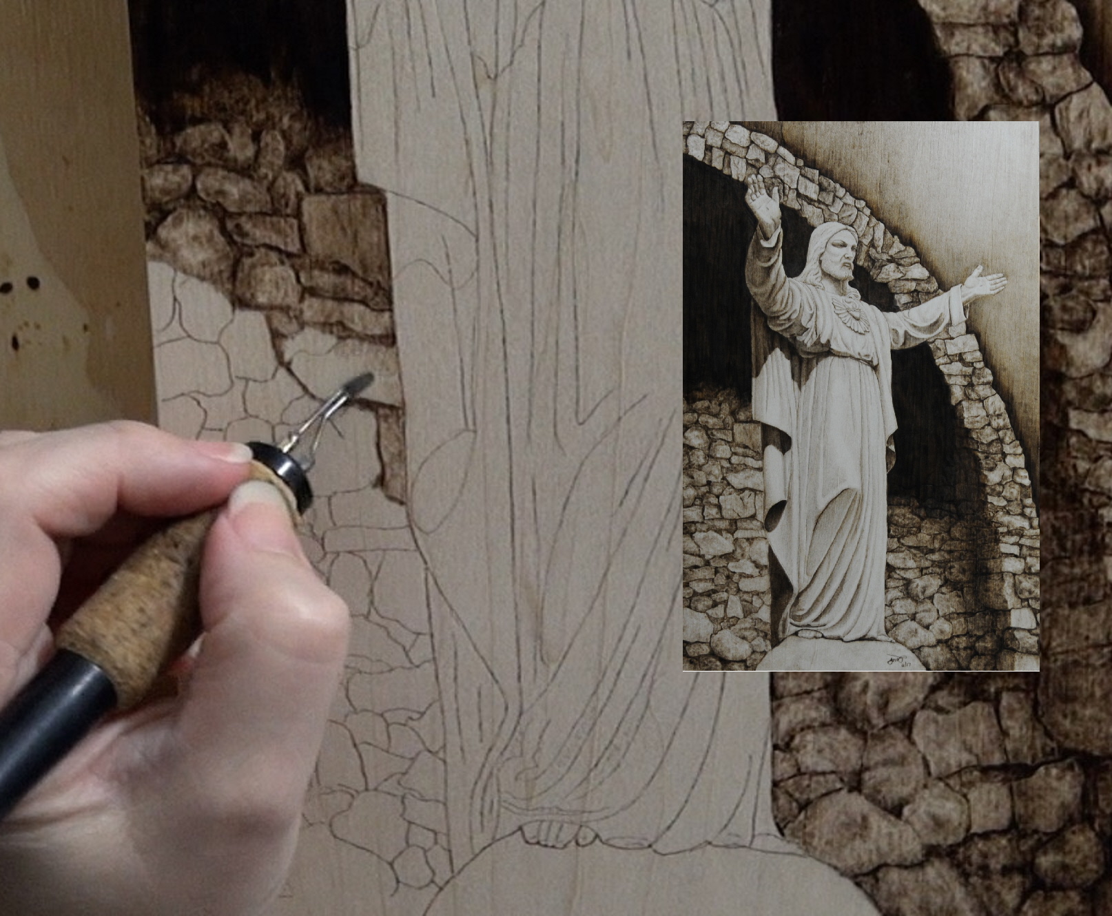 The Christ of the Mines artwork using a lot of circular motion. Circular motion was used on the the robe to create soft gradient transitions on the shadows. Whereas the rock have two distinct layers of circular motion to create a much bolder texture.
The first layer covers the entire surface. The a second layer is added to create irregularities and random darker spots. The crevasses between the rocks are burned in very dark and this gives each rock very defined edges. Truth be told, I often add several layers to build up the texture.
UNIFORM STROKES
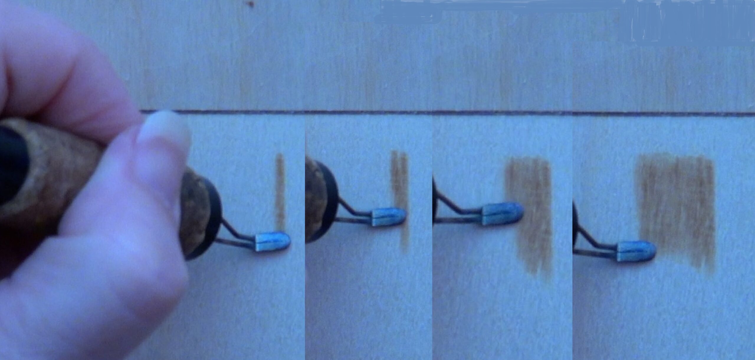 Uniform strokes are my burn method choice for smooth looking surfaces that are solid or uniform in color with little or no texture. They are created by burning wide bands of color that have the same tonal hue or color throughout the entire burn.
Begin by burning in a slow and controlled manner to get a stroke that is one solid color. The next stroke should be touching or slightly overlapping the first one. Continue to burn addition strokes adjacent to the previous one. Each stroke should be solid in color and match those burned before it.
It is important to burn so that you are pulling the nib down towards yourself. Also, use a light hand pressure and a constant speed. The combination of light hand pressure and constant speed will help ensure the color is the same through out the burn. I use uniform strokes when it’s important that the color be as smooth looking as possible.
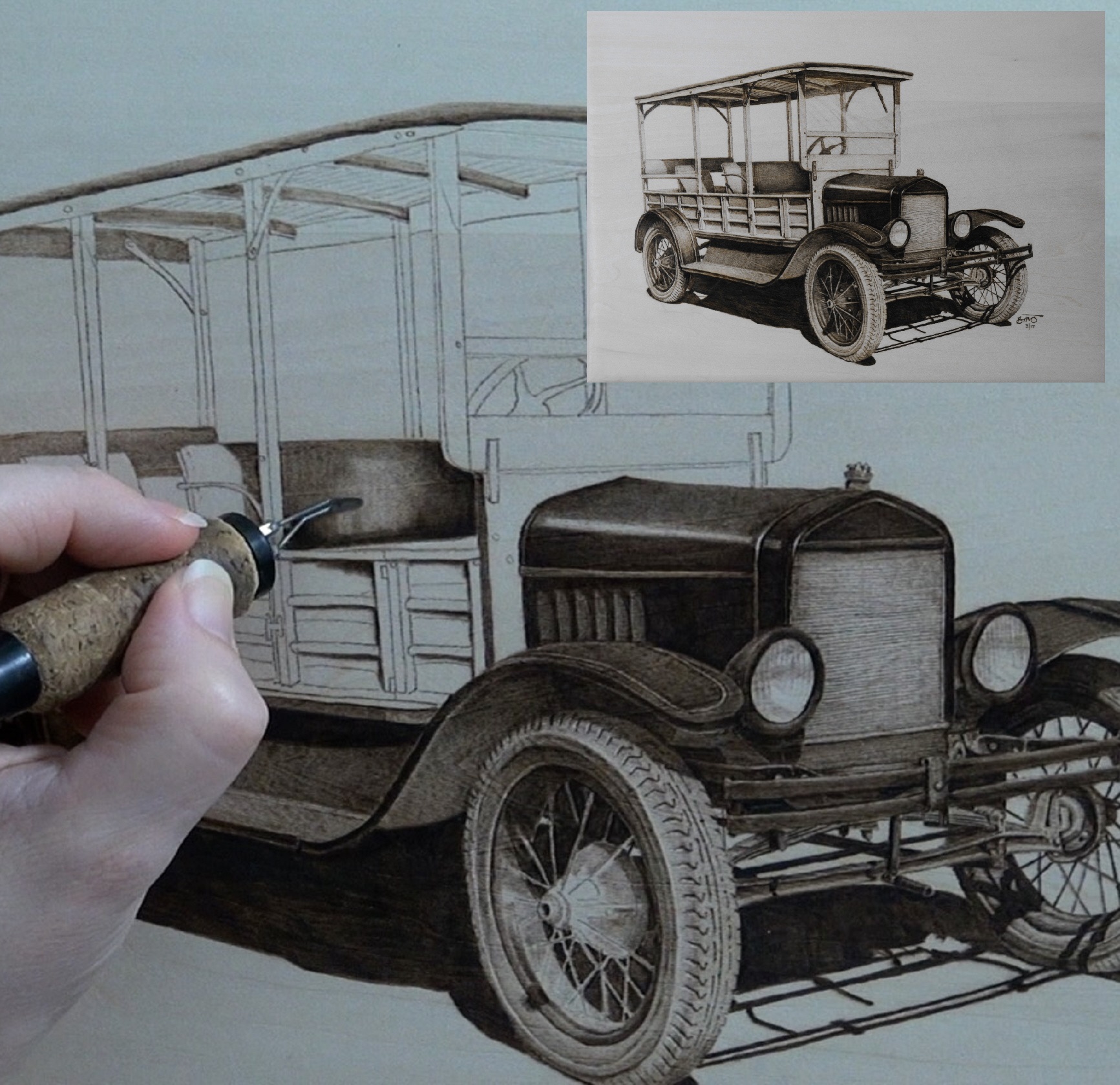 The old truck artwork relied on a uniform strokes to create the seats and a lot of the dark metal.
 There are many places on my Ford Buick is another artwork that required uniform strokes to achieve smooth color.
PULL AWAY STROKES
 Pull away strokes are used in places where I want the color to start out much darker than it ends.
The stroke is always started on the darkest end and is pulled in the opposite direction. How quickly the stroke is pulled away will determine how fast the color fades. You do not keep a constant hand speed when using the pull away burn stroke.
 Pull away strokes are generally started on the edge of an object. The pen tip is pulled away from the edge and lifted up away from the wood. The strokes are easier to do if you pull the pen tip towards you, so rotate the wood, if needed, to make this happen.
Like all things, re-burning over the strokes will darken them up.
One of the benefits to using pull away strokes is that they can provide color and contour an object at the same time.
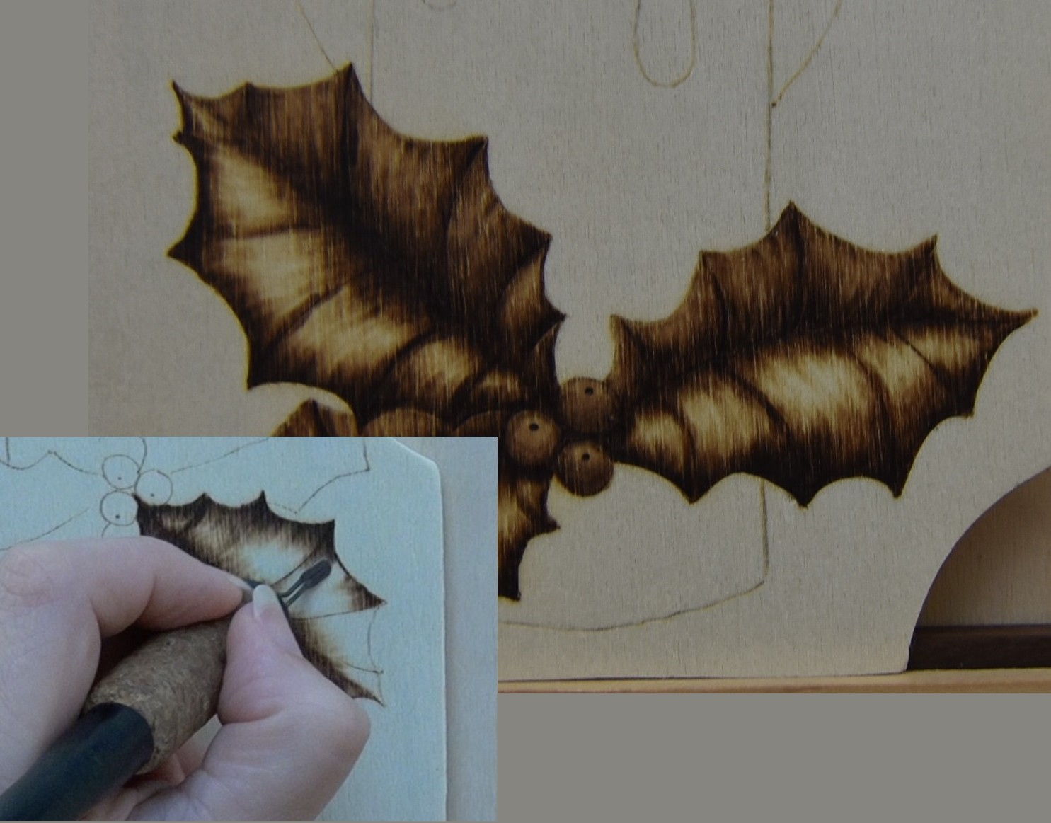 The holly leaf is an example of how pull away stroke can color and contour. If often use this burn stroke to create objects that look bowed or rounded.
 A great example of the bowed or rounded look created by pull away strokes is the Celtic knot I burned along the edge of this harp.
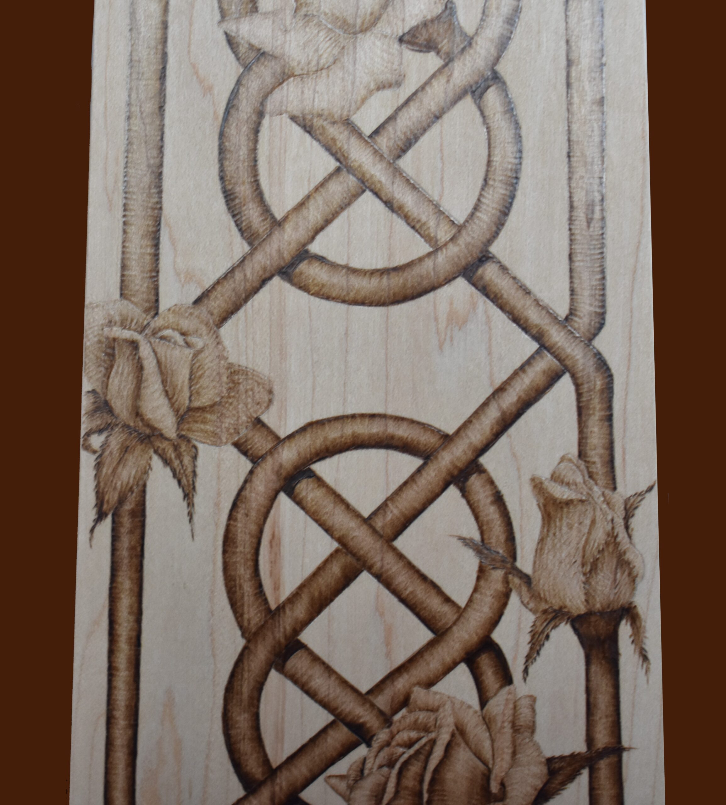 Here’s a close up of the knot area.
I burned pull away strokes along both edges of the knot. A lot of the flower petals on the roses have some pull away strokes burned on them.
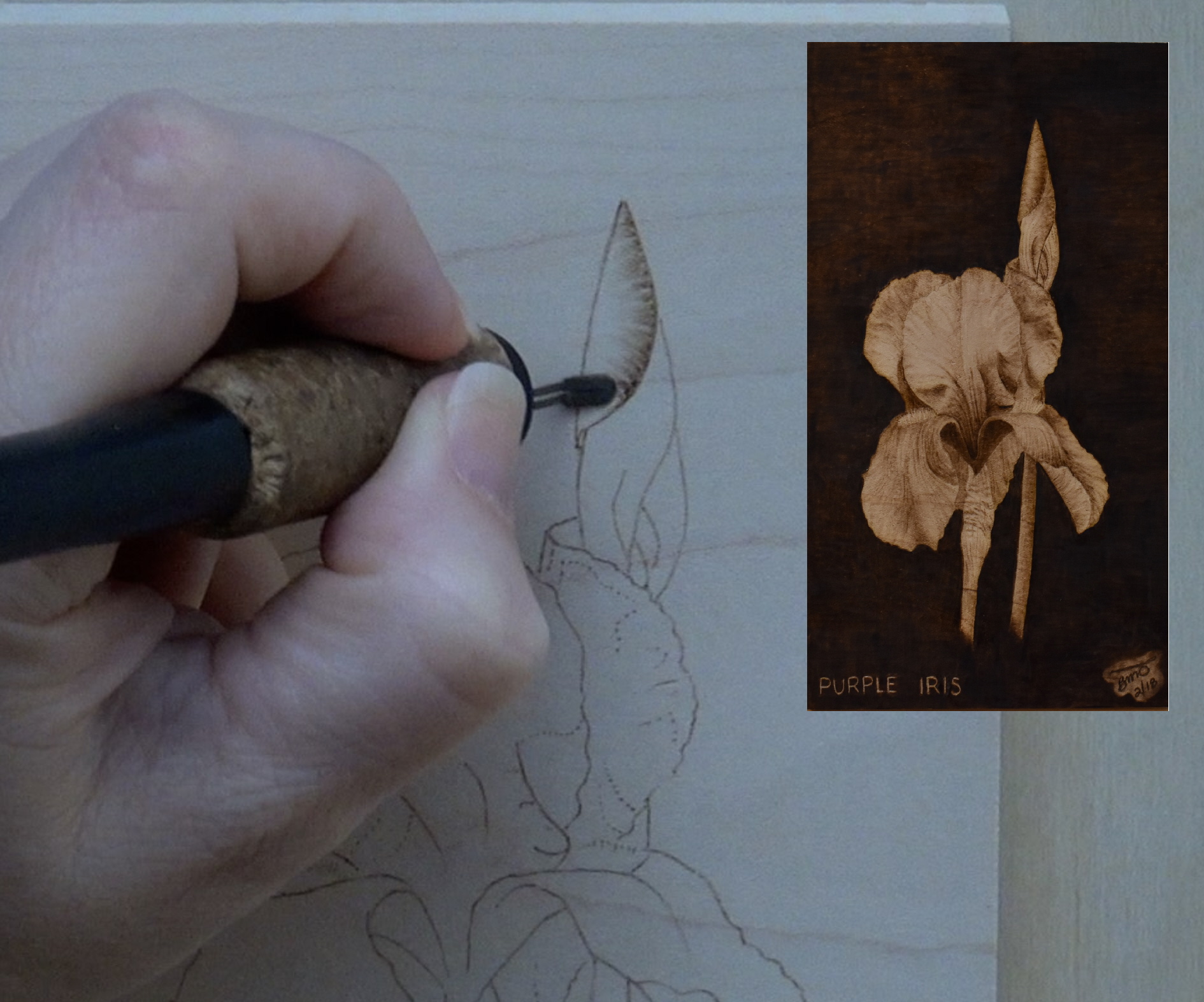 Speaking of flowers, I use pull away strokes along flower edges to create ruffles.
ZIGZAGS
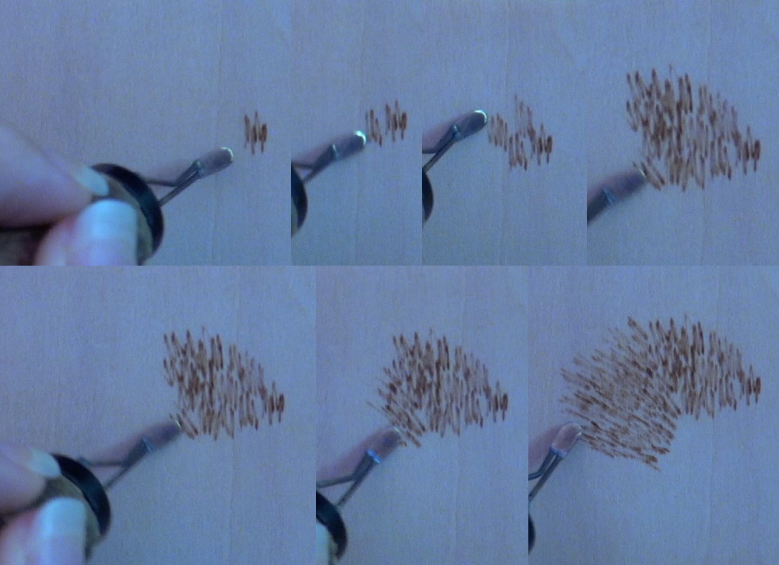 Zigzags are used to create the look of specific textures like short fur, distance evergreen trees, and rocky mountains. The burn method is created by burning a literal zigzag that is 3-7 lines long.
When using zigzags to create short fur texture, it’s VERY import to burn the zigzags in the growth direction of the fur. This composite photo is showing how I’m altering the direction of the bursts to change the direction.
To darken up an area, use repetition or re-burning, and apply the same basic zigzag guidelines.
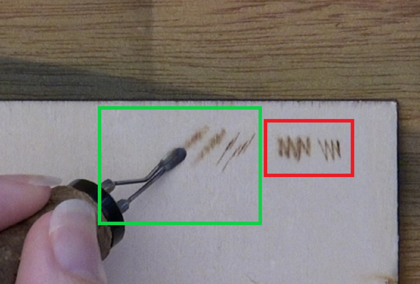 The zigzag burn stroke is not like the sewing machine zigzag stitch. Instead the burn stroke resembles something closer to a bolt of lightning.
The burn strokes in the red box show what a traditional sewing machine zigzag stitch resembles. The burn strokes in the green box are what I actually create.
One more thing I want to point out. If you look closely at the burn strokes in the green box, they are fat and get thinner as you go from left to right. This was done by altering the angle of the nib. Using the flat of the nib produces a wide soft stroke. Using the edge creates a thin crisp line. This can be used to create depth in your artwork.
For example, burn thin crisp lines on the animal face. Burn soft thicker lines on the body. The thin crisp lines will appear to be in focus and seem closer to the viewer. The soft thicker lines will appear slightly out of focus and that will help push the body into the background.
I’ve had a number of people tell me that burning zigzags is difficult to do. A couple of tips. First, use a very light hand pressure. Second, make sure your board is very smooth. Third, don’t burn at a high heat.
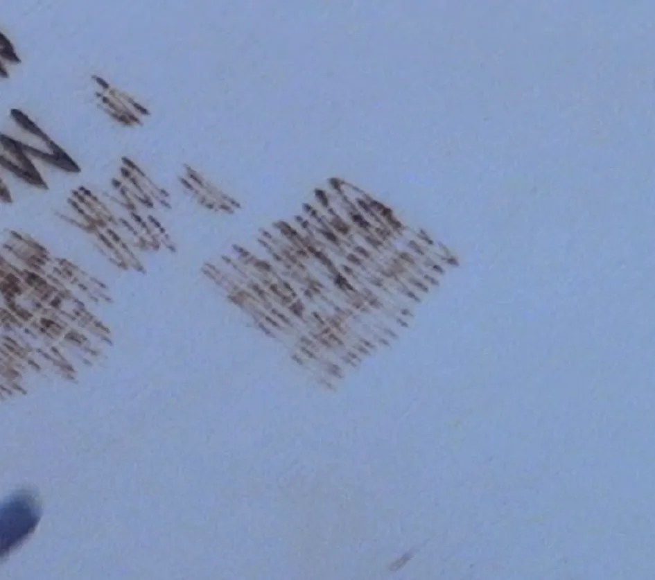 Don’t burn rows of zigzags! It doesn’t produce realistic results. Also, some artist prefer to burn single lines instead of zigzags. There’s nothing wrong with that. Try both methods and use the one you like best.
 Fur is my main use of the zigzag burn stroke. This bobcat artwork is a perfect example of how I use the zigzag burn stroke to create fur texture. Done correctly, it produces realistic results. Here’s a link to the bobcat tutorial: Bobcat
As I said before, some artists prefer to burn single lines instead because they think it looks better and is easier to do.
 This beginner friendly mountain lake artwork uses zigzags to create the mountains and trees.
The trees use a stroke that is closer to a sewing machine stitch. The zigzag starts small and gets wider as you approach the bottom of the tree. The mountain uses something close to the lightning bolt. The main thing is to burn the strokes that angle down both sides of each peak and ridge on the mount. Here’s a link to the tutorial: Mountain Lake
5) COMBINATIONS
Combinations happen when I use more than one burn method in the same area. It is very common to use combinations in pyrography to create an assortment of looks. While I use several different combinations on a regular basis, there are many more out there. It is pretty much limited to your imagination as to how you combine burn methods to create different textures and effects. I will share with you a couple of the combinations I use on a regular basis.
 Combination 1. Circular motion and uniform strokes.
This is probably my most used combination. I often use uniform strokes along edges and to give an area a base color. Then I switch to circular motion to darken areas where I want a soft transition.
With the robes on the Christ of the Mines statue I used uniform strokes along the seams and folds of the robe and then switched to circular motion to transition or fade the color away.
 Combination 2. Pull away and uniform strokes.
This is another combination I use a lot. I burn pull-away strokes around the edges of an object to give the edges a rounded look. Then I fill in the object with uniform strokes.
 Combination 3. Circular motion and zigzags.
This creates a unique texture that reminds me of fallen rotted logs, rough bark, and tree branches that are dying. I don’t use it very often, but I think it produces realistic results.
I work in small sections fill it with circular motion and then burn some zigzags over it. I don’t burn zigzags over the entire surface, just a few here and there for added texture.
CONCLUSION
That’s it for this blog. Did I cover every question you have on the subject? Highly unlikely. Hopefully, I have provided you with some useful information that helps your with your artwork. If nothing else, hopefully it explained terminology I use in my tutorials. Heck, it might even help you understand what’s going on when you watch a video. For example, if you see someone’s hand move in a circular motion you’ll have a better understanding of what they are doing.
Just remember that with practice (continued creation of art) you will discover the heat, angle, and hand speed that works best for you.
I said this before, but I’ll say it again. I believe that my success with creating smooth shading and achieving highly realistic artwork is by using low heat and make multiple passes (going over the same area) to build up the color. It’s not a fast process, but I think the results are worth it.
Until the next blog.
Brenda
Mar 14, 2017
Last updated July, 2018
Want to subscribe?
- Click on the “Leave a Comment” field at the end of any post (blog) and a subscribe option will appear.
- Put something in the comment field (if you put “test” or “just subscribing” I won’t make your comment public)
- Fill in the sections for your email address and name, and then click on the “notify me of new posts via email.”
- You will get a confirmation email from WordPress confirming you want to subscribe.
- Click on the confirm button in that email and you’re done.
Please note that I do not send out emails. If you have a WordPress account there is a way to subscribe within the WordPress system, but I cannot provide specifics on how it works as I don’t know.
Thank you for sharing your knowledge. It’s clear you’ve spent a lot of effort putting this together. I thought I was doing well with pyrography, getting good results with the skew and ball nibs, but the shader is a different animal. I’ve prepped the surface to 600 grit smoothness, made sure the contacts are firmly plugged into the jacks, tried all the suggestions and still getting splotchy, inconsistent results. I’m using a Razertip heavy duty shader and have tried all different heat settings with lots and lots of patience. I will continue practicing!
Hi Jim,
I haven’t tried anything but a colwood burner, but I would think that they are all pretty similar. My suggestions are as follows:
1) Use a light hand pressure; let the pen tip glide over the surface of the wood.
2) Blot the pen tip on scrape wood before you start burning. It could be that your pen tip builds up heat quickly, so when you initially touch the wood it produces a darker burn result than you want.
3) Turn down the heat. I adjust my settings before every single burn session. The goal is to get a dark tan burn result. Unless I’m working on a large dark area, then I’ll aim for something in the brown range so I don’t have to spend the rest of my life re-burning over the area to get the dark color I want.
Hope that helps
When you write that you are using a burn heat of 3, are you on Detail or Heavy Duty mode? Or do you always use only Detail or only Heavy Duty?
I need to update that blog. There are too many factors that go into heat setting. What type of wood, the type of pen tip being used, and how old or how many hours of use does the pen tip have. The pen tip I normally use has well over 1000 hours of burn time on it. It requires a lower heat setting than a brand new pen tip of the same type.
Instead don’t worry about the heat setting. Instead adjust the heat as needed to get the proper colored burn result.
For the record I seldom use the HD side of the burner. Only if I’m using a large shader or burning really dark for a prolonged amount of time.
Brenda, I just got off the phone with Colwood about tip questions I had. In the conversation I remarked that I was using your information a lot as I got started and noted that you are left handed, like me. When we got to talking about bent tips, I was told to tell them I was left handed whenever I wanted a bent tip. I laughed when he said that, describing what I thought was the bent tip process. That would be an in-line bend. Surprisingly, he said that there is a difference. I just thought to tell you this and also ask do you know anything about it?
Hi Warren,
the first I’ve heard of the terms, but that’s not surprising. I’ve created or made-up most of the verbiage I use on my website as there didn’t seem to be much information out there about burn strokes, etc. Other than ordering tips from Colwood and asking them about the polishing burrs, I haven’t conversed with them. I doubt they are aware I exist.
Thank you for passing on the information. It makes sense that there would be different terms used to identify where the pen tips are bent at.
Pyrography History. The link will take you to the article on Ryn’s website.
404
Error – Page Not Found
Please check the URL.
Otherwise, click here to be redirected to the homepage.
I went to the homepage, but could not find it listed.
Hi Warren,
Ryn is always changing her website around. Thanks for letting me know it doesn’t work anymore. I’ll remove the link.
This blog was… how do you say it? Relevant!! Finally I’ve found something that helped me.
Thanks!
Glad the tutorial was helpful
Thankyou for your wonderful tutorials, I am from Sydney Australia and have dabbled in this art form without really knowing what I am doing. You have shown me some wonderful techniques that I cannot wait to tryout.
Again Thankyou from a fellow pyographer in isolation!
Hi Sarah,
Thank you very much for the wonderful comment. Pyrography is a beautiful artform and I enjoy it so much that it has become my primary medium I use. I hope you enjoy pyrography as much as I do.
Here’s hoping stay at home orders get lifted soon and things being to return to normal. In the meantime, stay creative!
Brenda
i have just started learning to burn while the virus is around and you are amazing the tutorial is great only trouble is i cant watch and read and do the burning to thank you for great tuition TC ivan
Hi Ivan,
Let me welcome you to the beautiful artform called pyrography! It’s a lot of fun, but I might be a bit biased. 🙂
I’m glad the videos and blogs are helpful. I hope you will enjoy pyrography as much as I do!
Brenda
This is a really good tutorial. Your work is also very good, some look like photos. I especially like your Christ in the Mines wood burning. Do you have an explanation (blog entry) as to how you transfer patterns to the wood before burning?
Thanks
Hi Rick,
Thank you for the very nice comments. I do have a general blog that discussed the different ways to transfer a pattern to the wood. If you click on the ‘tutorial’ tab it is near the top (no photo) and called Transferring Patterns to Wood. I am considering writing a new blog that discusses how to transfer a photograph. I actually use the same method I do with patterns (coat back with graphite and trace), but I planned to explain what parts I choose to trace over and some of the tricks I’ve learned to help me with areas that don’t have clearly defined start/finish lines to them. Brenda
super merci pour vos tutos ,je suis francais et il y a rien comme tuto pour nous aider .
Hello! You are so welcome. I’m thrilled that they are helpful. I hope you will create awesome works of pyrography art! Brenda